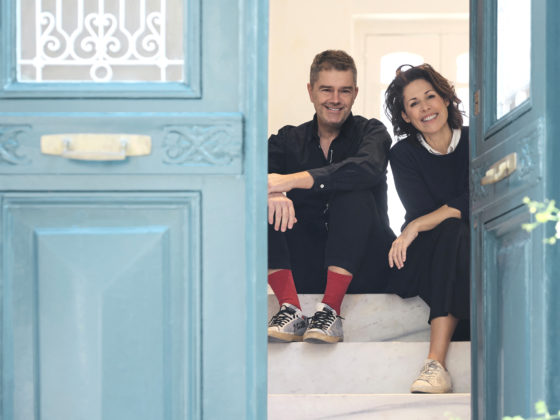
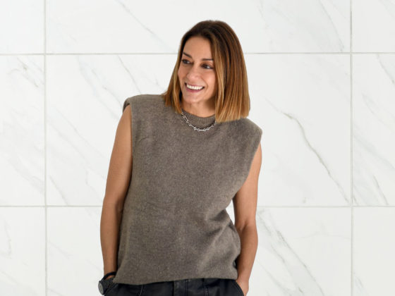
Yorgos Tloupas is a vibrant creative force in the design world, celebrated for his expertise in logotype design and his adventurous spirit across luxury, art and fashion. As the founder of Yorgo&Co, he has navigated various creative realms—from graphic design to art direction and entrepreneurship—crafting unique identities for brands and publications alike. With a rich tapestry of experiences, his work is as bold and distinct as the Greek heritage that inspires him. Join us as we explore the intersection of his creative journey, his roots in Greece, and his vision for a visually captivating future.
You’ve worn many creative hats throughout your career, from graphic designer to art director and entrepreneur. How do you navigate between these roles, and what fuels your passion across different disciplines?
Well the creative part of my life is fuelled by the passion for my main job, designer, which is not just about creating beautiful things but also about finding the most efficient way to communicate and to transmit ideas. The entrepreneurial part is a direct result of years spent creating value for brands. In the end why not create the same value through my design, but for my brands?
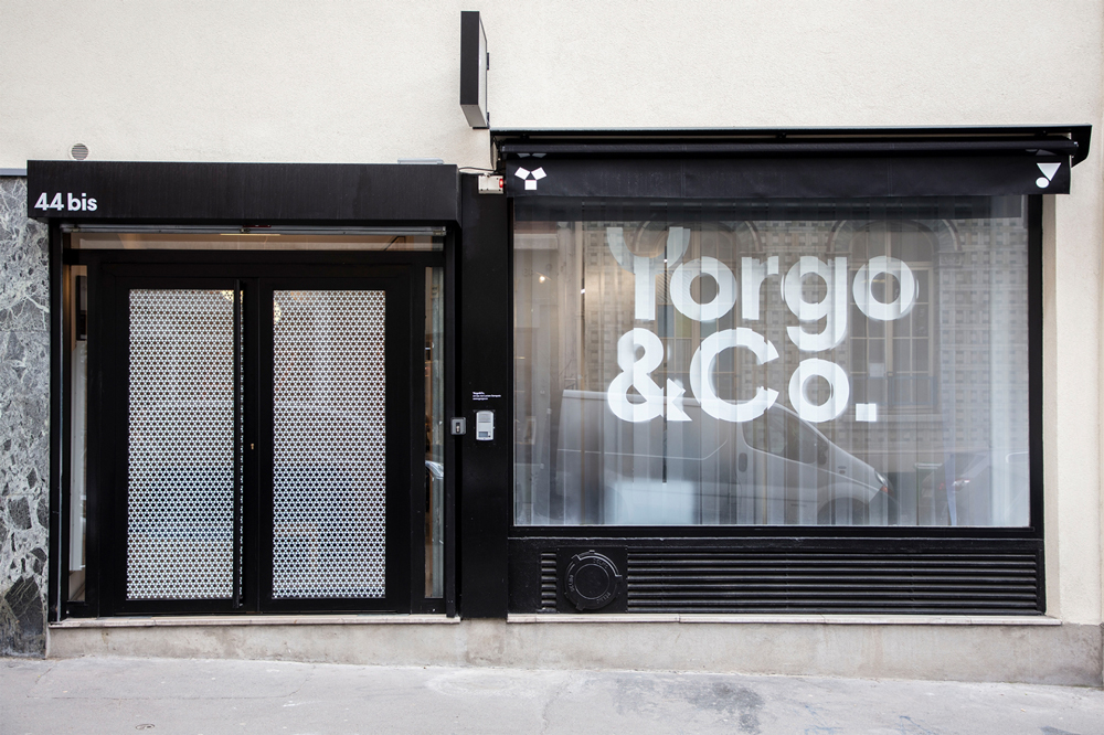
Your work with typography is bold and distinct. Could you share how your relationship with letters evolved, and how typography plays a role in expressing identity?
Typography is the “raw material” of graphic design, choosing a specific typeface for a specific project is the equivalent of an architect deciding between concrete, wood, stone or steel for a building’s structure. It answers both practical and visual questions. I’ve always loved designing letters, maybe from my years doing graffiti in the suburbs of Paris, and now we’ve hired a professional type designer in our team, Martin, who is much more skilled than I am. Together we design alphabets for brands, and I’ve launched an online type foundry, Yota Fonts. It’s a subtle but fantastic way to express the identity of brands.
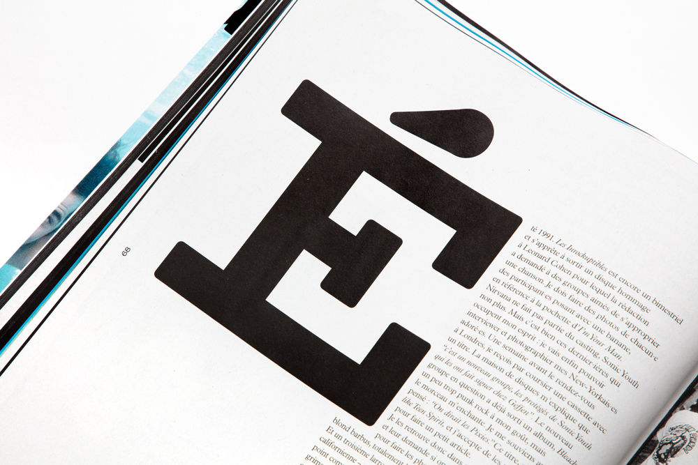
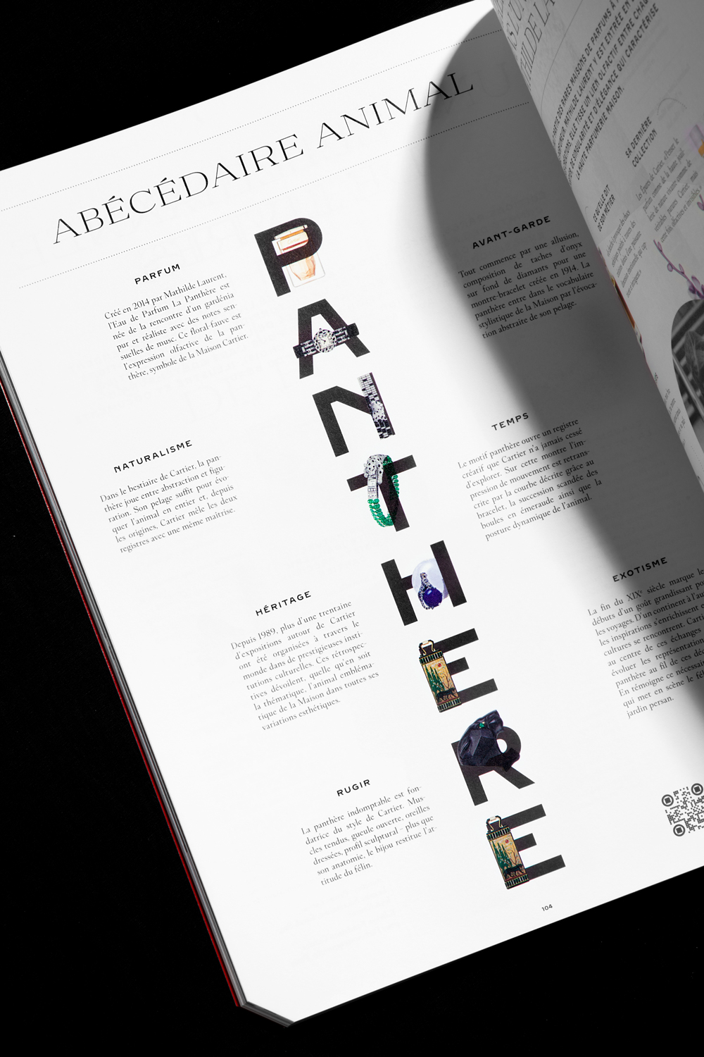
For example the fonts we did for Cartier come from the archives of the house, revisited and expanded, and are now used across everything Cartier produces. They have design details that relate to the history of the brand, and at the same time have themselves become a strong pillar of Cartier’s current expression.
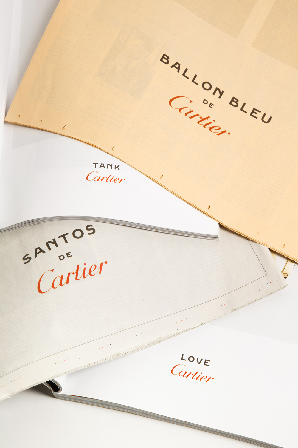
From your early work with Intersection magazine to your role at Vanity Fair France, you’ve worked with some of the most iconic publications. How do you approach the challenge of evolving classic brands?
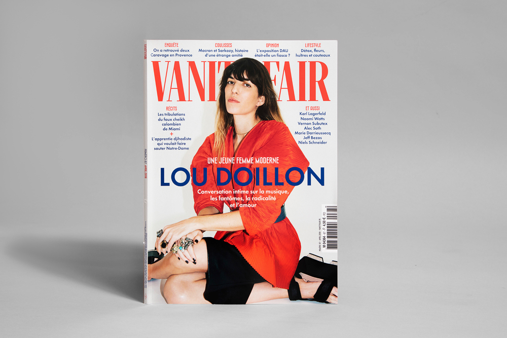
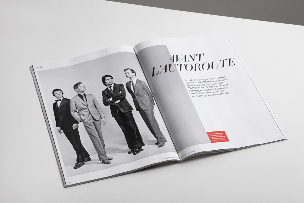
I have a passion for magazines, probably coming from my youth spent reading Skateboard and surf Magazines, and from my father’s subscription to National Geographic (even though he could not read or speak English!). In a way it’s easier to launch a magazine, as I’ve done with Intersection, Magazine, Crash and some others, as it is to redesign an Icon such as Vanity Fair. To do that I went to the Condé Nast offices in New York, dug through a hundred years of archives, and tried to create a contemporary yet timeless version of that magazine, which has been my favorite for years, not necessarily visually, but for its depth and accuracy of journalism and investigation.
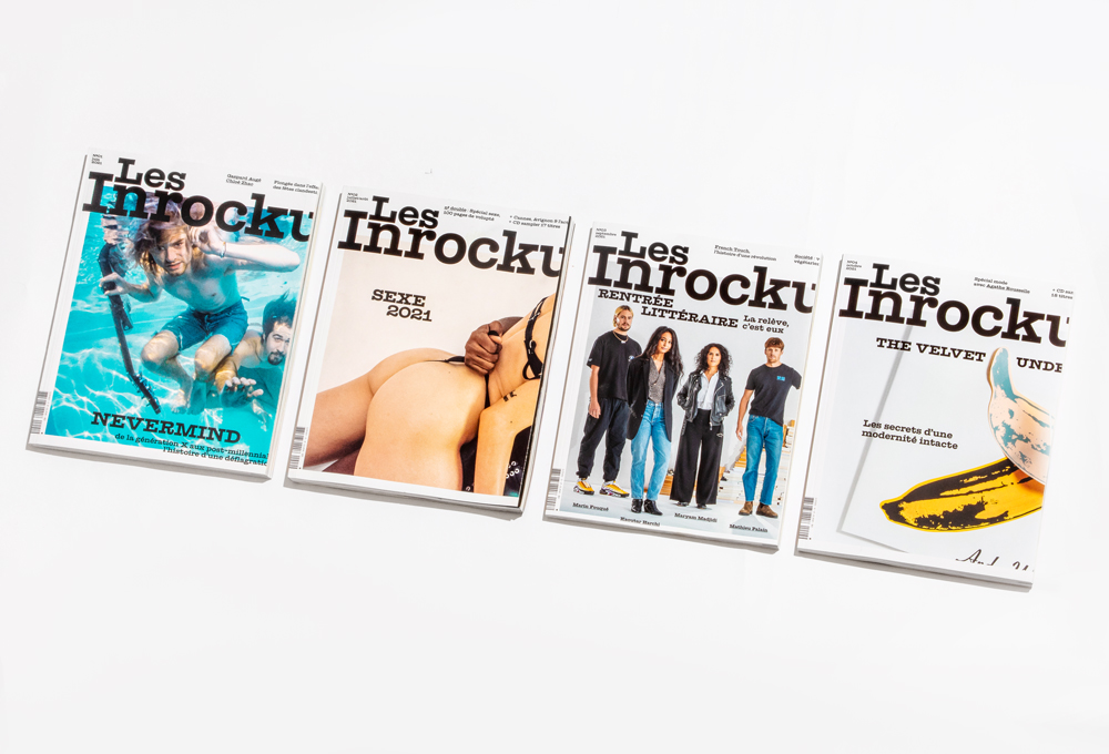
I did a similar job for French cultural magazine les Inrockuptibles and for French newspaper Liberation, both icons of the country’s media scene. So that was a lot of pressure to get the visual tone right, and in both cases all my decisions were based on a deep research through the archives. More recent magazines are easier to redesign, for example GQ France was just a case of improving the existing visual system, and at the moment I’m working on another masculine title which is kind of like a sick patient you have to heal.
Greek design is experiencing a renaissance, both locally and globally. Where do you see Greece fitting within the broader landscape of contemporary design, and what unique elements set it apart from other international design communities?
I keep on saying to potential Greek clients asking to collaborate that they should look locally, as the scene is as you mentioned, both thriving and very qualitative. I’m not sure there is a special uniqueness to it beyond the use of the Greek alphabet, as design is a global language. But what I find inspiring is that small brands, especially in the food and beauty markets, care about how their products look. As a result there is an emulation, and in a Greek pharmacy, in a delicatessen, the sophistication and visual quality of the products is creating a positive competition, pushing everybody upwards. Type designers like Parachute fonts are also doing amazing work, and I’m a big fan of the Instagram accounts @signsfromgreece and @quickbrownfox.ath, both run by a very talented calligrapher and sign painter, who archives and observes the beauty of old store signs across Greece.
“It’s a national treasure that needs to be preserved, and thankfully some people are starting to understand that tourists, both Greek and international ones, prefer to go into a Kafeneion with a beautiful hand-drawn logo from the 60s than one with a modern generic typeface printed on plastic.”
Your father, Philolaos, was a renowned sculptor, and his work often drew inspiration from Greek heritage and landscapes. How has his artistic legacy and your Greek heritage shaped your perspective as a designer? Can you discuss the significance of returning to Greece throughout your career and how the Greek visual and cultural environment informs your work today?
Obviously my father’s vision has shaped my perspective, from his architectural talent (I grew up in a house he built), to his tendency to design furniture if he could (I’ve started designing my own, both from my house and my office). His way of appreciating nature and travel is still deeply part of how I live today. It’s hard to explain of define clearly, but his taste, and the one of my mother, are crucial in the choices I make.
Having spent significant time abroad, what does ‘home’ mean to you? How do you reconcile your international career with your deep ties to Greece?
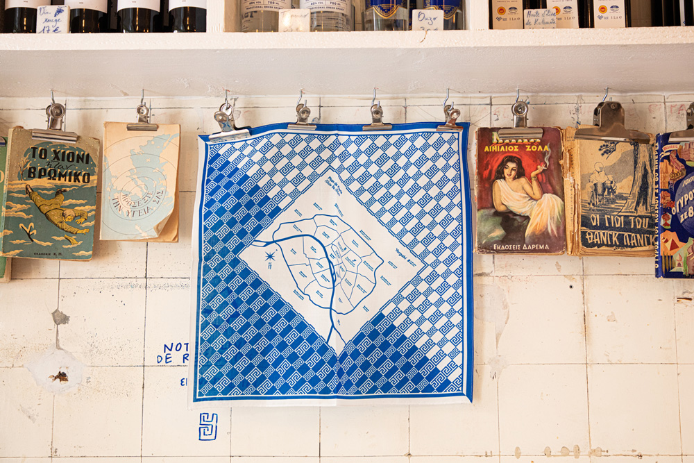
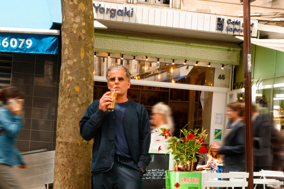
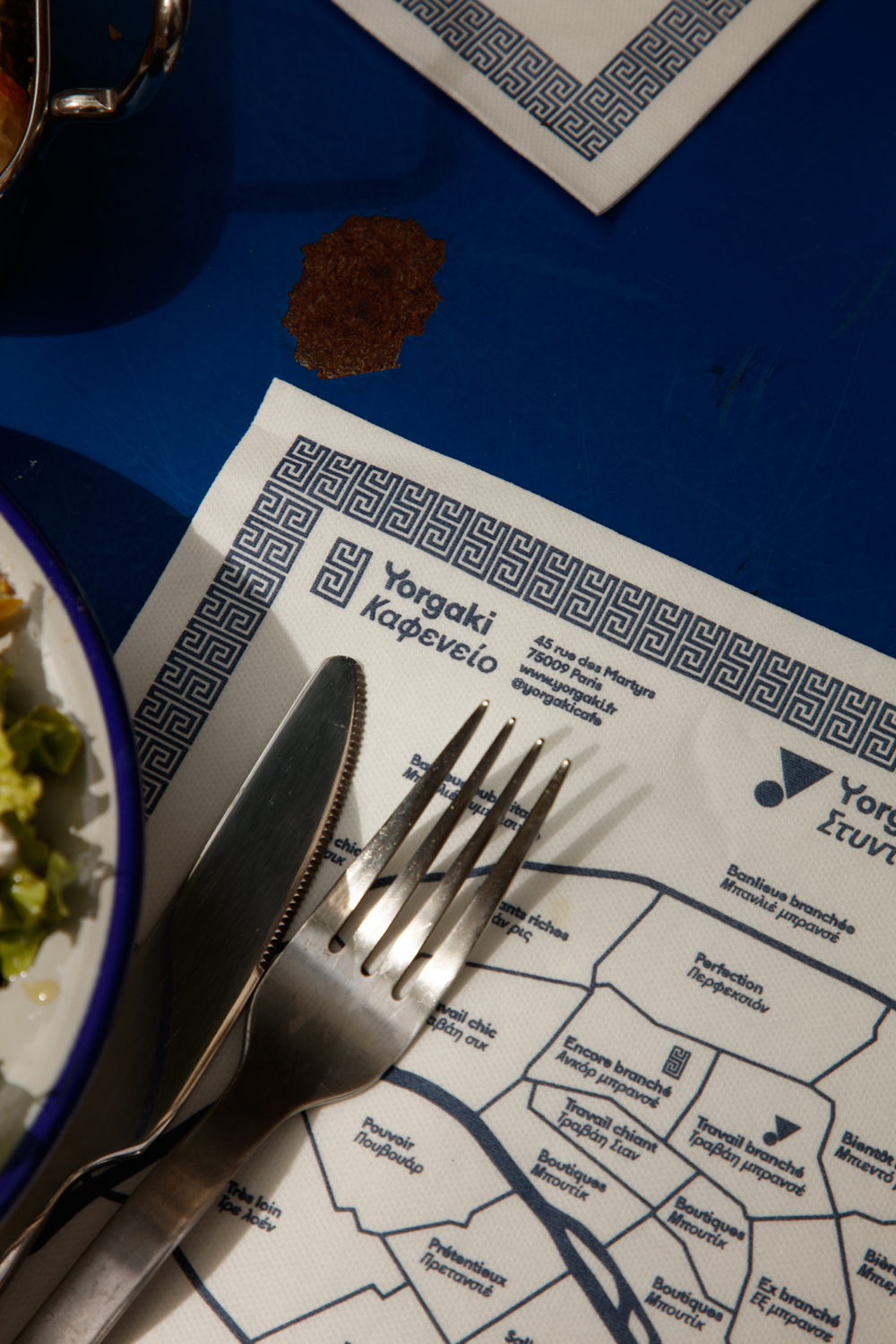
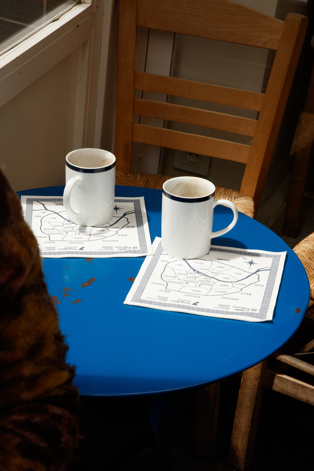
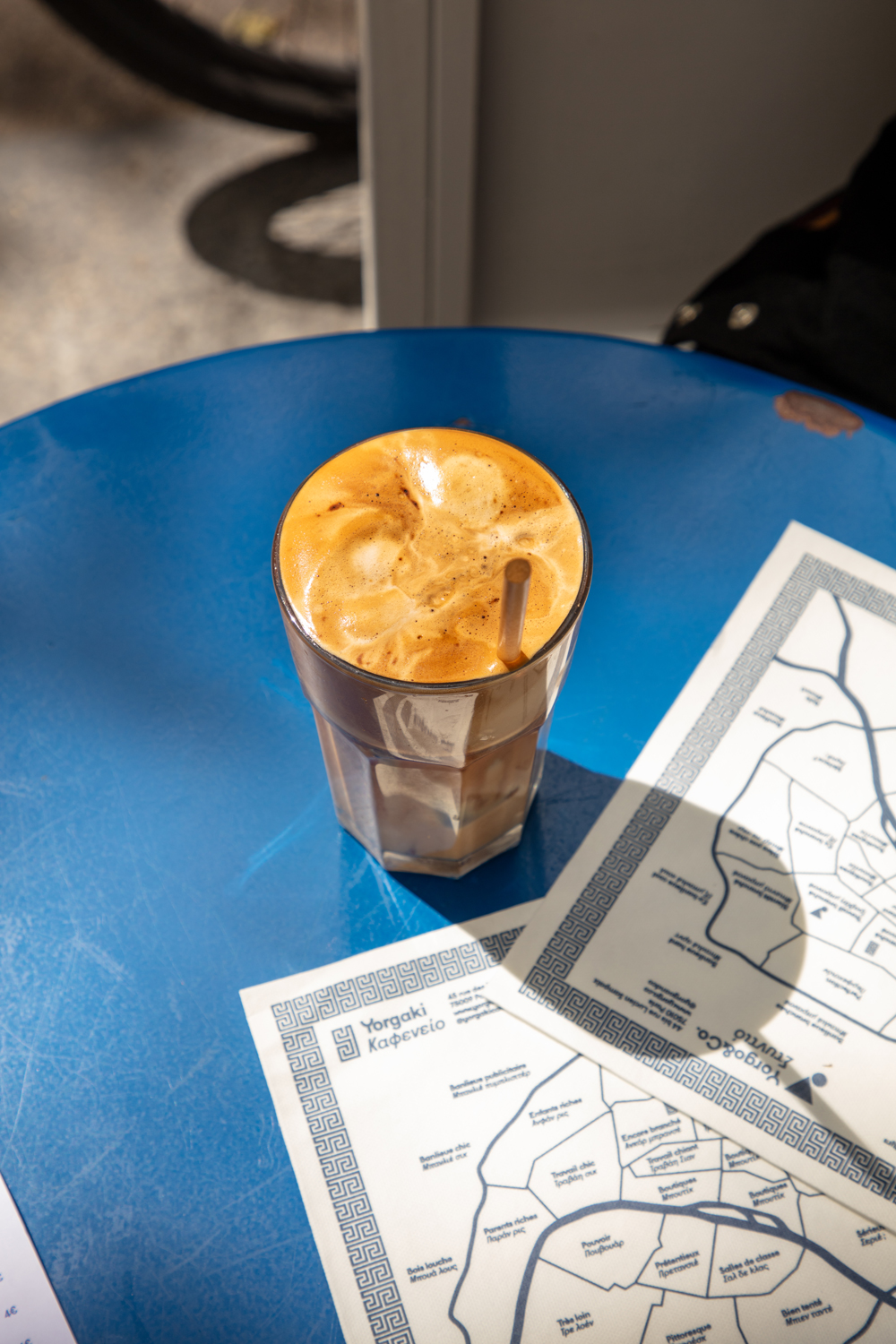
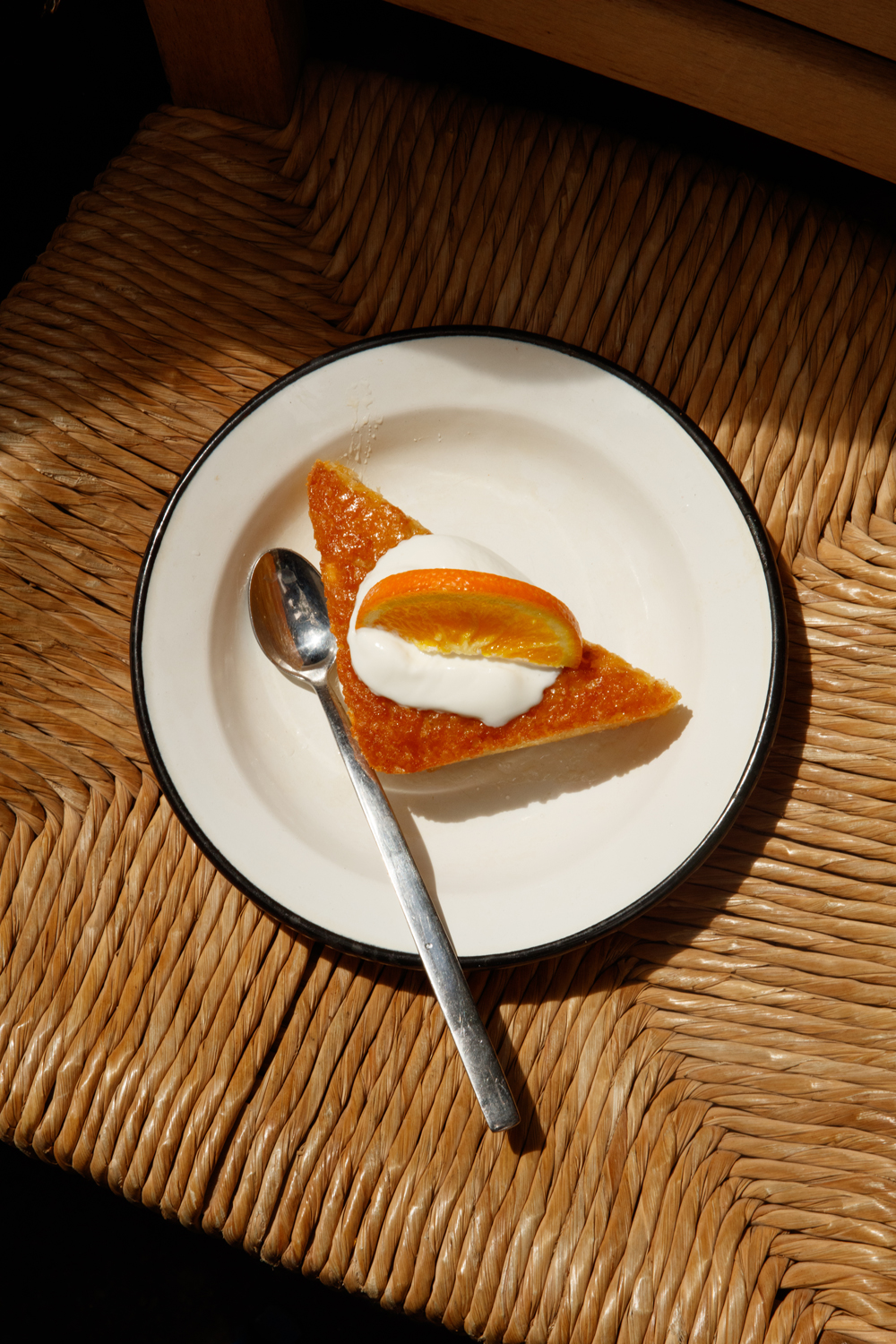
I grew up in suburban Paris, then Paris itself, then spent 10 years in London before settling back to Paris 14 years ago. These ten years abroad were the most formative ones, as it allowed me to change my focus and to see the world through a different filter. But since my birth I spent my summers in Greece, and could not imagine a year without doing that. Thankfully since I’ve opened my kafeineon Yorgaki in Paris 5 years ago, I can always find solace in a freddo expresso of a loukoumi from Volos that we sell there!
If you had to pick one piece of work or project that you are most proud of, what would it be and why?
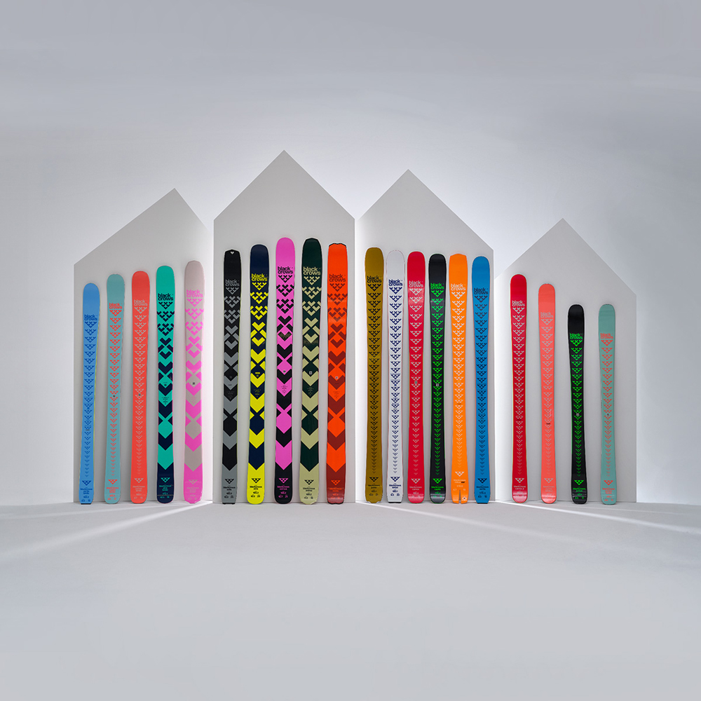
I would say launching and art directing blackcrows skis since 2006. Not only did the brand change the game in its industry, but it is also in my opinion a rare example of consistency and coherence in design over more than 15 years. By the way one of my dreams is to climb and ski mount Olympus with Yorgos Klaoudatos, the Greek distributor for blackcrows, and Kiriakos Mitsotakis, who does ski touring with Yorgos as a guide.
What advice would you give to young Greek designers looking to make their mark on the global stage?
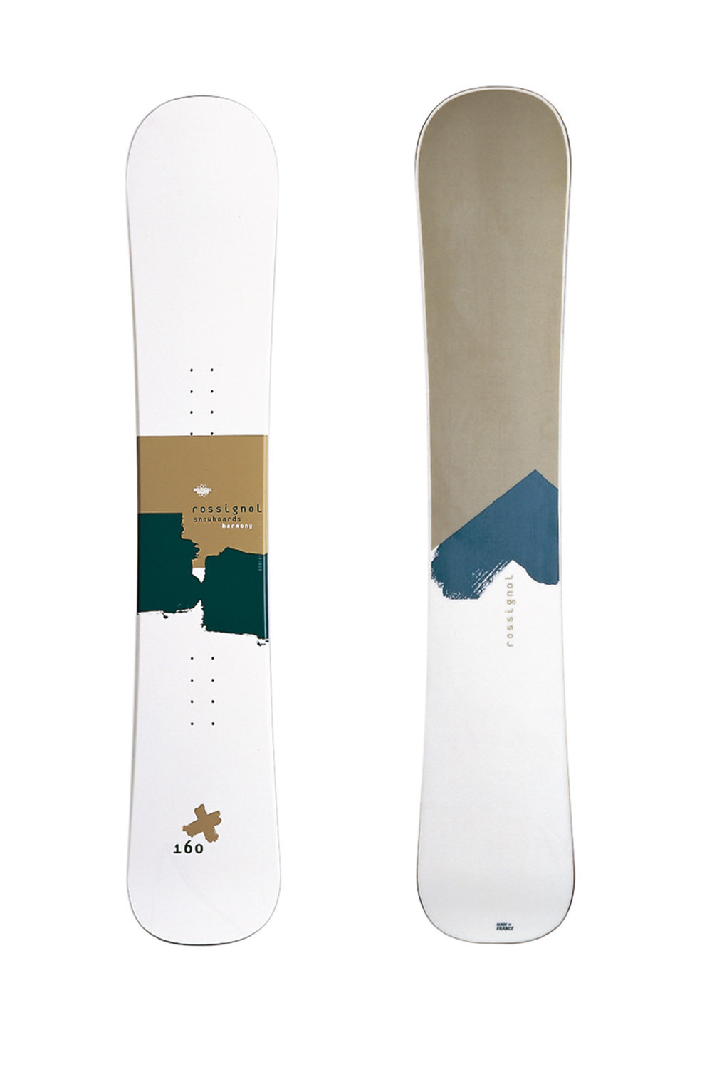
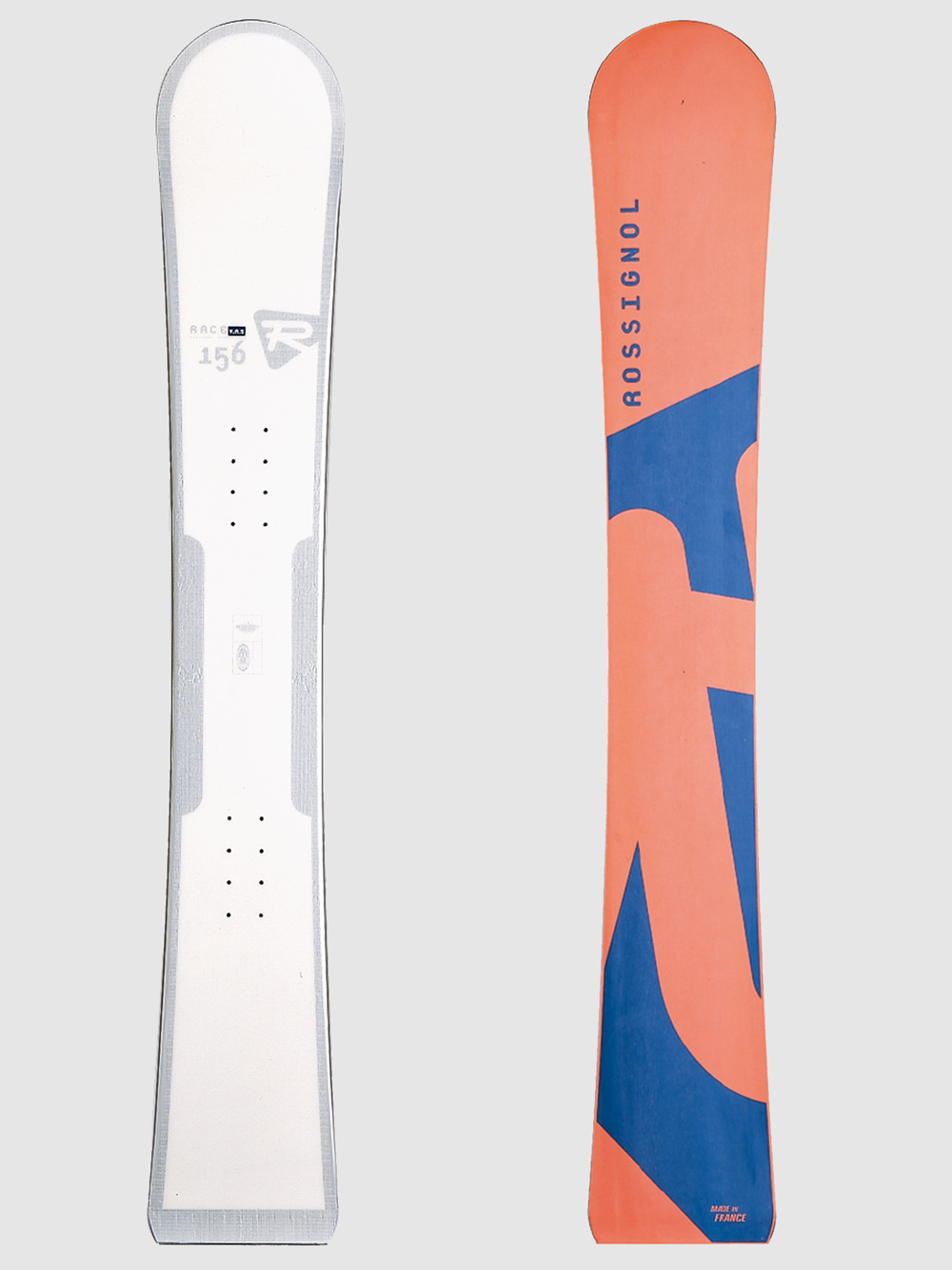
Start by working in a field you love. I started by designing logos and snowboards for Rossignol, as I was a sponsored rider for them and completely obsessed with the sport. That led to other projects and so on, but my knowledge of this world was key into me finding the correct designs solutions. So if you’re a young designer into music, start by designing for your friends’ band, then you’ll end up doing it for your favorite labels. If you’re into food, use the same process.
Can you give us a glimpse into any upcoming projects or collaborations that excite you?
There a so many, we’re lucky to be working on more than 30 projects simultaneously. I would say launching a line of food products for Yorgaki is extremely exciting, I’m starting to look for local producers in Greece and it will hopefully take shape next spring. We’ve also just designed a full typographic family for the PSG football club, and applying to all the levels of the brand has been both challenging and extremely exciting.
Lastly, if you were to design something that embodies Greece today, what would it look like?
Hard question! You don’t want to fall into the antique clichés… Having said that we’re designing a scented candle for Yorgaki at the moment, and it smells of Greek coffee, is beige like ancient marbles, reproduces our Y logo, and locks into an endless frieze, if you buy many. So it’s a modern and useful cliché, but very Greek.
