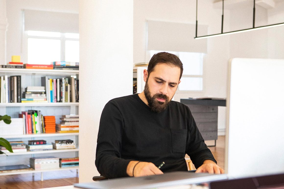
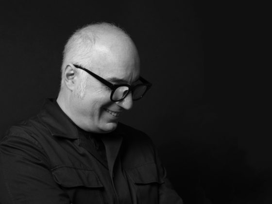
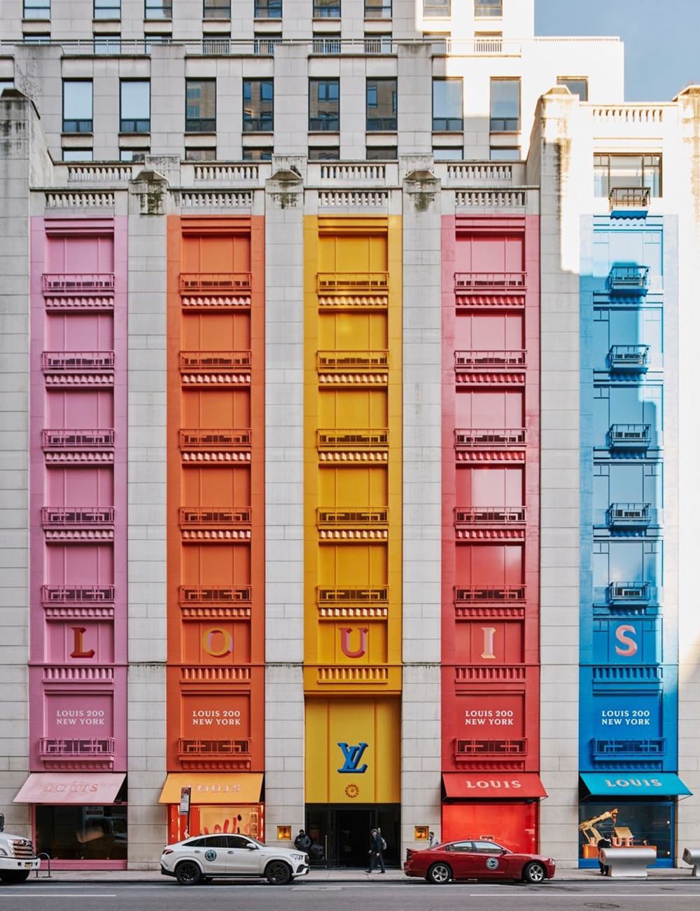
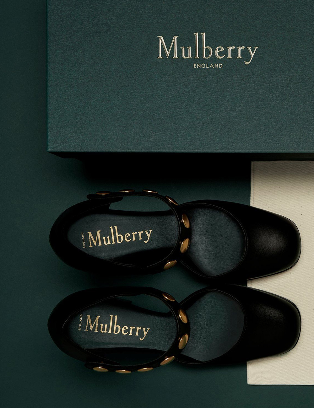
Award-winning creative director and graphic designer, Andreas Neophytou has worked for over fifteen years in Europe and the US on creating campaigns, experiences, and brand identities for prestigious brands in the fashion, beauty, and lifestyle industries. Not many designers can claim to have worked with leading brands like Louis Vuitton, LVMH, Estée Lauder, Nike, and Tom Ford, yet Andreas’ and his partners’ agency “Closer”, located in NY, London, and now Thessaloniki has quickly grown since its establishment, to win the trust of world-renowned brands in multiple categories. His love for type, as he says, grew from his love for record sleeves as a young boy. He believes that collaborating with the right creators, writers, directors, strategists, photographers, producers and artists to best convey the desired message is key, noting that the maker is as much a part of the message as any medium.
Can you describe your approach to design in a few words? Where do you draw your inspiration from?
When my partners and I established Closer we wanted to strike the balance between creativity, culture, and entrepreneurialism. We design strategies, products, experiences, and campaigns but we are always interested first and foremost in the fundamental questions of who our audience is, what world they live in, what they care about, and how to engage with them. We want to contribute to the culture but also study it – to understand our audience more as individuals and as communities – to understand their motivations, behaviors, fears, and aspirations and what informs their identity or identities. To create a framework for work that will be creatively inspiring but also relevant culturally and commercially.
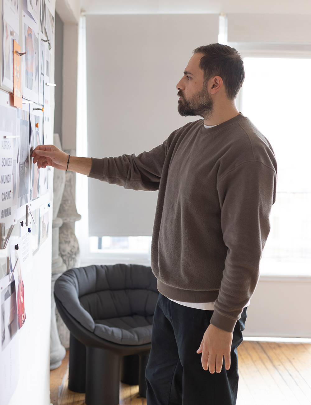
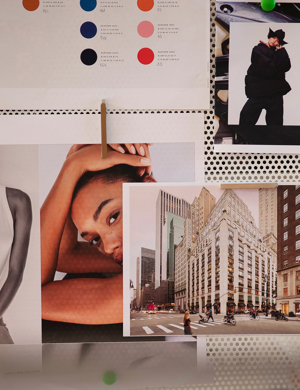
What is the basis of your visual vocabulary? Does it depend on the project? Are there any different contrasting elements that you use to find the right balance?
So much of our work has to function in a variety of modes. I’m very keen on establishing a fil rouge that connects it all. From physical to digital, print to screen, etc. Our ideas become a series of connected experiences for people to discover and interact with so my visual vocabulary is informed by integrating the disciplines we use to create those experiences, from graphic design to film and photography to spacial design and associated technologies. My aesthetic is also informed by the places I’ve lived and worked; I grew up in the midlands of England to Cypriot parents, then spent 10 years in London and 10 years in New York. Being a part of the industry there, and now in Greece. Those experiences are imprinted on the way in which I express myself. Absorbing the visual culture of these places and working with inspiring and prolific people from all over the world has shaped my perspective.

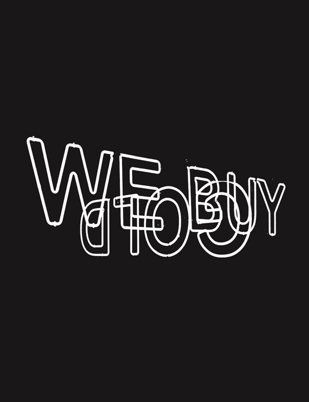
How was the experience of working with such recognizable brands as Louis Vuitton, Virgil Abloh, and Nike? What were the limitations and how did you lead the project to the outcome that pleased all sides?
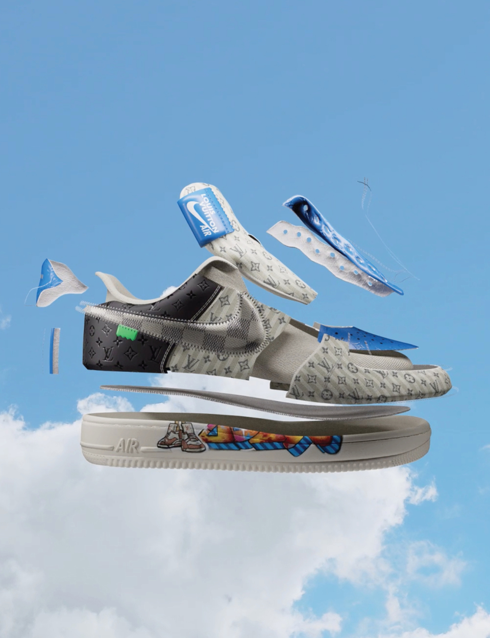
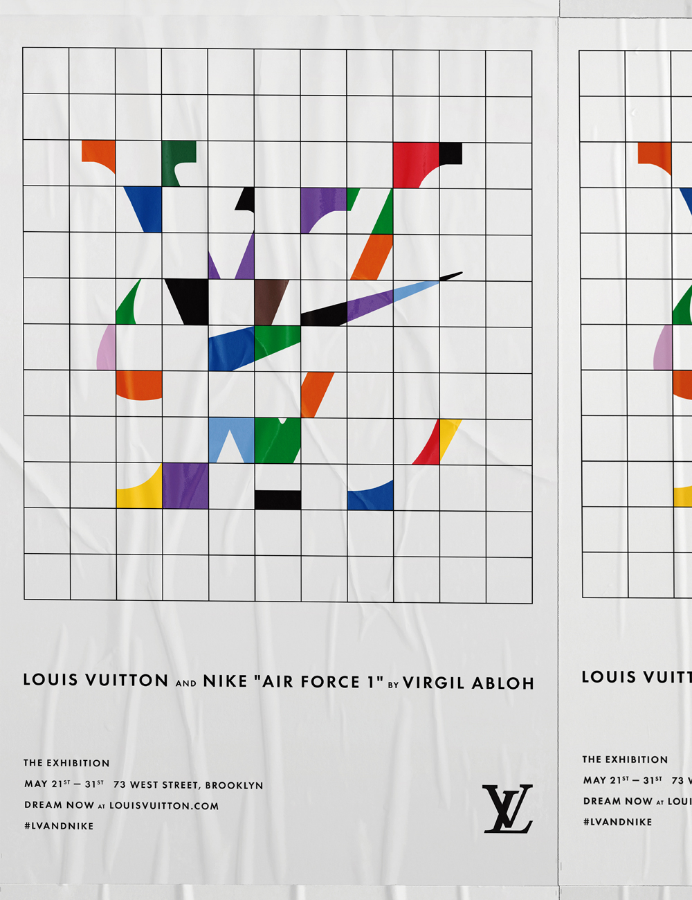
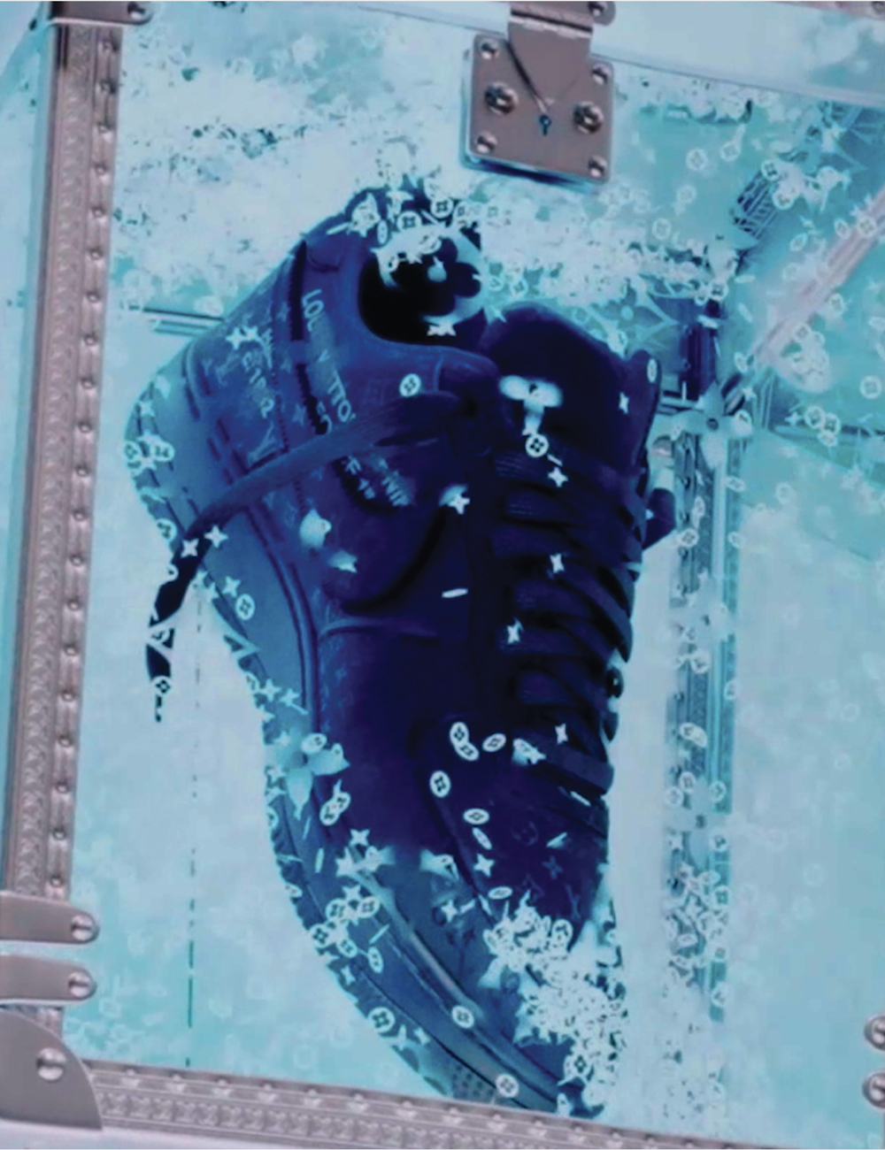
I love working with Louis Vuitton. It’s been an ongoing relationship for more than a decade now and I certainly enjoy the openness and collaboration. For the AF1 project, I knew that the right idea had to unite and celebrate the DNA of Nike, and Louis Vuitton, and also pay tribute to and honor the spirit of Virgil Abloh, who had sadly passed away before the release of the collection. He was a prolific man, from his work at his own brand “Off-White”, and later Louis Vuitton. He used streetwear to help redefine concepts of aspiration, exclusivity, and community within the luxury category. He also worked in many mediums: from music to fashion to art as evidenced in his collaboration with artist Murakami. Through all of this, he was forthcoming about his influences, ideas, and concepts, and you can see it in his establishment of “the post-modern scholarship fund.” So thinking about this and the collection we arrived at the idea of “World In Progress” — a nod to Virgil’s process of iterating designs but also a suggestion that there was, in his work, a continuous push to challenge conventions and to question social structures and ideologies.
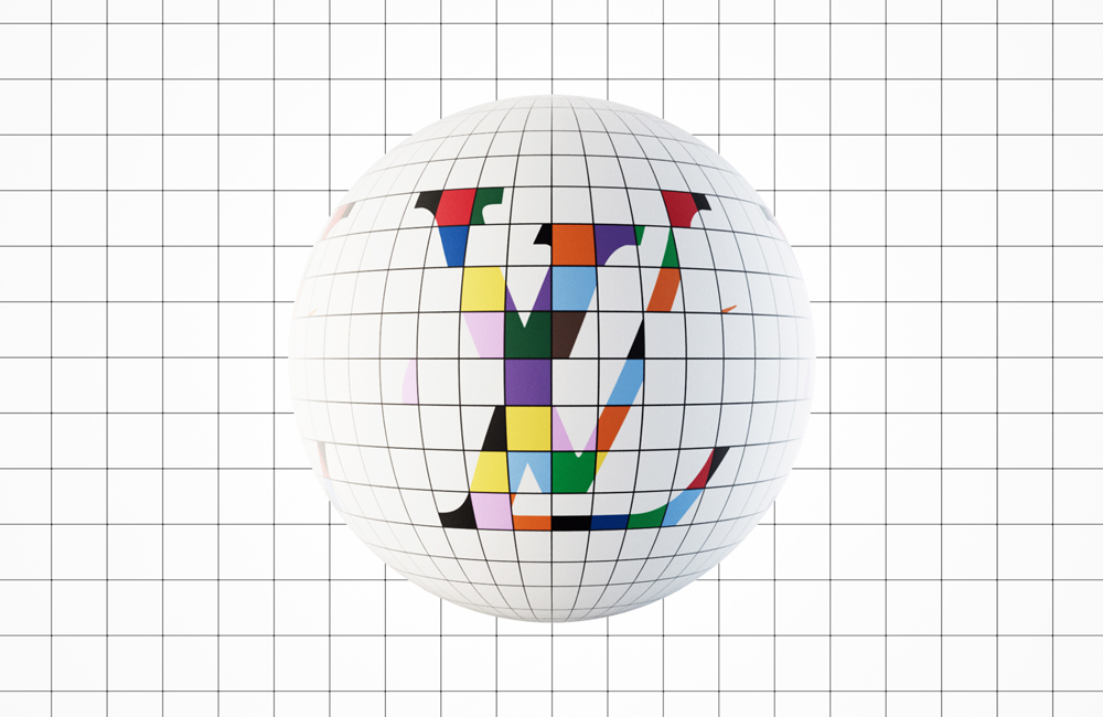
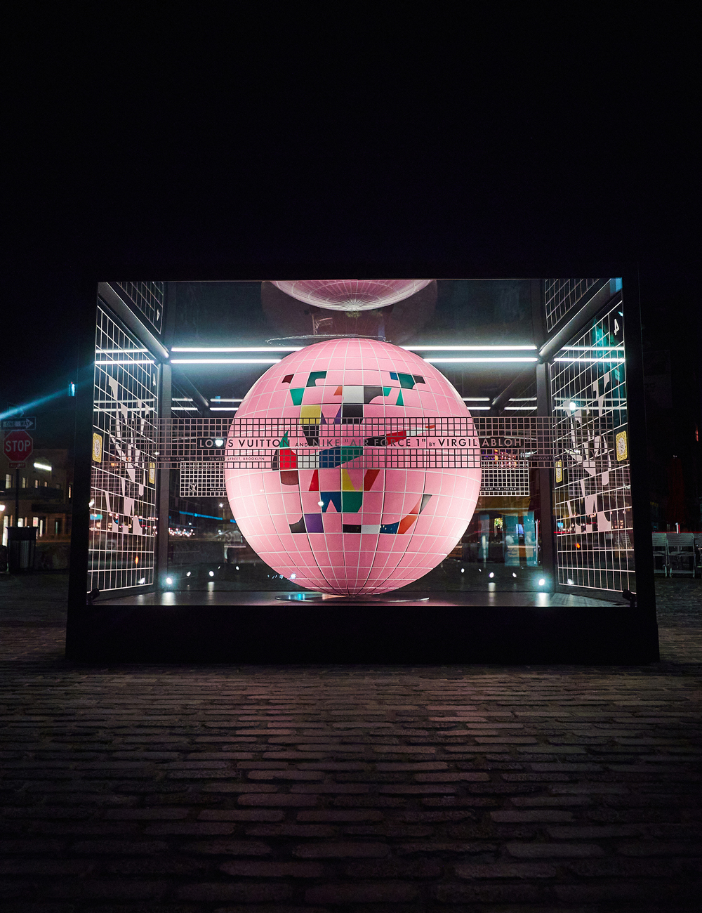
Graphically the idea was represented by a spherical grid that constantly iterated between the two brand symbols which became the blueprint for the exhibition we designed in Brooklyn. The spheres also appeared physically in key locations around New York City and Brooklyn as well as in China and Singapore, then digitally around the world using anamorphic billboards, holographic screens, and web3 technology. The simplicity of the campaign’s graphic language allowed for a very connected experience across all of the touch-points we had designed – Advertising, exhibition, website, and physical out-of-home installations.
Talk us through your relationship with typography.
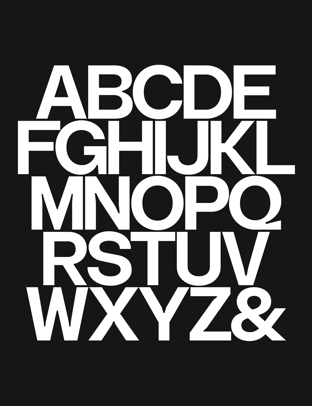
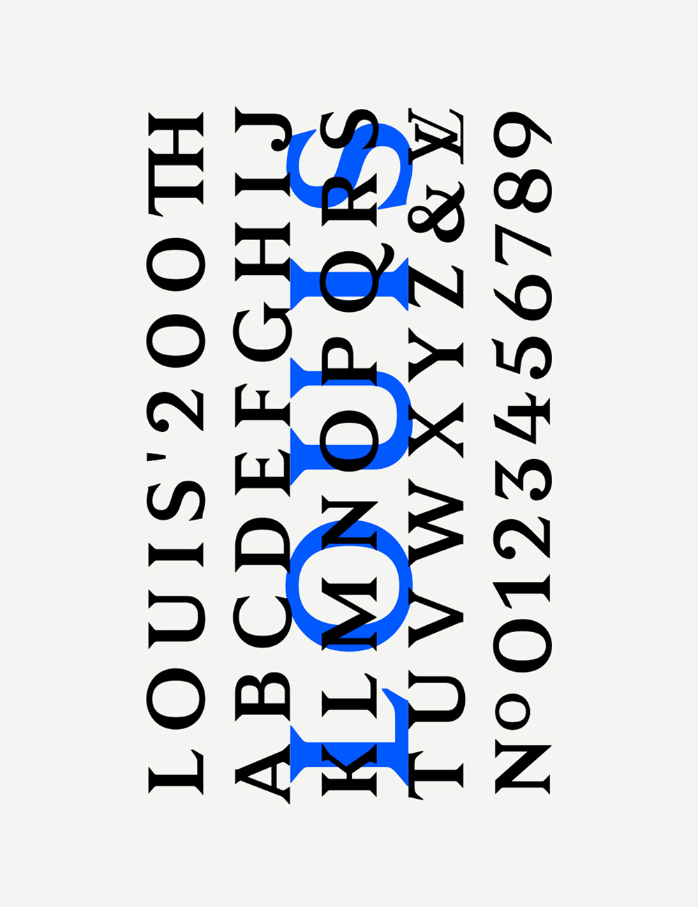
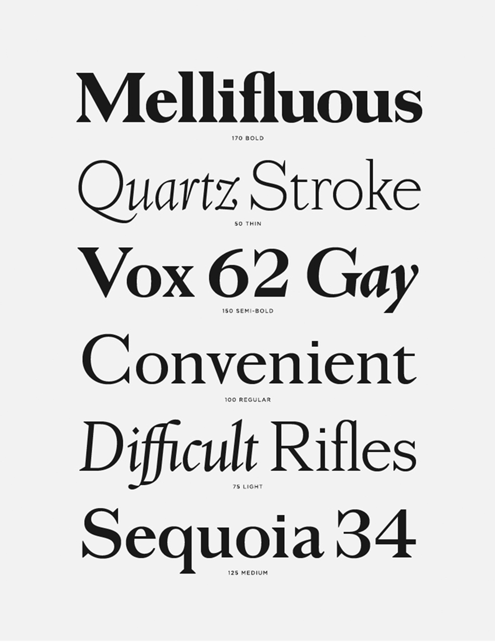
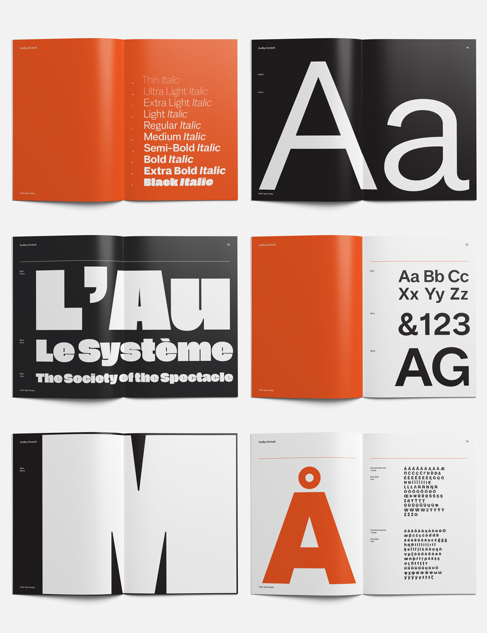
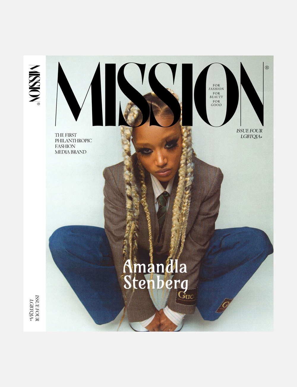
I’ve always been fascinated with type from record sleeves to toy packaging to TV and movie titles etc. I started designing typefaces when I was a student because I wanted to deconstruct the medium I was working with and understand it better. I decided that in order to create my own work I should try to create my own tools and type design just became a part of my process. So my interest in type design grew from a curiosity to trace design decisions back to the fundamental tools and elements of design, in part to avoid falling prey to the law of the instrument. The discipline of type design has allowed a greater level of control and expression in my work and I design original type for almost all of my output today. I also have a couple of type families that I plan to release commercially.
Design has infused every part of our lives, as designers have now a well-established seat at the table. Looking to the future, how do you think graphic design will maintain its significance and value for business and culture?
I don’t necessarily agree that designers have a well-established seat at the table. Looking to the future I think it’s important that designers or graphic designers, in particular, are finding ways to evolve their practice – to understand culture, commerce, and technology. So much of graphic design today is used to simply package the ideas and products of venture capitalists or established institutions and the result is often a lack of distinction. Many brands put too much onus on content, influencer, and paid media. Design can be seen as less of a priority. When you look at brands that prioritize and understand the power of design it can empower elevation, clarity, surprise, and delight and cut through the saturated markets. So to have a well-established seat at the table creatives must be able to have real strategic conversations about the difference that their work can make. Designers must keep insisting that there is an important place for them in culture but also acknowledge that the conversations to be a part of might not be taking place in purely creative circles.

What is the conceptual process you follow to create a campaign, brand identity, or experience that serves its intended purpose while being exceptionally designed? How do you create the union of function and aesthetics in a world where both are equally needed?
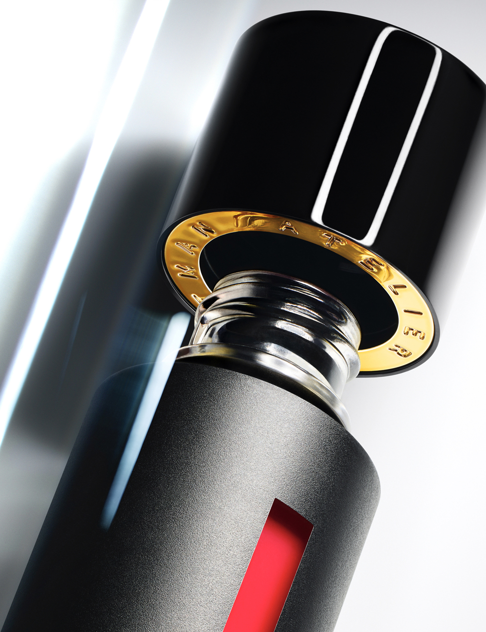
We always begin by defining a clear purpose for what we create. This helps us to identify the opportunity to do something exceptional. We want to avoid simply being polished, predictable, and efficient – those are ‘death cuts’ for creativity (as a friend of mine put it). And because our work involves a synthesis of many disciplines our process is not linear. We approach our work from a place of knowledge and experience within those disciplines but also from without, from an integrated perspective. We are grateful to have clients that really appreciate the value of creativity but also clear strategic thinking.

Graphic design is proven to have the power of encouraging people to stop and stare, think, and create a moment of pause for themselves. In which ways do you think this asset can be used to reflect on key issues from technology to sustainability and well-being?
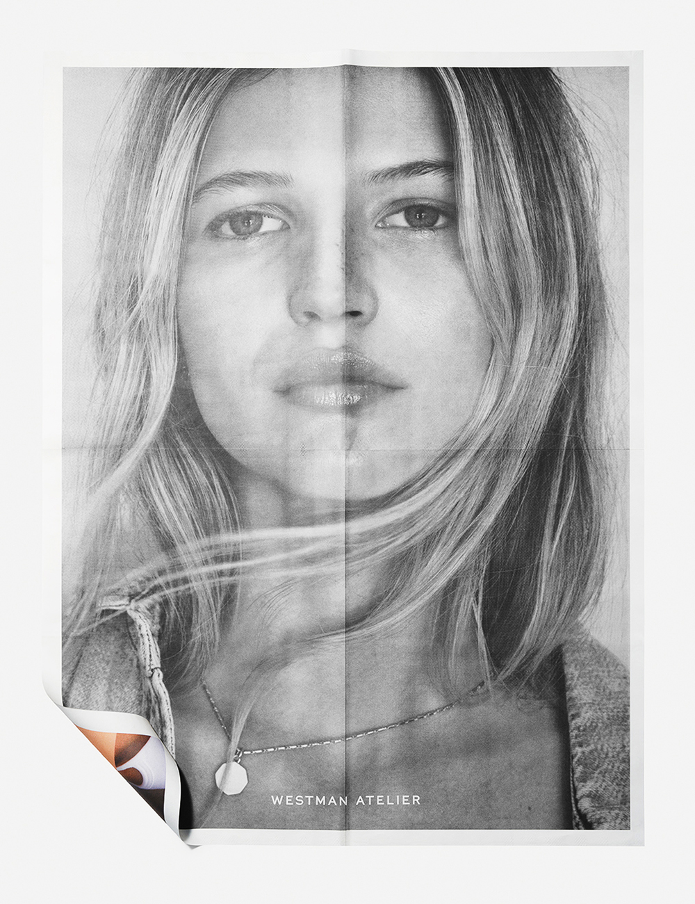
Graphic design plays a role, from the signs and symbols we use to identify a cause to civic design such as the typography and layout of ballots. Good design can help to make information accessible, promote action and remove barriers to democracy. Design and technology are powerful tools for the interaction and sharing of ideas. I think it’s great that technology is providing alternative opportunities for creatives, such as decentralizing creative education. Advances in hardware and software are creating new possibilities for creative and industrious minds. It’s a huge area of interest for us as we think about the evolving media landscape.
Sustainability is also important to us as a business. We want to work with people and brands that care about sustainability and we are constantly looking for ways to make products that are better for the environment. We all know how important it is to consider the impact of certain printing methods or the carbon footprint created by manufacturing and shipping. It’s interesting how so many sustainable or recyclable products now share or surpass the beautiful aesthetics of their legacy analogs. Sustainability doesn’t need to be a compromise of aesthetics and it often brings an element of joy to the experience of an object.
What would you suggest in terms of graphic design and experiences, in order to incorporate design into Greece’s everyday urban life in a meaningful way? Do you have any thoughts on how to invite people to use the public space in new ways?
I’m new here, but I think the answer is always in sharing more. Every successful creative agency or design consultancy has an obligation to share, build community and invest in the generations coming up. Public spaces could be used to share knowledge and experience. I was inspired by initiatives such as Redhook Labs when I was in New York or the Rubric Initiative that promotes inclusion and diversity in the fashion industry. I’m also personally keen to find a way to contribute to the development of initiatives here and I’m open to the possibility of collaborating with local studios.
Are there any designers you admire and look up to?
It’s a long list from Shōji Kawamori or Floro Dery to Eileen Grey, Peter Saville, Enid Marx, Barney Bubbles, Robert Brownjohn, Takenobu Igarashi, Margaret Howell, Jan Tschichold, David Adjaye, and more but in many instances, I’m more inspired by individual pieces of design than designers. I take a lot of inspiration from reading, art, and film, I like the writing of Juan Baudrillard, Terry Eagleton, Stephen Bayley, Dick Hebdidge, etc, and the work of Chris Marker or Adam Curtis. But when it comes to creative individuals that inspire me I think I’m most inspired by the team and people I work with every day.

What are you excited to have coming up in the future?
All will be revealed in good time but in the present, I’m excited about developing our studio culture across New York and London and building the studio here in Thessaloniki. I think it will be a very interesting dynamic.
