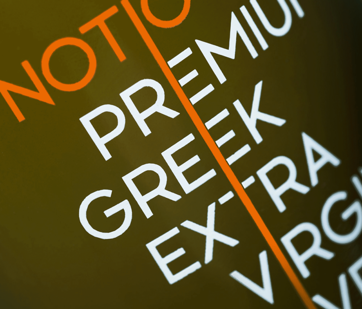
The main idea behind the packaging design of the Notio Premium Greek extra virgin olive oil was to make clear that it was produced by a company proud of its Greek and – more generally – southern European roots. In the European South, people “see things slightly differently”. As a result, an outsider usually gets the impression of disorder, whereas in reality it is just a matter of a different logic, a different set of rules that may not always be what one is used to, but ultimately work. Similarly, the letters that form the brand name on the bottle and the overall identity of the brand, on a first look may appear disorderly, as there is no apparent alignment. A closer look however, reveals that the alignment of each word is based on a central axis that unites all the typographic elements. This axis symbolizes durable Greek values, such as simplicity, purity and clarity. Following the same logic of “slightly different”, the texts on the back of the bottle are vertical instead of horizontal, which would be the norm. The typeface used for the brand and product names was designed by The Comeback Studio from scratch. Each bottle is individually numbered, with its unique number written by hand on the top of the safety strip that secures the cap.
Notio Premium Greek Extra Virgin Olive Oil won a merit at the 2014 Greek Design & Illustration Awards (EVGE) in the Olive Oil Packaging category.
