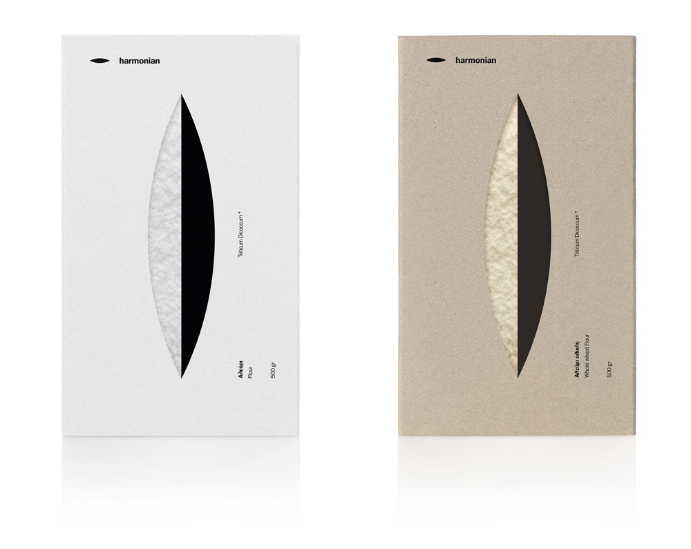
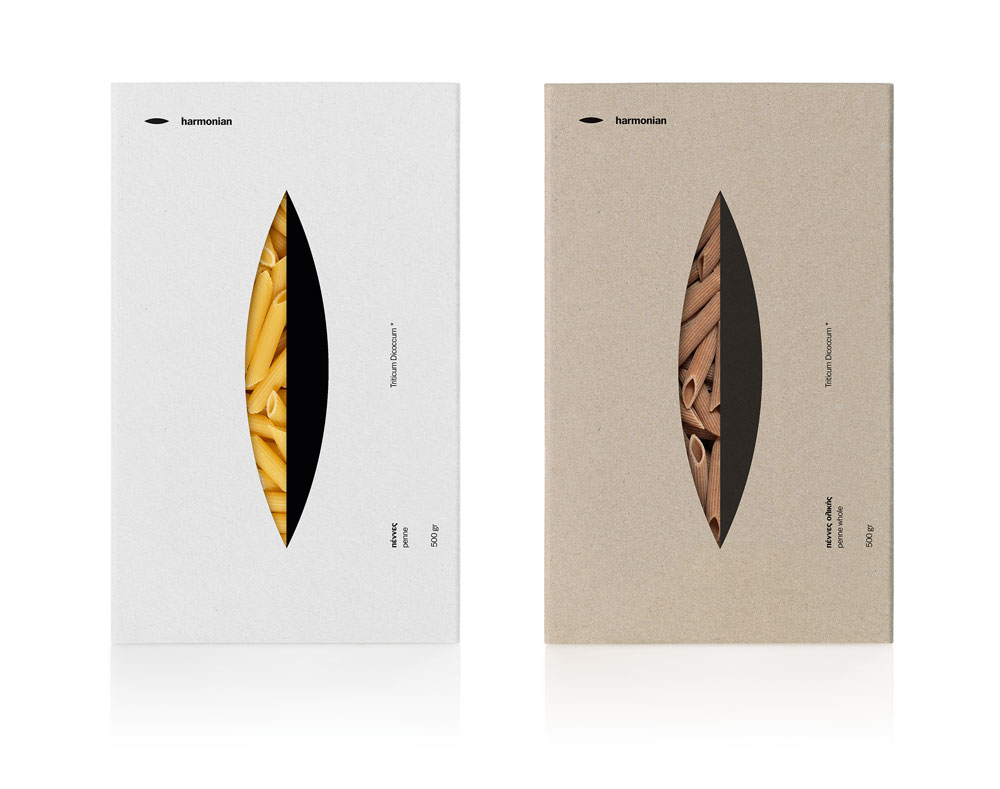
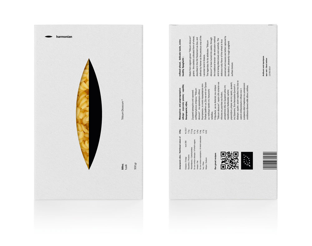
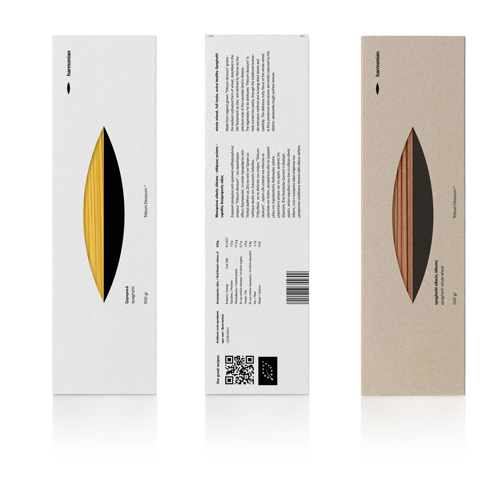
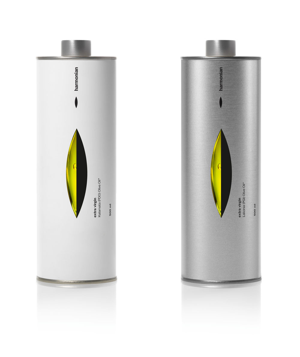
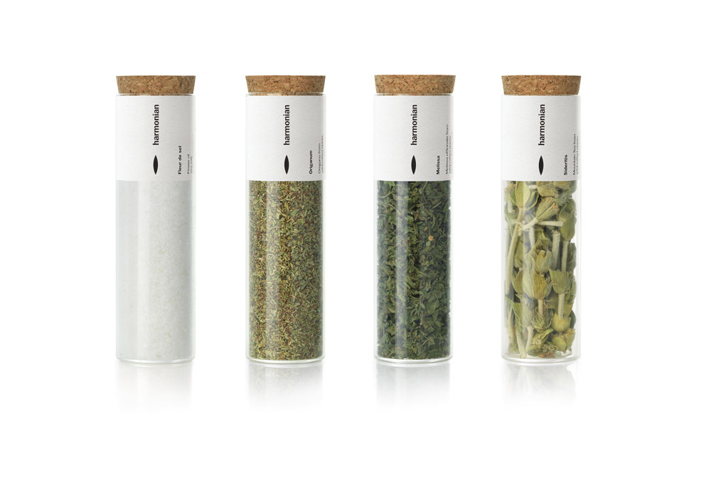
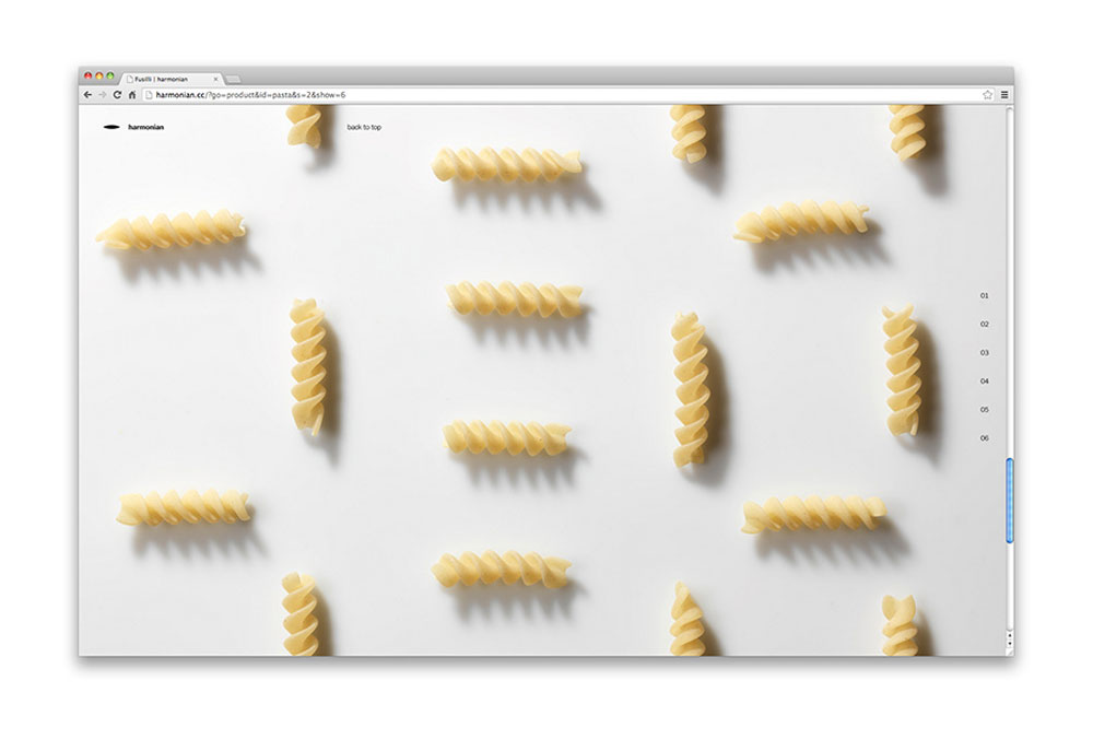
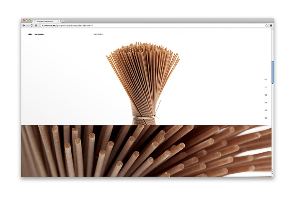
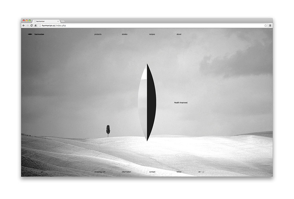
This packaging design introduces a radical line of food products, suggesting a new, healthy and tasteful way of life in the most definitive way. Targeting health-conscious and demanding consumers, the design brief demanded an aura of exclusivity, which would nevertheless be rooted in elegance and measured values. Mousegraphics decided to convey radical simplicity and hint at a different modus vivendi, addressing a wide range of products including olive oil, flour, pasta, herb infusions, fleur de sel etc. Many of the products are based on the Triticum Dicoccum variety of wheat seeds, which was widely cultivated in the ancient world. Thus, they opted for a design that would convey both the nature of these valuable seeds and the harmony and balance of their spindle shape. In addition, inspired by Lucio Fontana’s famous Tagli (slashes) pieces, they designed simple white surfaces – packages that are distinguished by the illusion of a cut, a twofold spindle-like incision on paper. The decision to blur the boundaries between two-dimensional and three-dimensional space is a simple yet decisive design gesture that alludes to a space system and calm connoisseurship. The Harmonian received the “Best of Show” at The Dieline Awards in 2014.
Harmonian by mousegraphics

