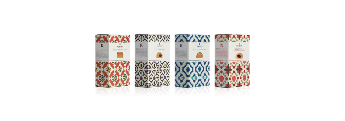
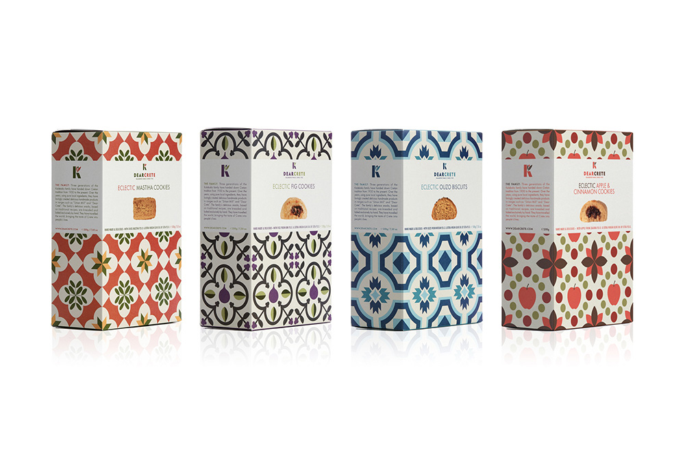
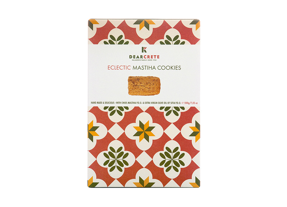
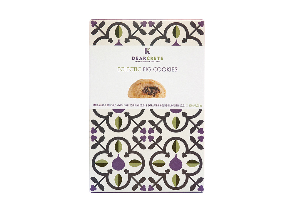
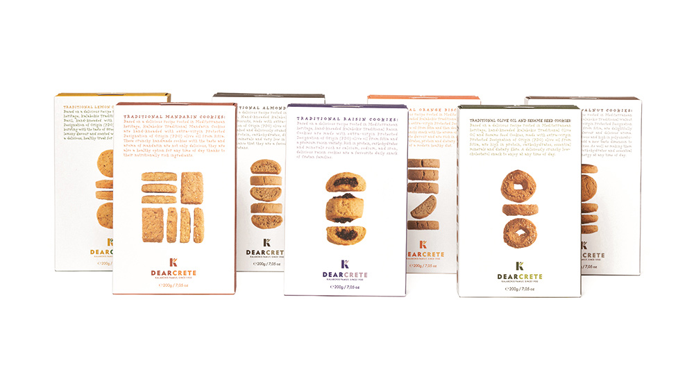
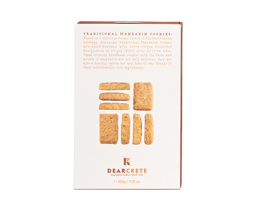
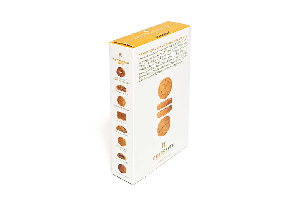
The main objective behind rebranding these traditionally handmade Cretan cookies and biscuits was to diversify from the competition by creating a clear distinction between their quality and premium taste on one hand, and their local origin and history on the other. The logo was based on the Greek initial K (of the word ‘Crete’ in Greek) and the shape of an olive, which is the main ingredient of all these products.
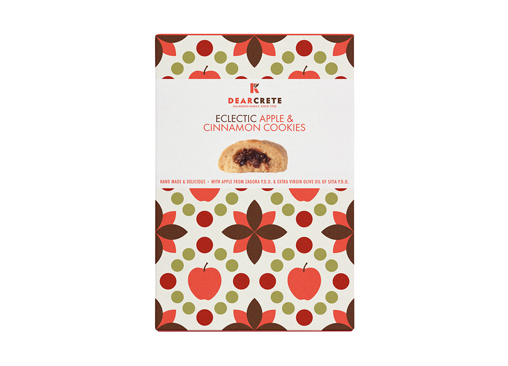
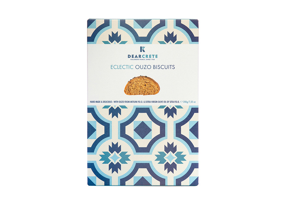
The design approach placed great emphasis on the products themselves, but in a different way for each product line. The “Eclectic Series” gives emphasis on illustration – different for every taste, depending on the ingredients of each product – using bespoke patterns, a distinct color code, and bold typography.
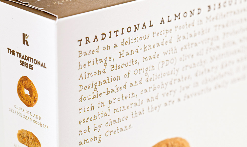
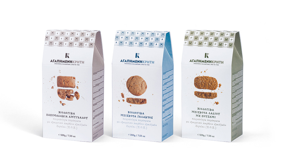
In the “Organic Series”, emphasis was placed on the purity of the materials by using an almost completely white packaging and images of bitten cookies. In the “Traditional Series”, a photograph shows each cookie in a white background, while the embossed printing on the packaging suggests an aura of quality and ‘classic value’, in an otherwise entirely contemporary approach.
The project was awarded a red dot communication design award (2013) and an Ermis Award (2013).
