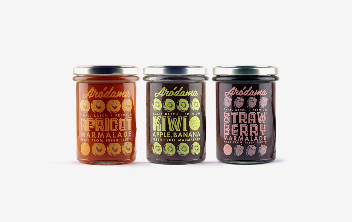
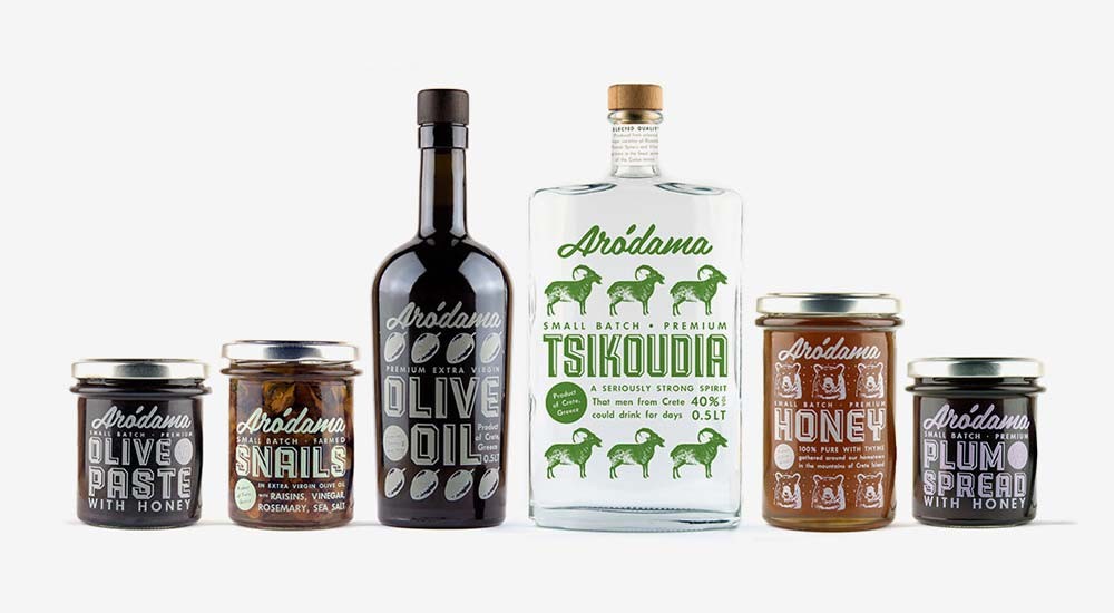
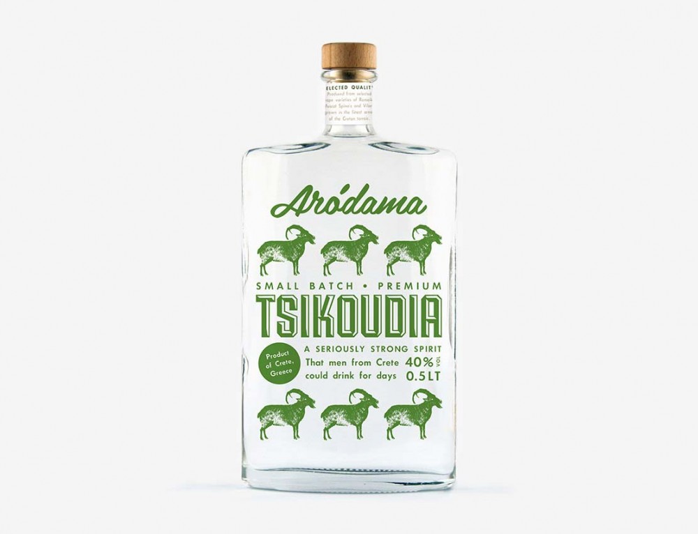
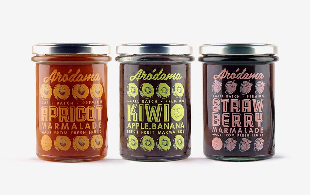
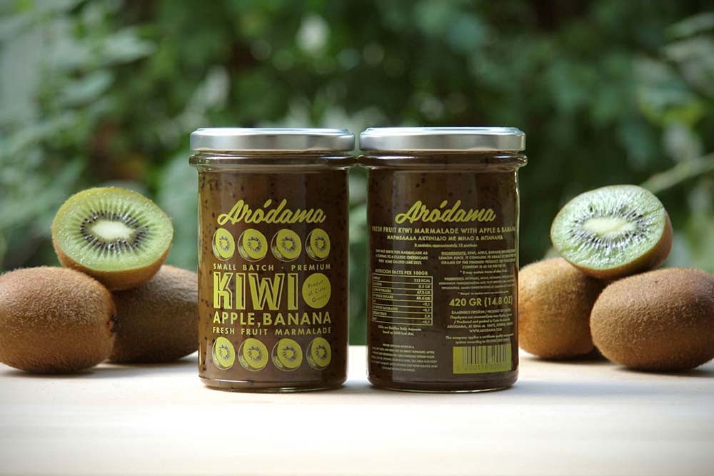
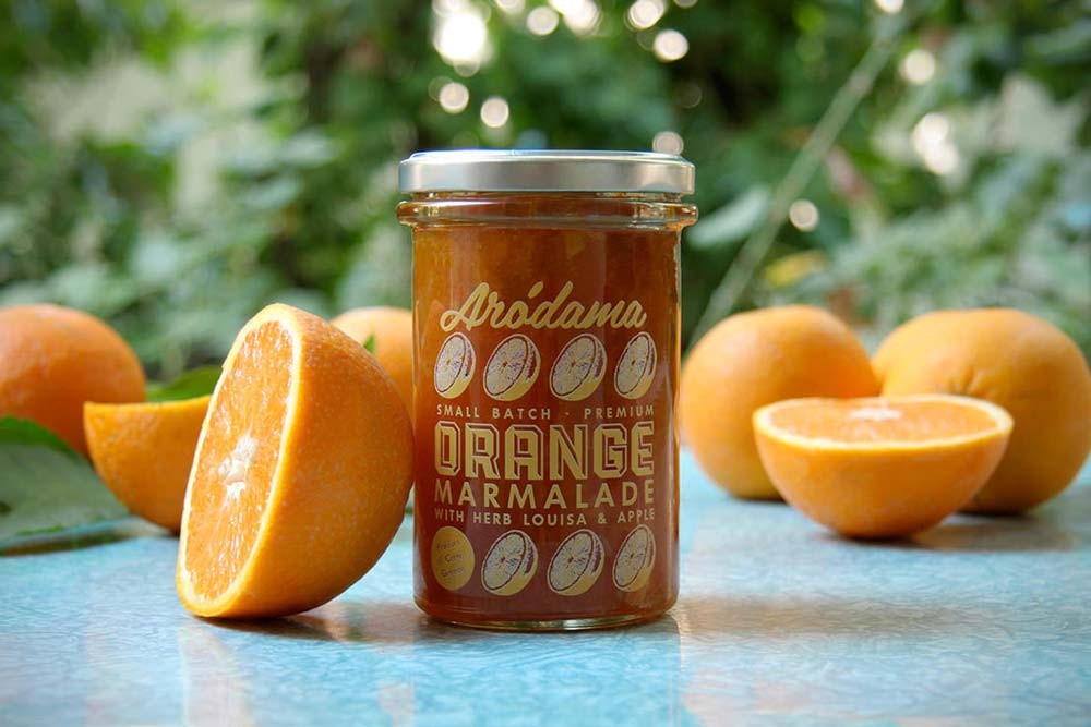
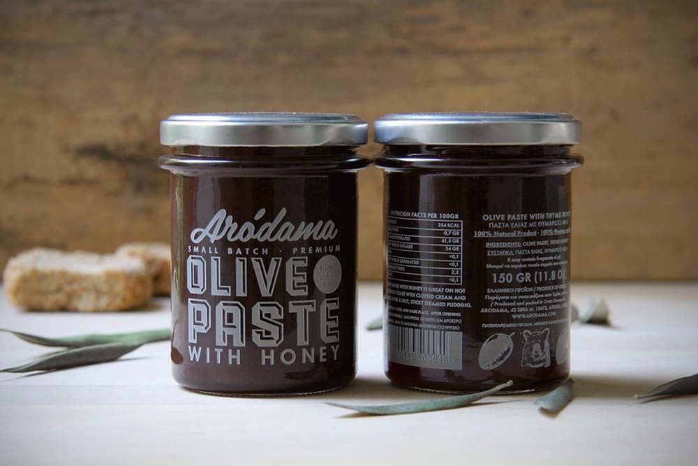
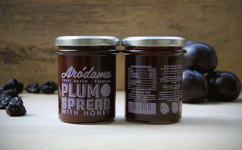
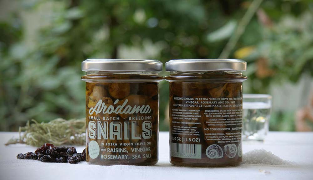
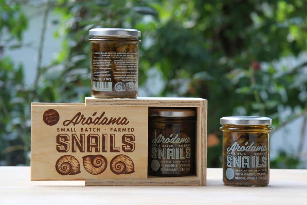
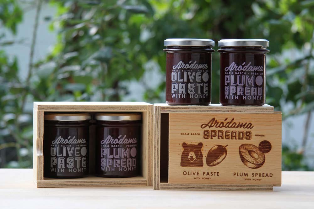
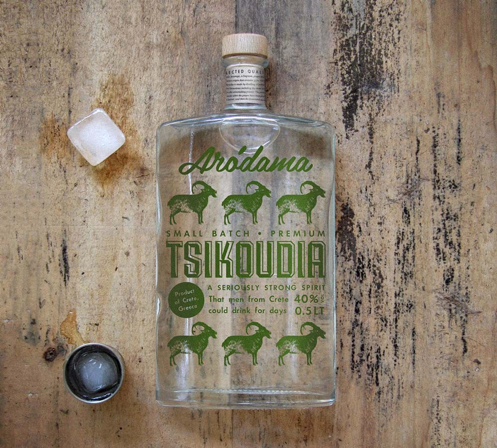
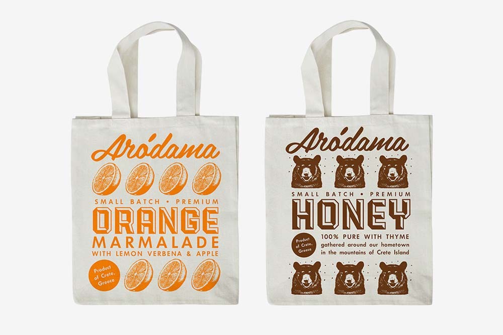
The branding and packaging design of this series of traditional Cretan products (Arodama stands for tender twig in the Cretan dialect) uses vivid colors and illustrations, giving them a cheerful and playful character. Food is one of the best joys in life – especially for Cretans – and Bob studio aimed at transmitting that through the chosen design. They drew illustrations for every product showing its basic ingredients and created a pattern that applies to all labels in order to achieve a consistent image for the whole product family. Products and corporate identity share the same design elements in order to create a direct relationship between them and a strong consistent image. The design patterns and illustrations have been implemented in jars, olive oil and raki bottles, packages, press kits, bags and the website.
Arodama Cretan products by Bob Studio
