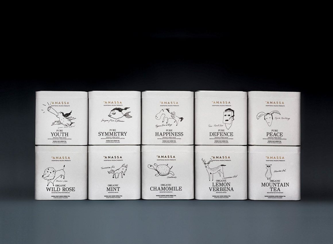
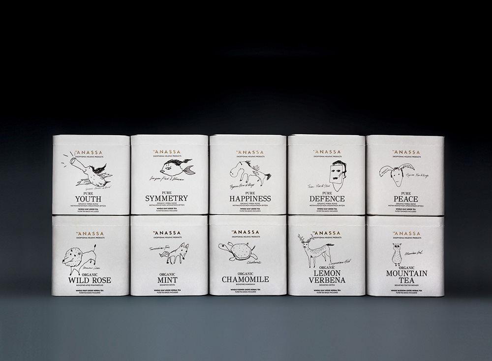
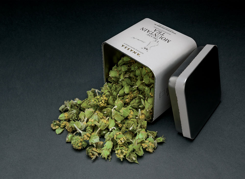
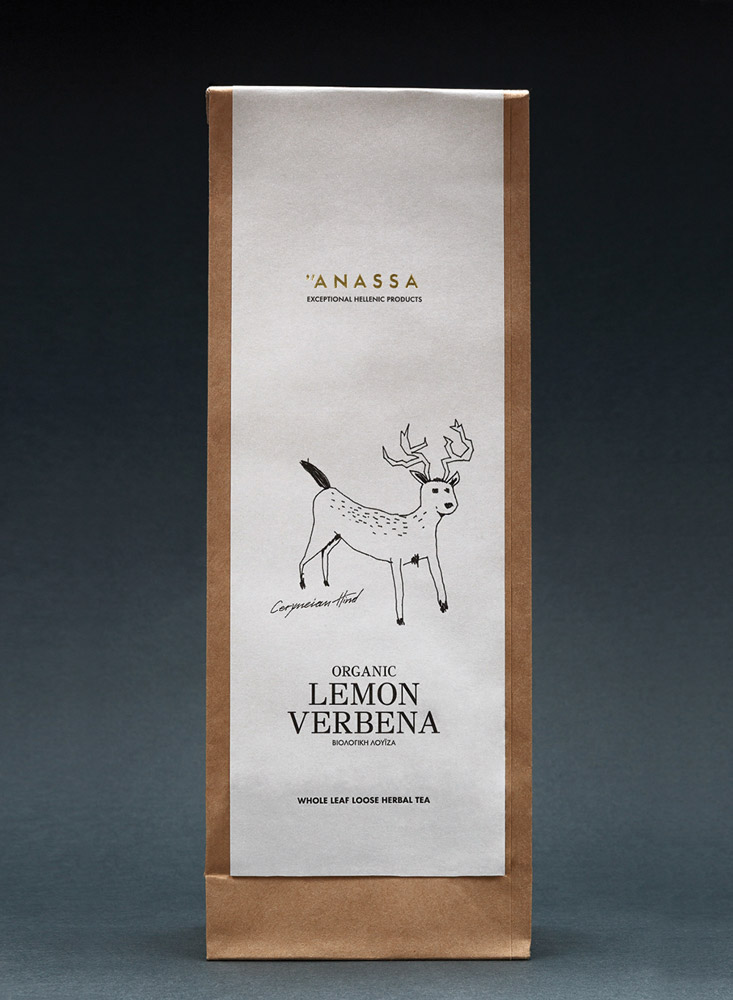
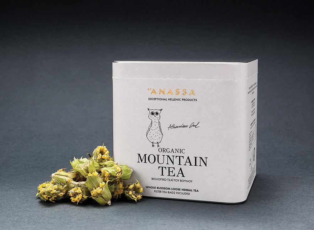
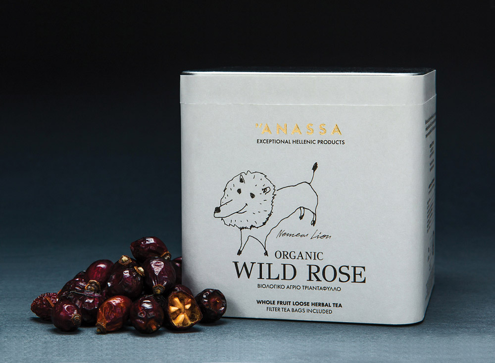
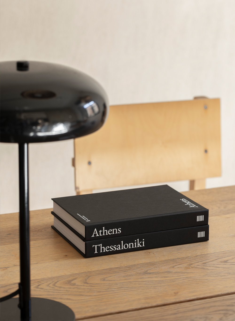
In the design of this logo, MNP used multi-tone Greek to emphasize the origin of the brand’s name (‘Anassa’ stands for ‘Queen’ in Ancient Greek) and to give the ability to non-Greek speakers to read it correctly, stressing the first letter ‘A’. Regarding the packaging, the designers used illustrations of creatures from Greek mythology, whose special powers matched the properties of each of the contained herbs. The sketches on the packaging convey a cheerful and playful feel, while underneath the mythical creatures there is a handwritten description of the herb’s name, property and reference. The only color on the packaging is the distinctive color of its herb.
Anassa Organics by MNP Design
