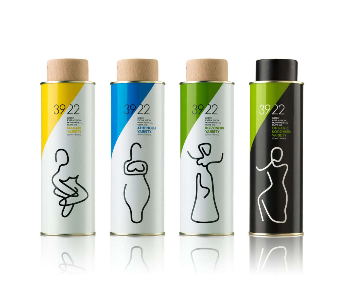
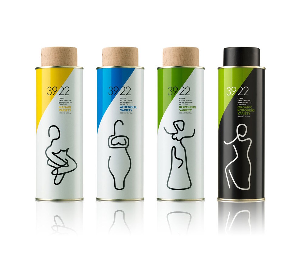
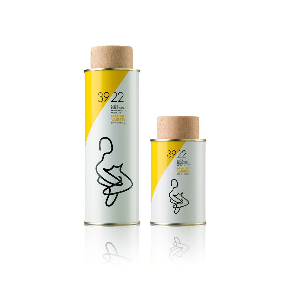
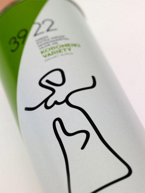
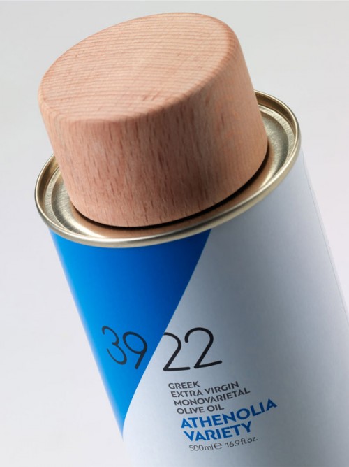
2yolk provided the packaging, visual identity and naming for 39/22, a young company which exemplifies the conspicuous talent of the Greek land for producing exceptional foods – olive oil being the most important of them. The name was chosen after Greece’s geographical coordinates, directing straight to the heart of the Greek landscape and creating an identity that balances between the virility of the people who harvest the land and the opulence of mother Earth.
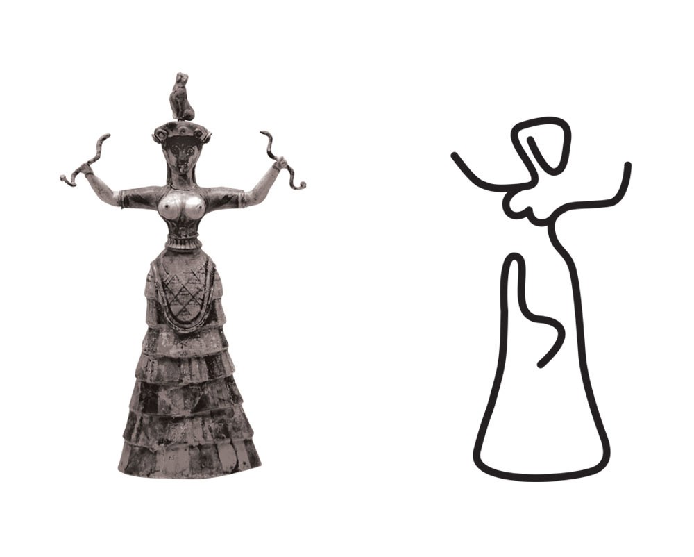
The female figures that adorn the 39/22 range of single varietal olive oils were chosen in order to emphasize the timeless character of the traditional Greek olive varieties that have been part of Greece for thousands of years. The design of each figure derives from ancient Cycladic, Archaic and Minoan female statuaries. For each of these cultures and periods, the image of the woman was used to signify the “Great Mother”, a symbol of fertility, rebirth and continuation of life – concepts identified with the sustainability of the Greek land. The wooden lids of the tin containers were chosen as a direct reference to the origin of the product, the tree.
The project won a Red Dot Award for Communication Design in 2015.
