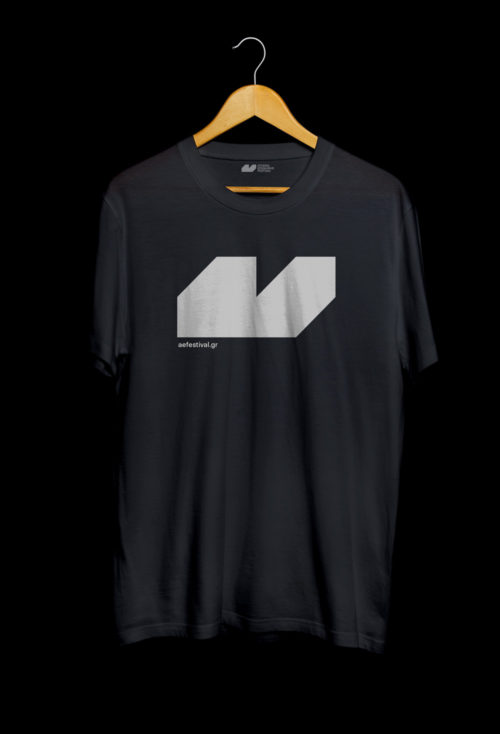
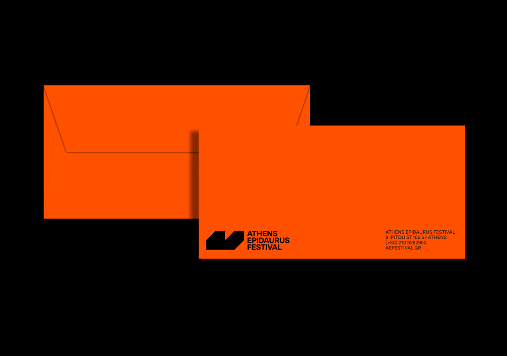
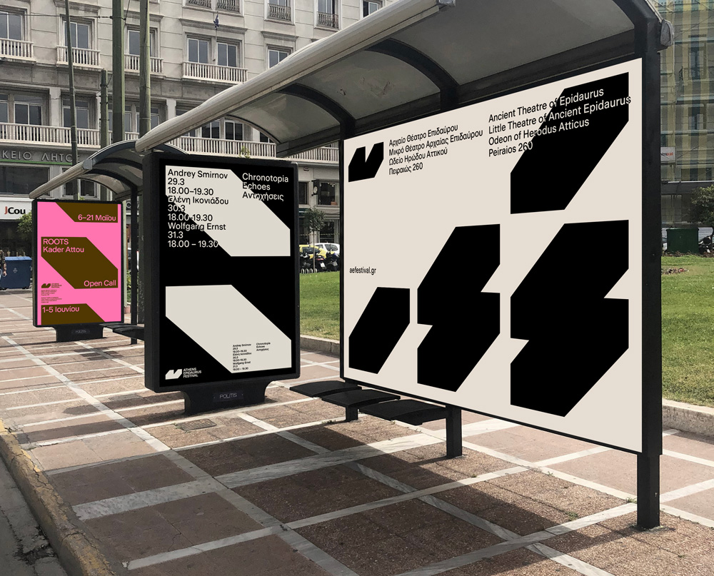
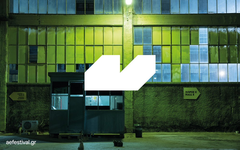
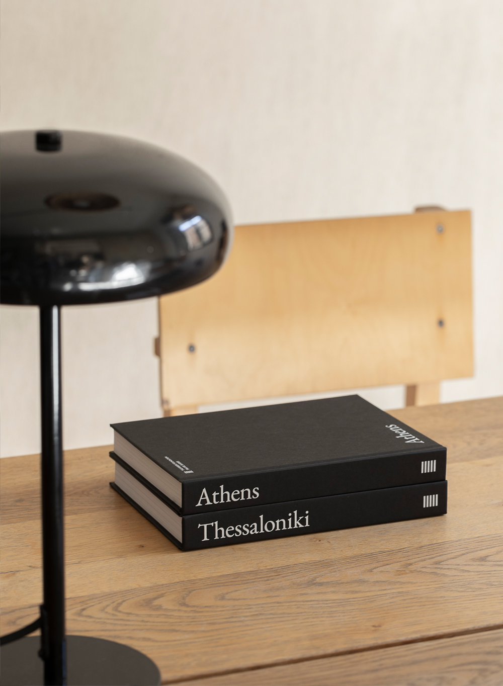
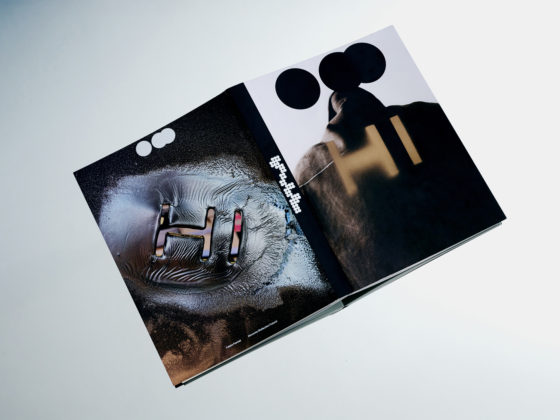
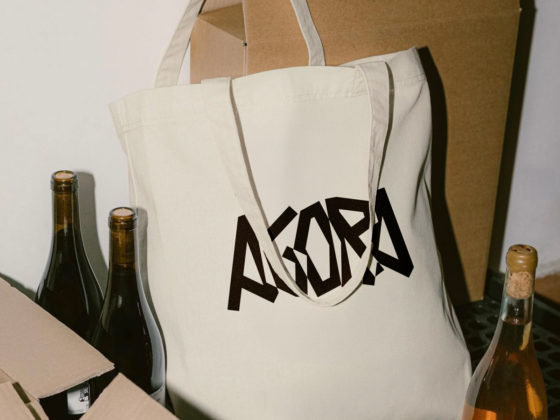
Reflecting both the fresh vision of the Athens Epidaurus Festival and the demand for stronger emphasis on promotion and openness in connection to Greece’s leading cultural organisation through various applications, the Festival’s new brand identity responds to two basic needs.
First and foremost, it is a powerful, symbolic statement, whose conceptual references, connotations, and interpretations visually encapsulate the Festival’s core philosophy. Furthermore, as a tool of communication, the new brand identity is multifunctional, creatively flexible, and experimental, effectively covering a wide range of applications. At the same time, it is worth mentioning that it retains the Festival’s spirit and its distinctive historical features.
The new brand identity of the Athens Epidaurus Festival expands the standard typographic form, eschewing a narrow interpretation of language and creating a new visual text. Through abstraction and density, the final brand identity is built upon the following cornerstones:
- Monolithic form
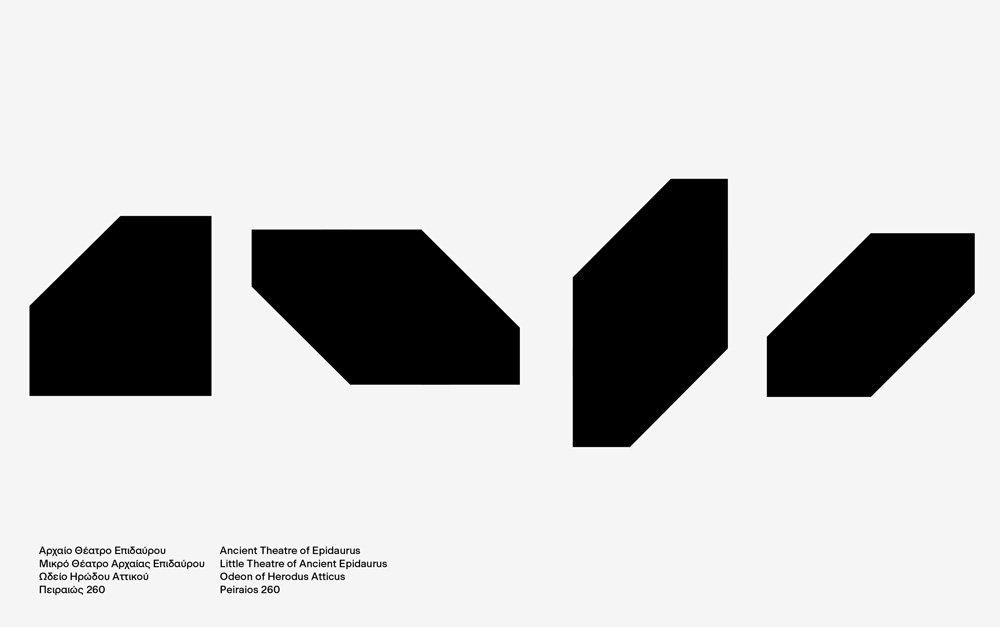
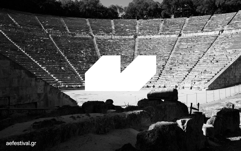
The form of the new brand identity references the morphology and historic value of two world-famous, iconic theatres: the Ancient Theatre of Epidaurus and the Odeon of Herodes Atticus. The materials and sheer volume of these monuments, the sharp contrast between light and shadow, and, perhaps more importantly, their substantial contribution to the performing arts, are captured in the strikingly modern, conceptual design of the new brand identity. Its pronounced density, three-dimensional volume, absolute, almost primitive, geometric form, and overall architectural aspects all work to that effect.
- Dynamic form
A dynamic form, at once static and kinetic, has been selected. The Athens Epidaurus Festival is Greece’s foremost cultural festival and synonymous with a strong sense of tradition. Nevertheless, it is also a modern and international Festival, continuously evolving, experimenting, and expanding its horizons. The Athens Epidaurus Festival brand identity moves forward in time, while also retaining a strong connection to its core, place of origin, and long tradition.
- Experimental form, open to multiple interpretations
The new brand identity of the Athens Epidaurus Festival encourages, seeks, and addresses the constant exploration of ‘form’; new interpretations and how these can be rendered. Establishing multiple correlations between subject and object is a central concern in both the performing and the visual arts. Abstraction expands our perception, thus making a form open to multiple interpretations.
- Typography
As far as the typesetting of the logo and new brand identity are concerned, we have used uppercase letters as a visual reference to the distinctive typeface legacy of the Festival, immortalised over the years in numerous notable posters designed by major artists.
Dimitris Papazoglou, Visual Communication Designer
‘The visual system created by internationally acclaimed Designer / Creative Director Dimitris Papazoglou and the DpS / Athens team constitutes a stable, recognisable image fostering dialogue with our continuously evolving identity; a system of communication aiming to complement our vision and our wishes for a Festival free of space and time constraints.’ — Katerina Evangelatos, Artistic Director
