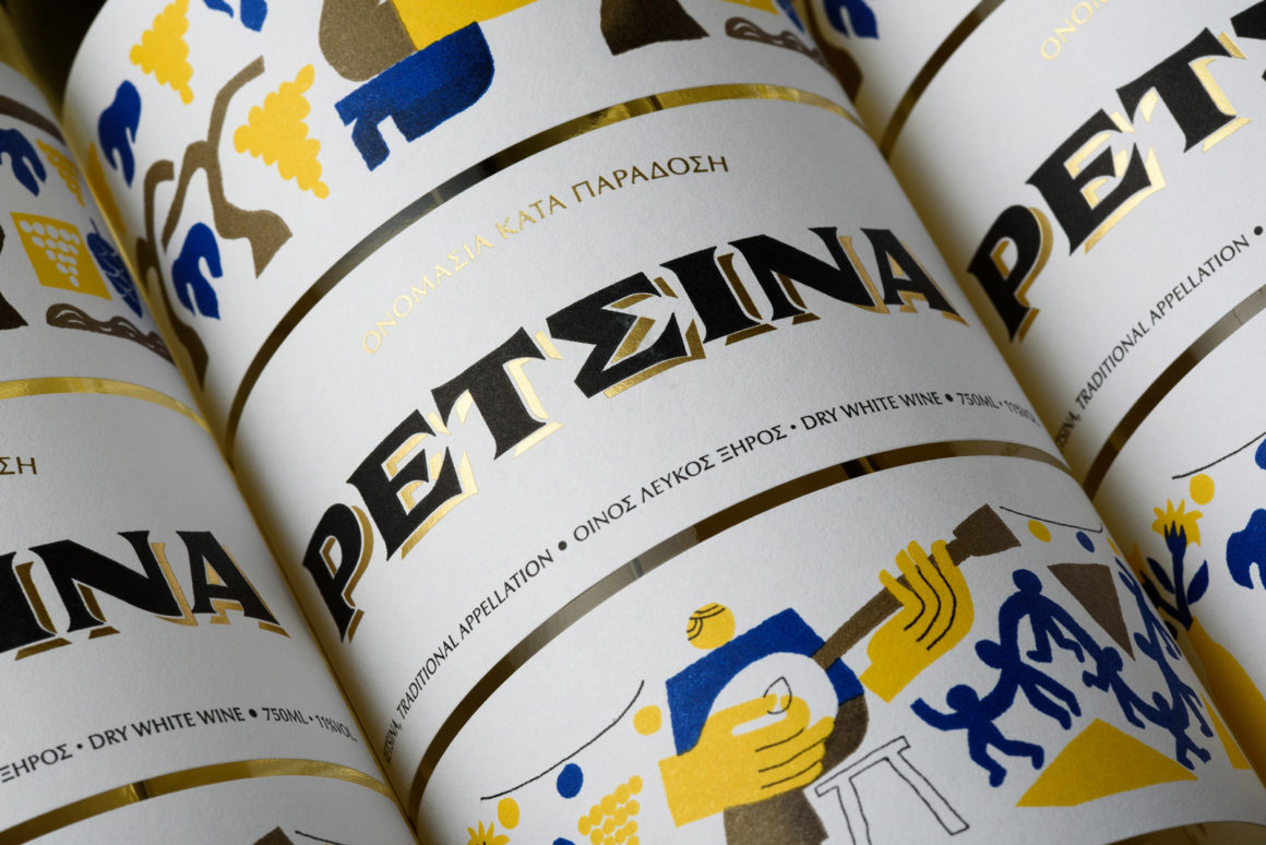
Retsina is one of the oldest kinds of wine globally, with more than 2000 years of history. Easy to make and to preserve, it was folk’s favorite in ancient Greece and continues to be one of the most popular wines in the country, especially during traditional carnivals and fairs.
But although it’s quite affordable, it seems to lose connection with the younger audience, being viewed as old fashioned and outdated. LIDL, the global discount supermarket chain, decided to re-introduce Retsina to the younger consumers, 20-35, and asked us to give them a hand.
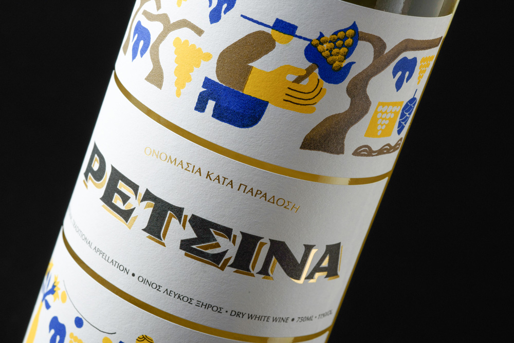
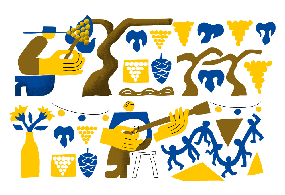
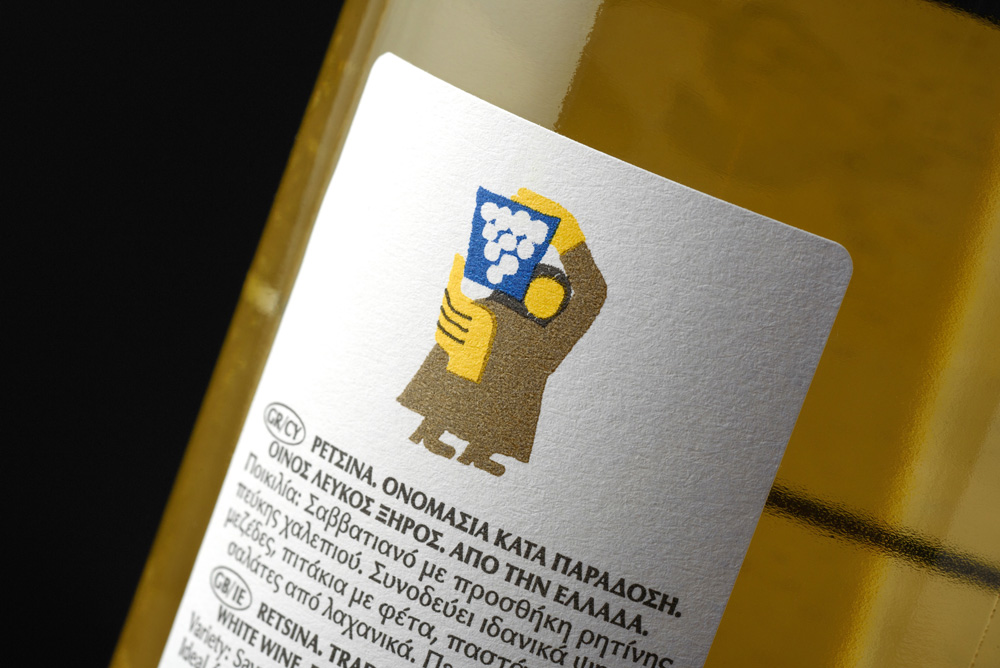
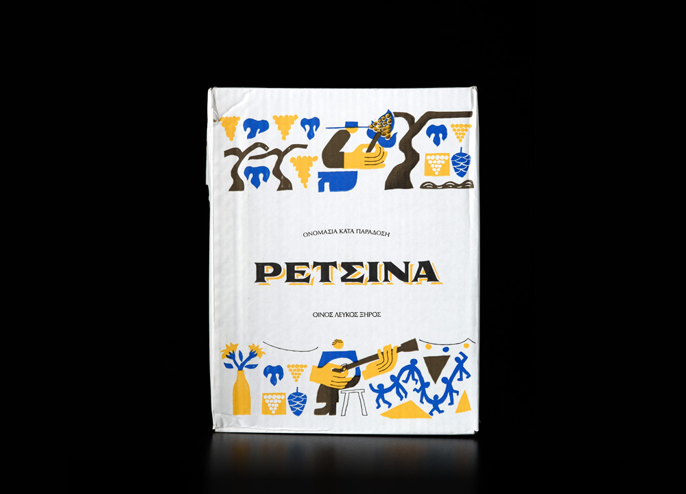
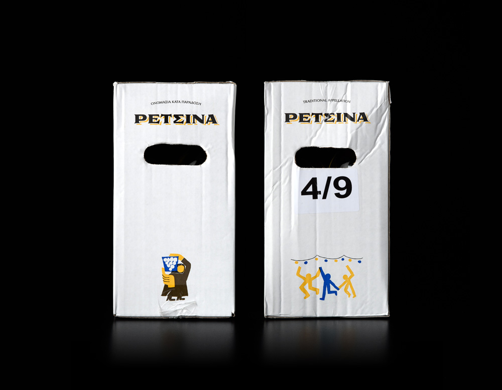
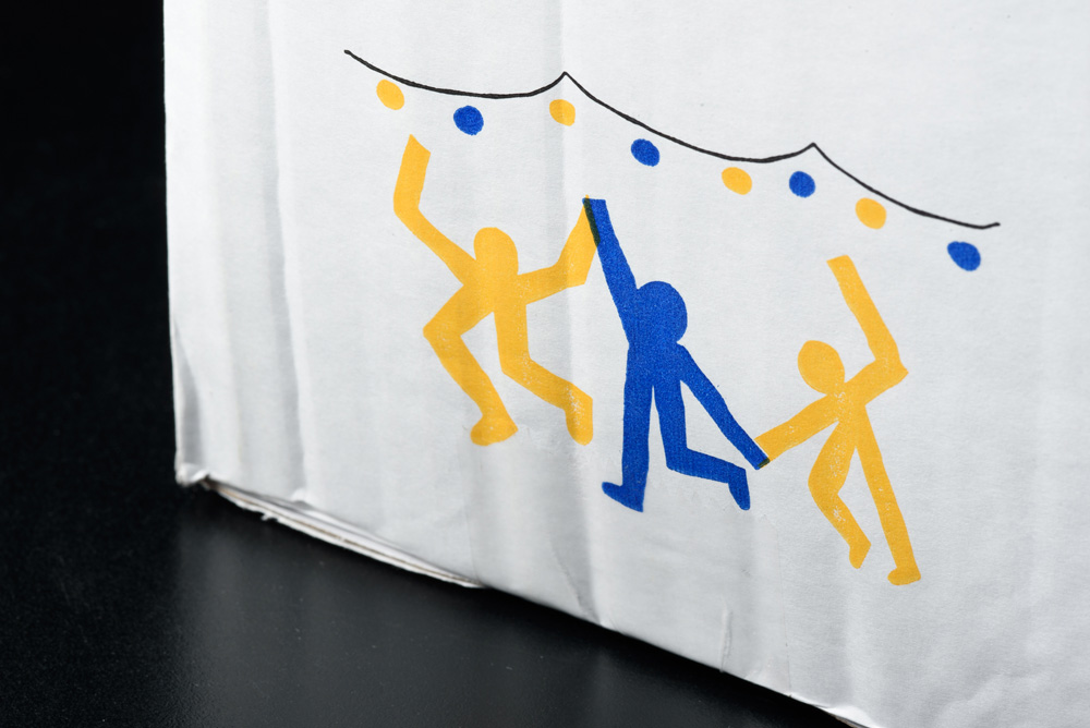
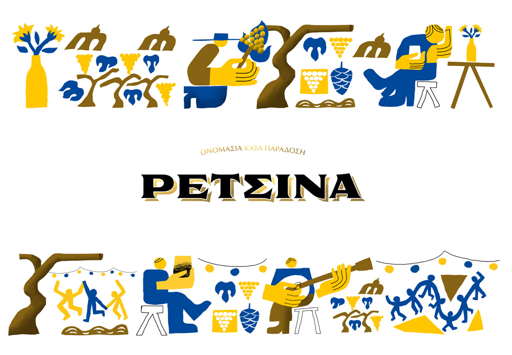
The theme of the illustrations is an almost euphoric union between people at traditional festivals (that every Greek can relate to, no matter their age), as well as the strong connection between people and nature in the making of wine.
Although the imagery of this kind usually falls under folklore, we wanted to give it a form that stretches from antiquity to the present. So we got our inspiration from great festivals of the ancient Greeks that worshiped Dionysus, the god of wine, as well as contemporary painters that transmitted the Greek allegro spirit across the world.
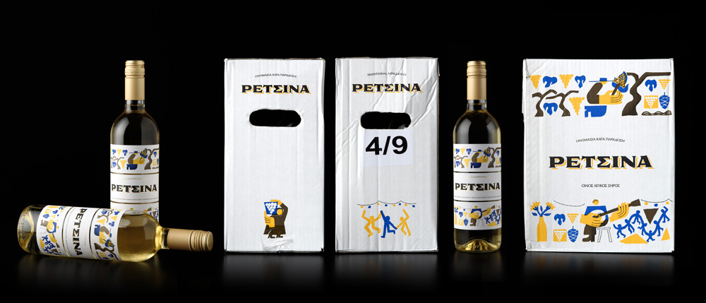
The color palette was defined by three major components of the wine itself: the heartwarming yellow of the bright sun, the earthy grey-brown of the vine bark, and the deep blue of the Greek sky. Gold – a color common to more luxurious wine varieties was used for the cap as well as the shadows that highlighted a name of humble origins, to imply the high quality of the wine itself.
The client asked us not to use a brand name so we used the category name, and we created a bold, straightforward wordmark with classic elements. By using the gold foil to give a more luxurious note, we aimed to balance the contemporary modern look with a more traditional look & feel.
