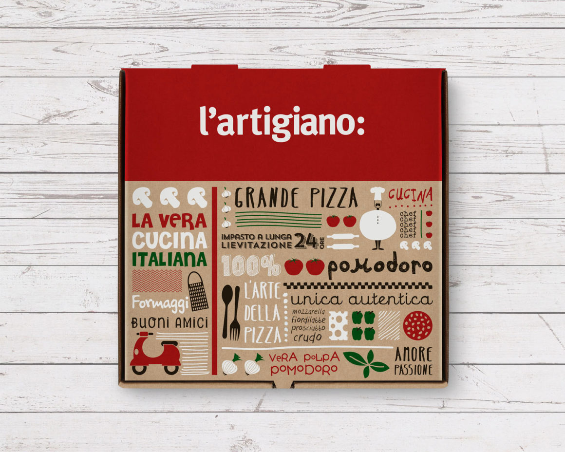
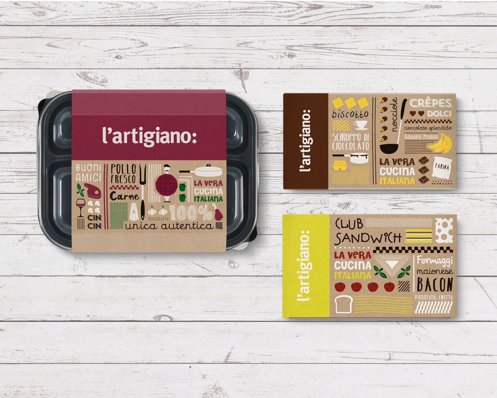
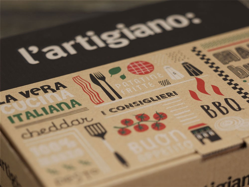
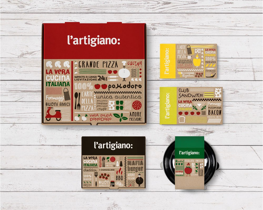
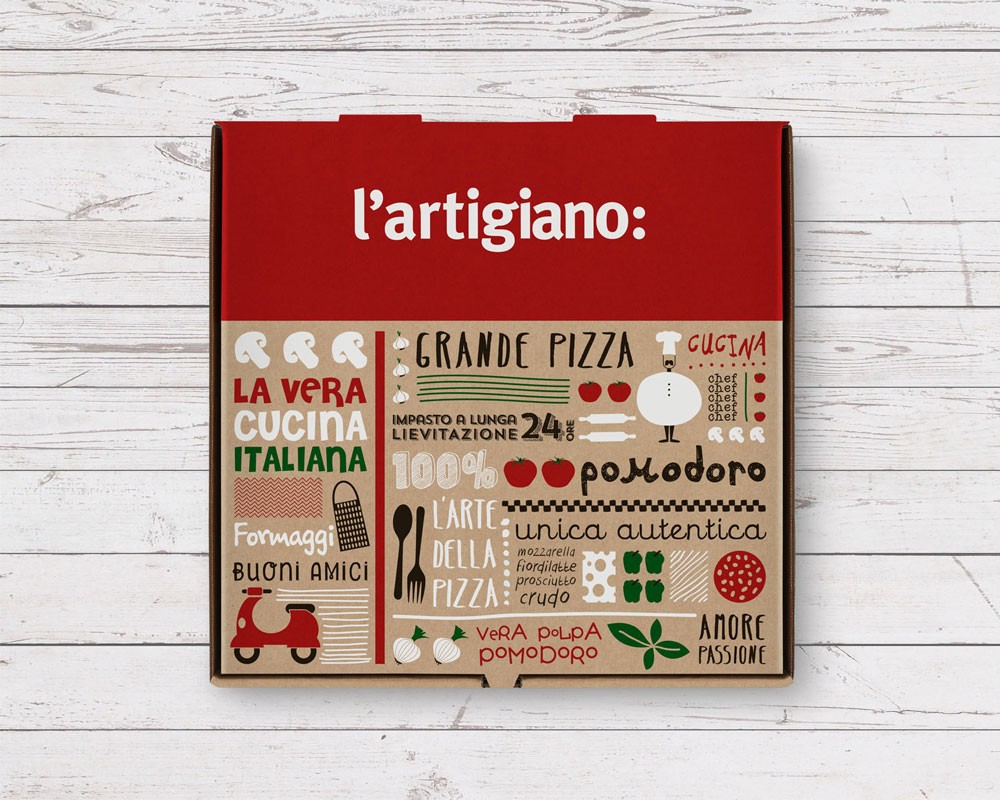
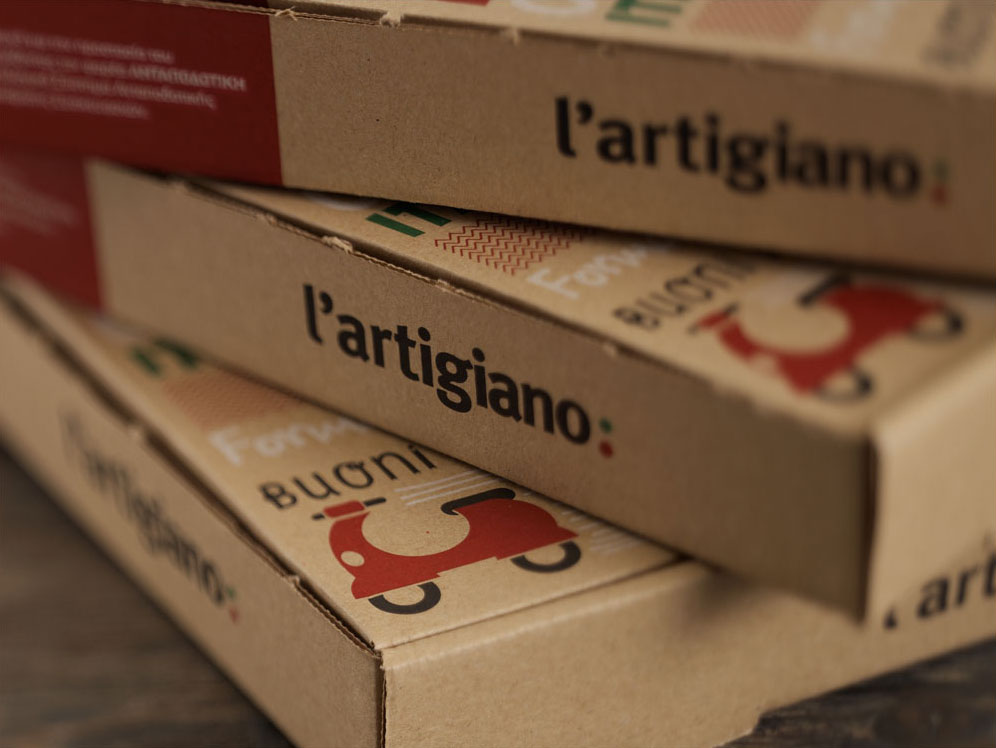
2yolk Branding & Design provided the rebranding for L’Artigiano – a chain of Italian food delivery restaurants – by conveying craftsmanship and making references to well-known elements of Italian culture. Traditional recipes, quality ingredients and freshly prepared meals have been part of L’Artigiano’s distinctive brand promise for years, however, when the company decided to turn towards a more sophisticated take of Italian food, it was time to start communicating with their consumers using a different “design language”. The logotype was redesigned using simple typography paired with a colon (:) punctuation mark thus conveying that “L’Artigiano is…” all about the finest, freshest ingredients, an abundance of Italian flavor and taste. The same idea was applied to the design of the takeaway packaging with the use of culinary inspired wording and vivid, custom-made illustrations that depict the key ingredients of the Italian cuisine snugly placed among famous elements of the Italian culture. The almost rough, sketch-like illustrations adhere to the spirit of a genuine “artigiano” meaning craftsman.
The project won a Red Dot Award for Communication Design and a Silver Pentaward in 2015.
