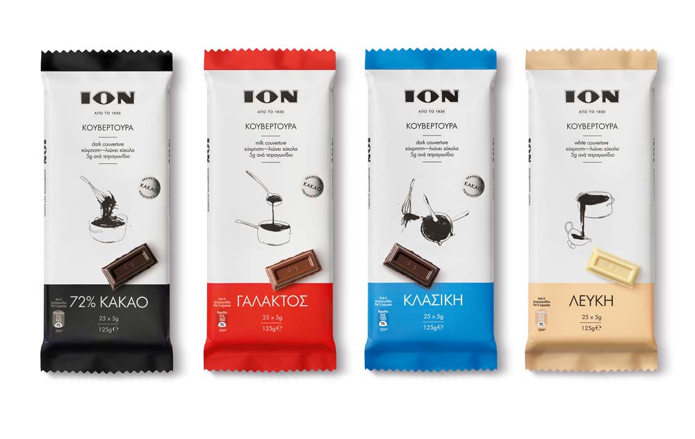
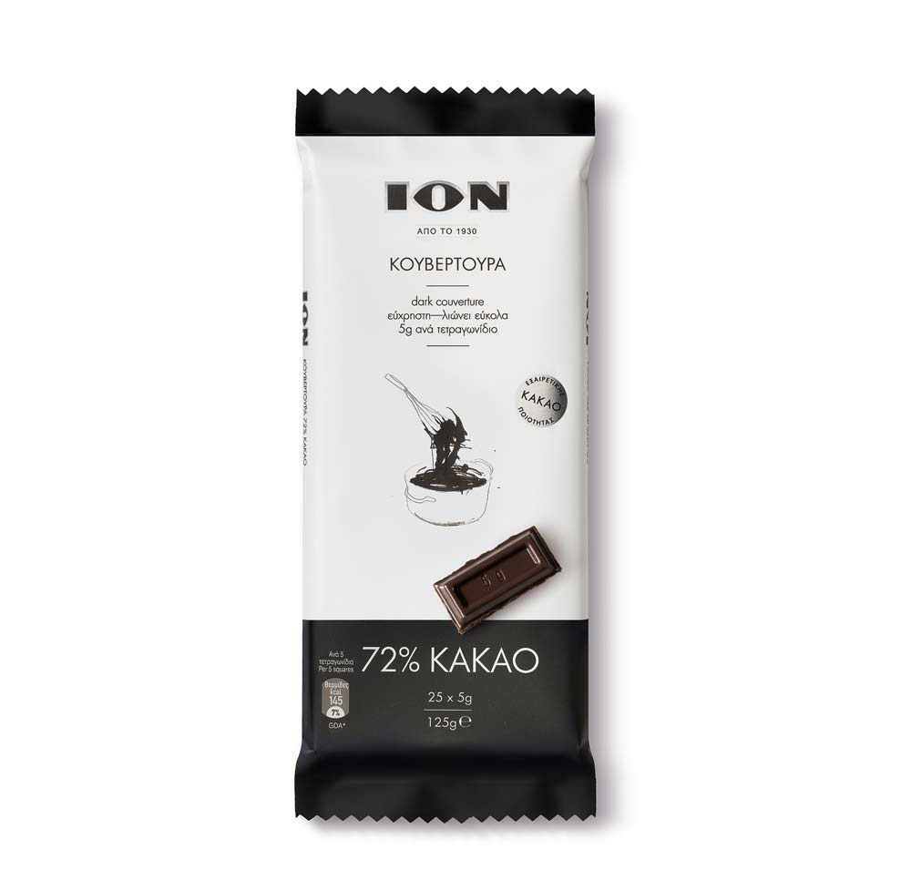
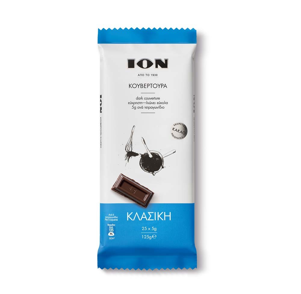
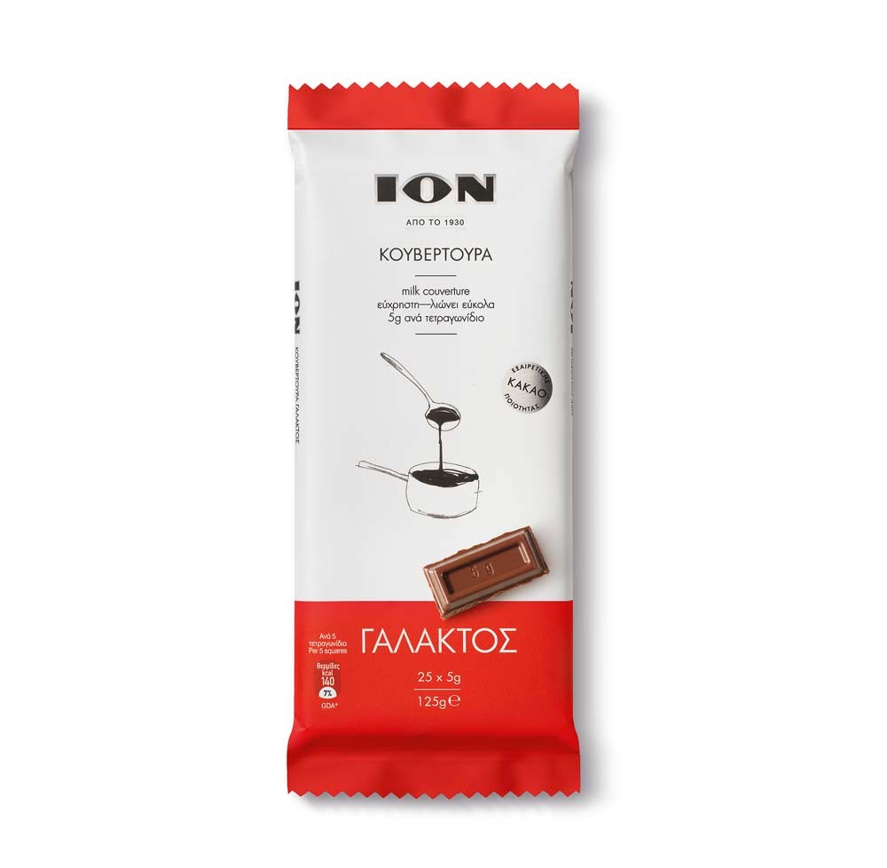
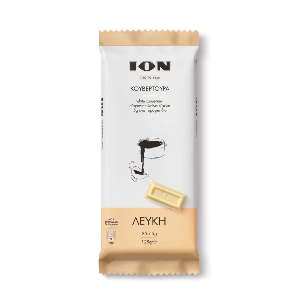
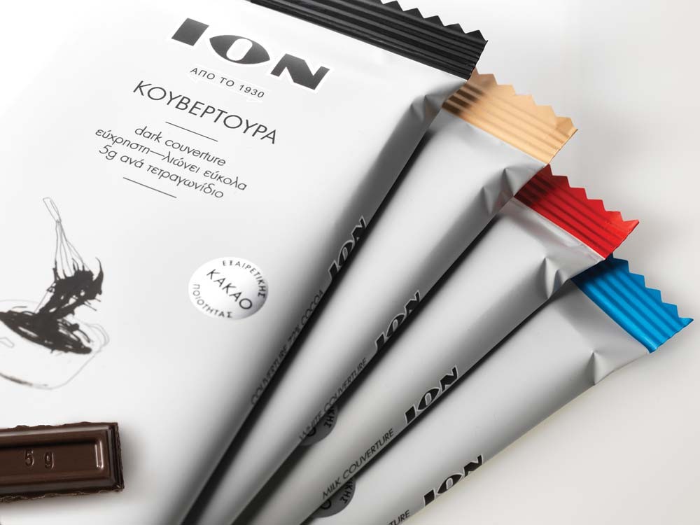
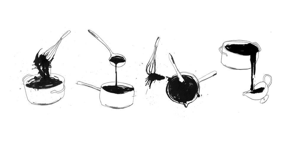
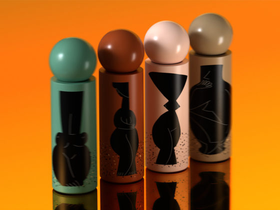
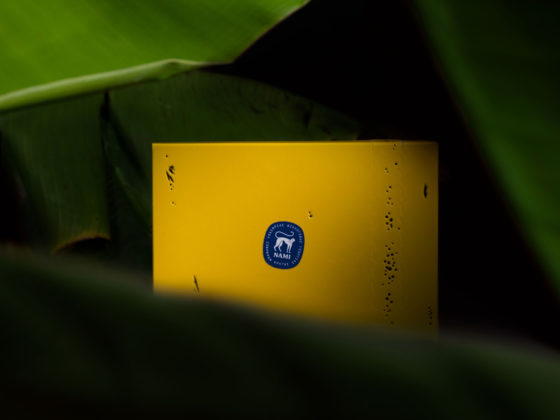
Mousegraphics renewed the image of the ION couverture chocolate series by adding a contemporary look to the product identity and pleasantly surprising consumers while strengthening loyalty to an already popular brand. The series targets a middle – upper class group of various ages, faithful to the ION quality and also younger generations of prospective clients. Mousegraphics opted for a design drastically different to the visually overcharged one that already existed: the packaging surface was cleared so that the basic product attributes could emerge in favor of the consumer. Zones of color were limited to surface edges so as to denote the 4 different chocolate types-flavors (classic, milk, dark cocoa and white chocolate). Emphasis was given to the functional basis of the chocolate-cooking process, the 5 gr. of couverture used; its sharp ‘snap’ is actually a sign of quality and the first element that memory recalls in relation to couverture handling. The cooking ritual was further invoked by the hand-drawn designs of pots where chocolate pieces are melted. The selected typography added to an overall feeling of a neat kitchen diary where notes and recipes are kept and valued.
ION couverture chocolate by mousegraphics

