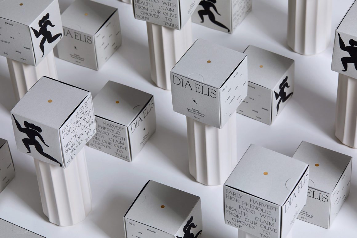
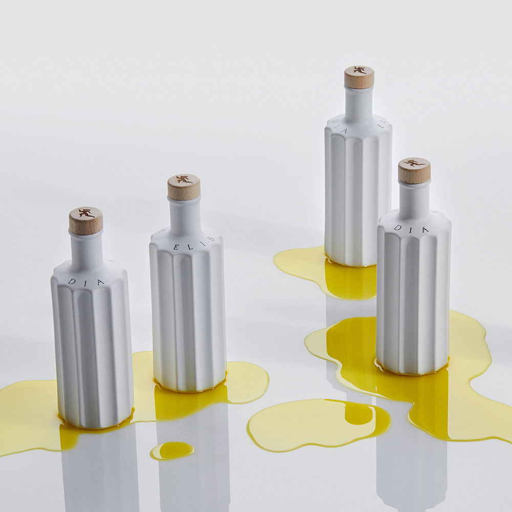
Organically cultivated near Ancient Elis, where the Heraean Games took place, Dia Elis is a single variety of olive oil rich in health benefits. Elis, located in the Peloponnese area, was home to the ancient Olympics and where Dia Elis’ Koroneiki olives are grown and cold-pressed into EVOO (Extra Virgin Olive Oil). Inspired by the platonic ideals of rhythm and harmony, and the Olympic ideals of respect, fair play and physical prowess, G Design Studio created a holistic identity that references the past while looking to the future.
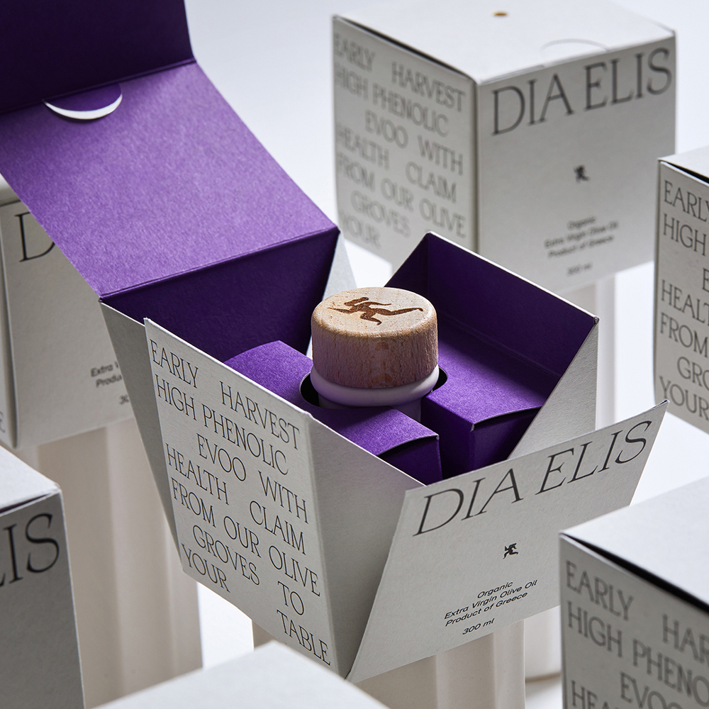
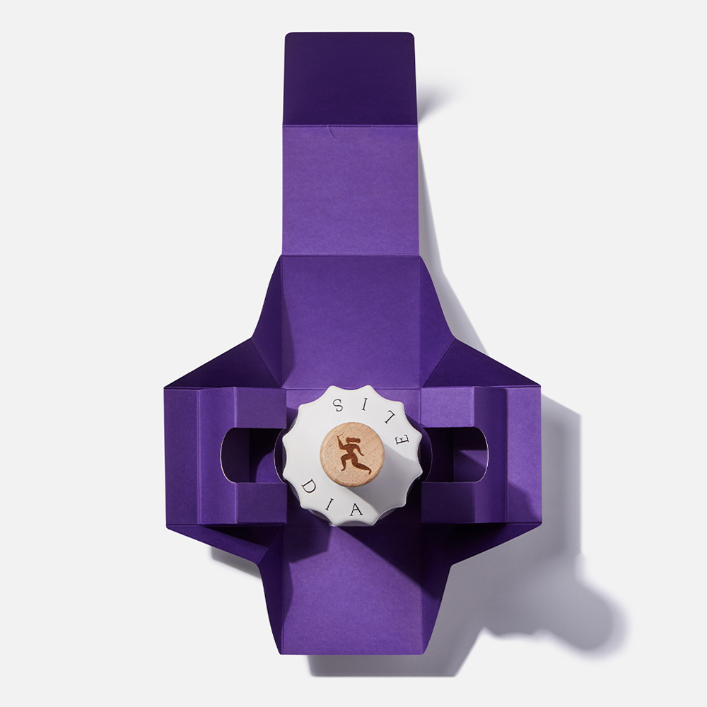
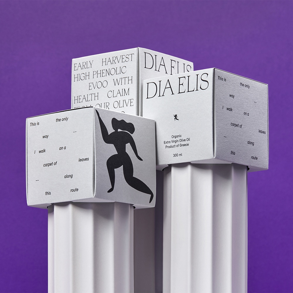
The logo is a female runner, sprinting ahead with the vigour and vitality bestowed by the product. Her dynamic silhouette recalls the red-figure vessels of ancient Greece. The steady pace of her heartbeat and breath is rendered in the sparse layout of the elegant typography, which creates a sense of rhythmical movement. The shapely white ceramic bottle, designed by Studio Aristotelis Barakos, echoes the slender columns of the Doric order. Sculpted with vertical grooves, the surface of this handmade bottle offers a practical grip for the user.
G Design Studio performed a comprehensive branding strategy, crafted the storytelling and conceived the structural packaging, a lightweight but load-bearing lid that is easy to pick up. The purple color pop when opening the packaging creates an element of surprise. The gold spot on the lid suggests the liquid gold within. It is also a subtle reference to the metal core that ensured Greek marble columns remained upright for eternity. Just as olive oil has been an essential ingredient of Mediterranean culture for centuries.
