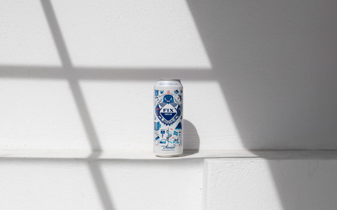
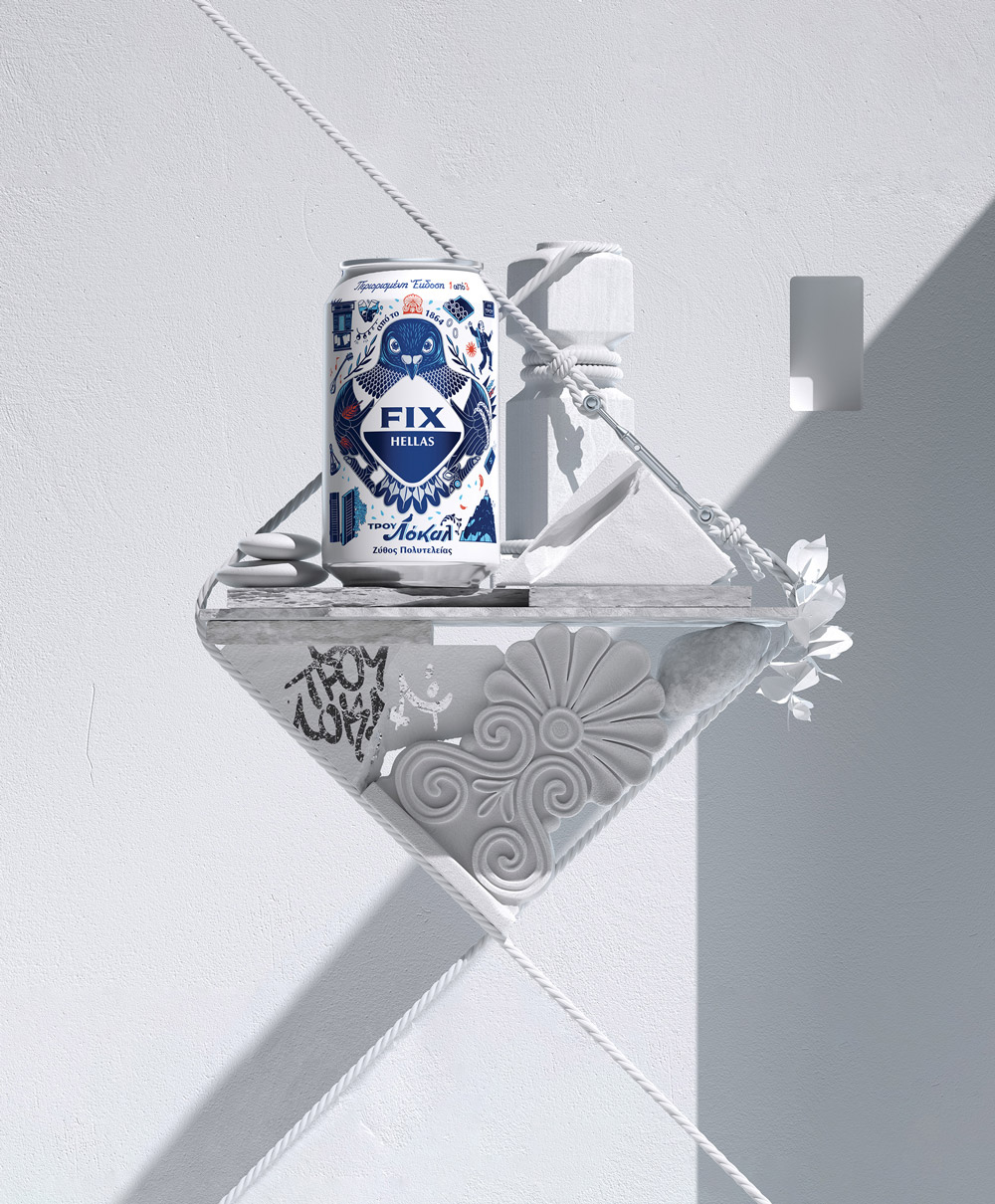
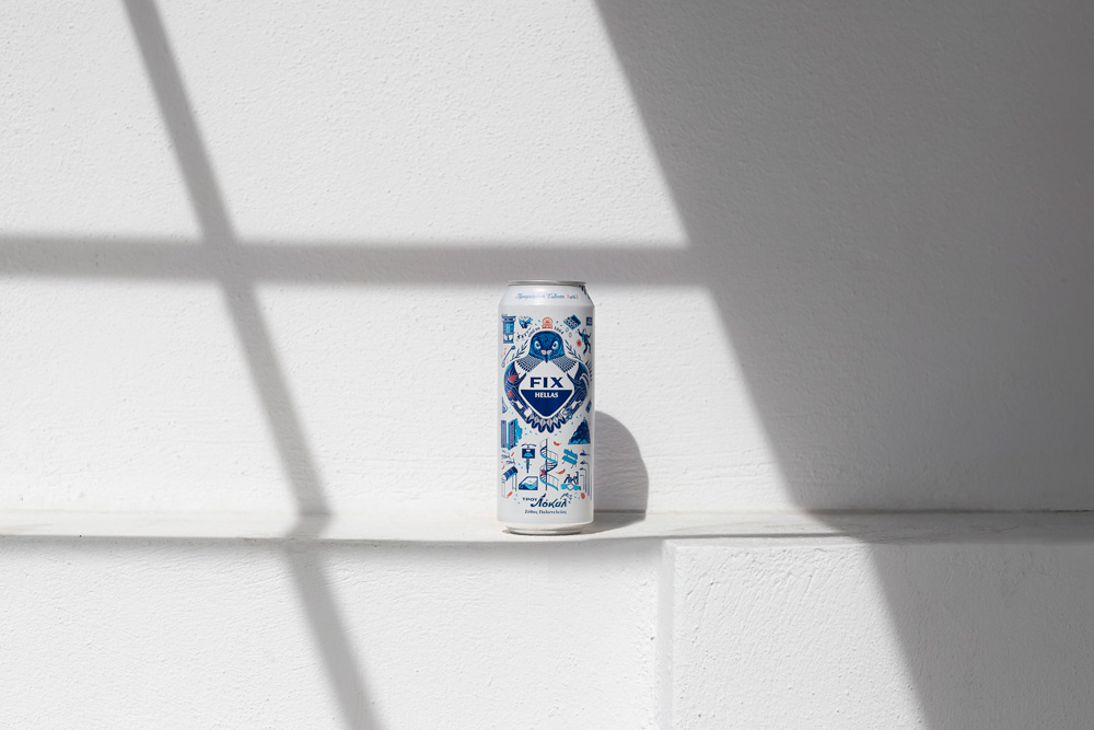
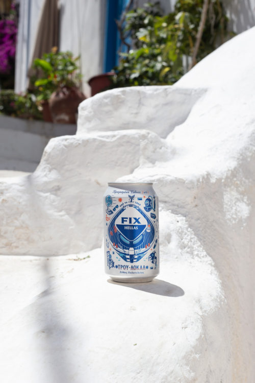
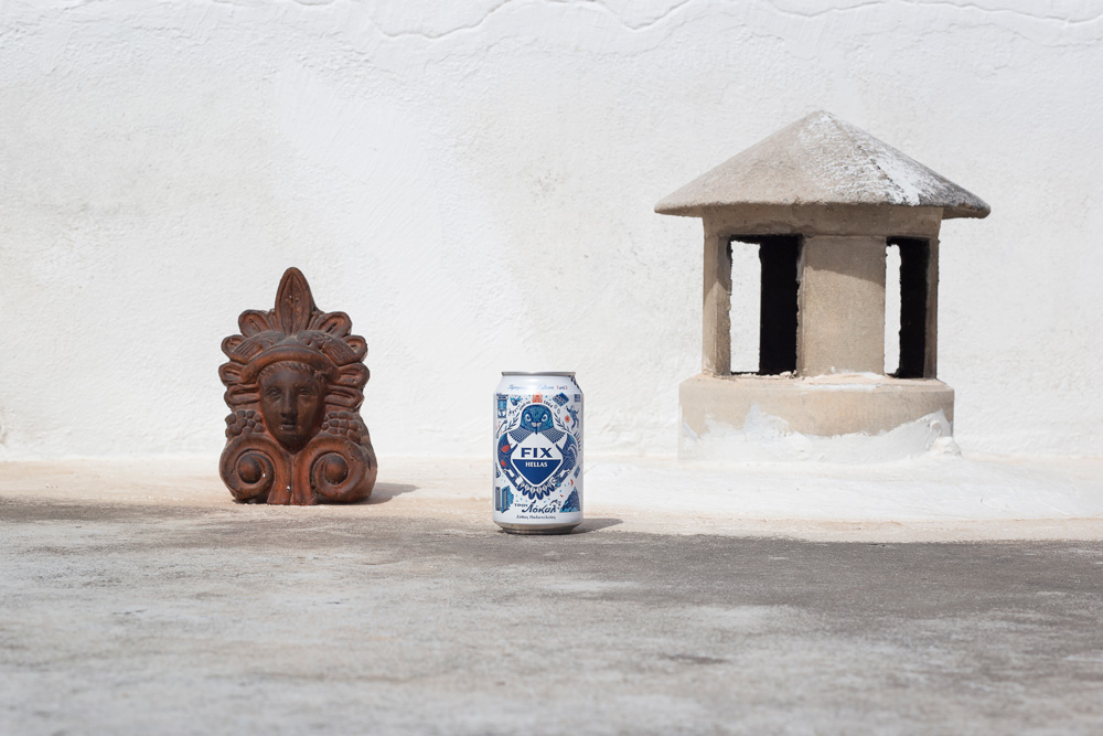
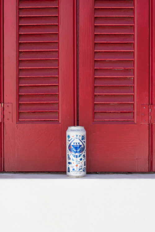
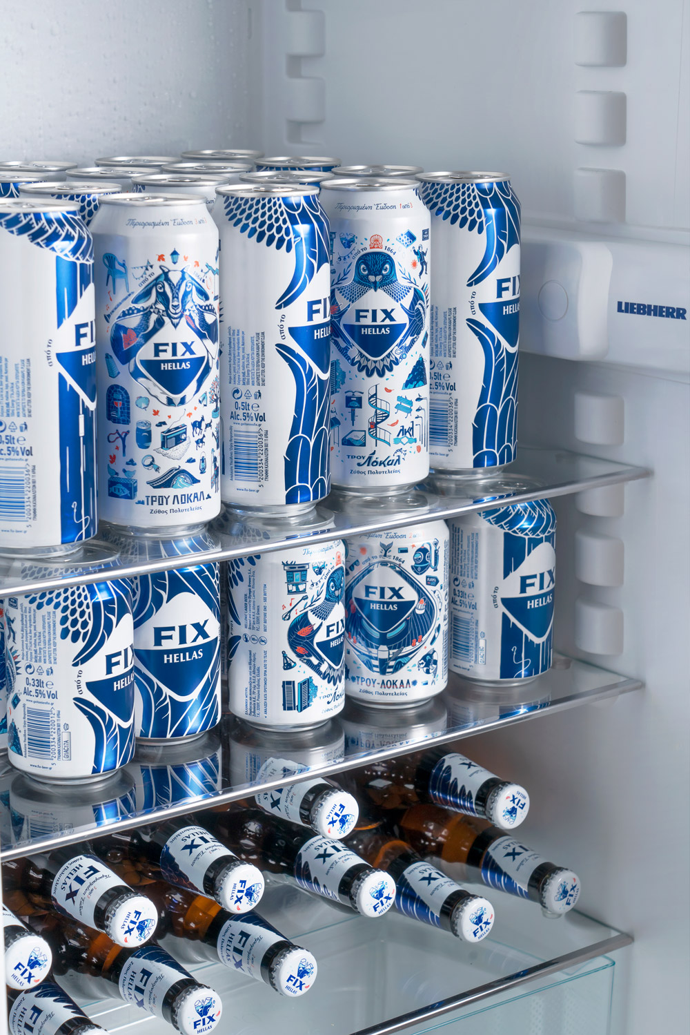
“FIX Hellas is the first Greek beer with a presence in the Greek market since 1864, having proved its authenticity. Designing the brand’s limited edition packaging, our aim was to create an instagrammable series of cans, unlocking communication with a younger audience.
Drawing inspiration from the authentic side of Greece, the one that you won’t find in the pages of a travel guide, which does not boast of trends and is only known to the locals, we developed the concept “TRUE LOCAL”, which – in addition to the limited edition packaging – is also the dominant brand communication for this year.
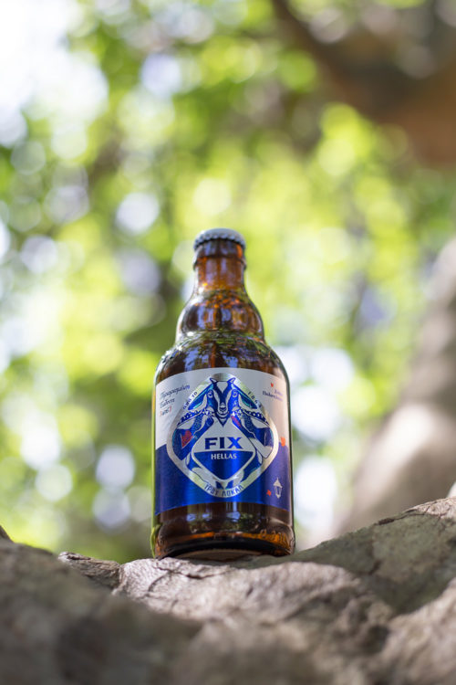
Responding to the different requirements of each medium, we also created the content for a series of communication materials (POP materials, press kit, brochure, key visual, pack shots, press copies).
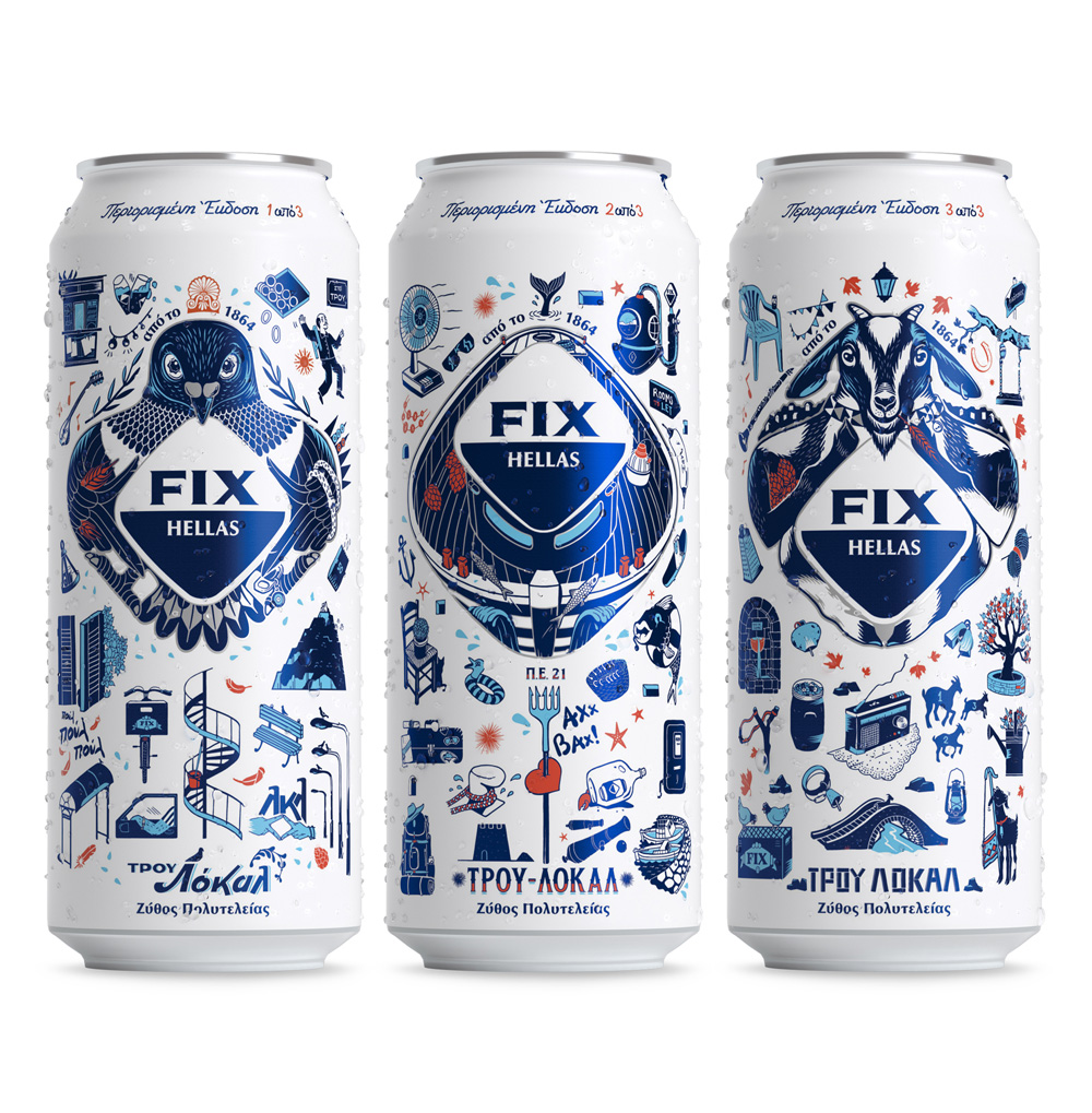
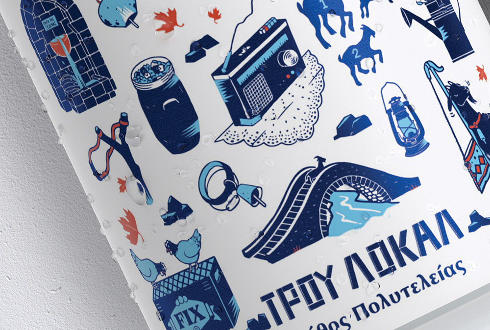
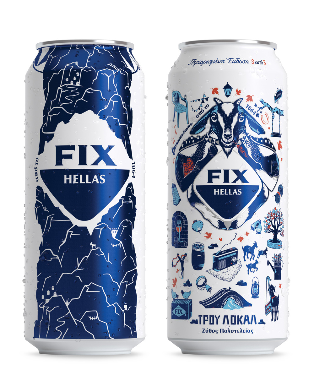
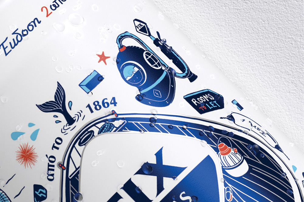
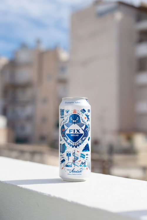
The illustrations stand out for their boldness, narrating small and fun stories of hidden locality that are depicted differently to each side of the cans. The iconic rhombus of FIX Hellas lends its shape to the different local heroes, and is part of the iconographic language we created.
The dove knows which city spots and parties are justifying the hype, the boat is the connoisseur of the beach where you will have the privacy you want, and the goat is the hero of the rugged – yet attractive – countryside that will show you the difficult paths to the best spots. The universe created around them maintains the values of the brand, crumpling the commercial with a fun & irreverent mood, just like an authentic local puts aside the stereotypes and keeps the essence.
The color palette of FIX Hellas is maintained, with small variations. Blue was redefined, as was white, which was matte to give the packaging a sense of uniqueness. Cyan and terracotta were added to the palette; colors that you find in the Greek terrain.
With the new packaging, FIX Hellas addresses an audience that first chooses to live authentic experiences and then to capture them on their mobile screens. Isn’t this the difference between a local and a visitor?”
