busybuilding designed the new packaging and developed naming proposals for Buondi Caffè’s portfolio of roasted-whole-bean (R&G) products in Greece, which is part of a wider repositioning effort by the brand.
Buondi Caffè arrived in Greece in 2002 under the brand name Buondi Espresso. In 2018 it defined a new branding strategy in order to establish itself among the premium coffee players in the local market, and eventually become the leader within espresso R&G territory. The new Buondi Caffè brand shifts away from the idea of “Italian culture” and celebrates artisanal coffee culture and “coffee expertise”. It reflects Nestlé Professional’s obsession for detail and perfection, as well as the specific communication main idea: “Handcrafted with passion”. As part of this rebranding process for the Greek market, the brand name was changed into Buondi Craft.
“We were commissioned to design new packaging and develop a naming strategy for Buondi Craft’s R&G products and reposition them to reflect the brand’s leading position in the local market. We analysed local competition’s branding and packaging, and developed a new positioning strategy for Buondi Craft’s R&G packaging. We then developed a visual identity and naming system based on the brand’s main communications idea, focusing on artisanal coffee culture, craftsmanship and authenticity.
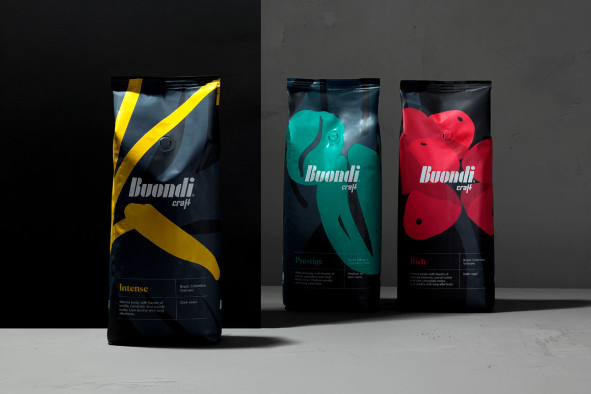
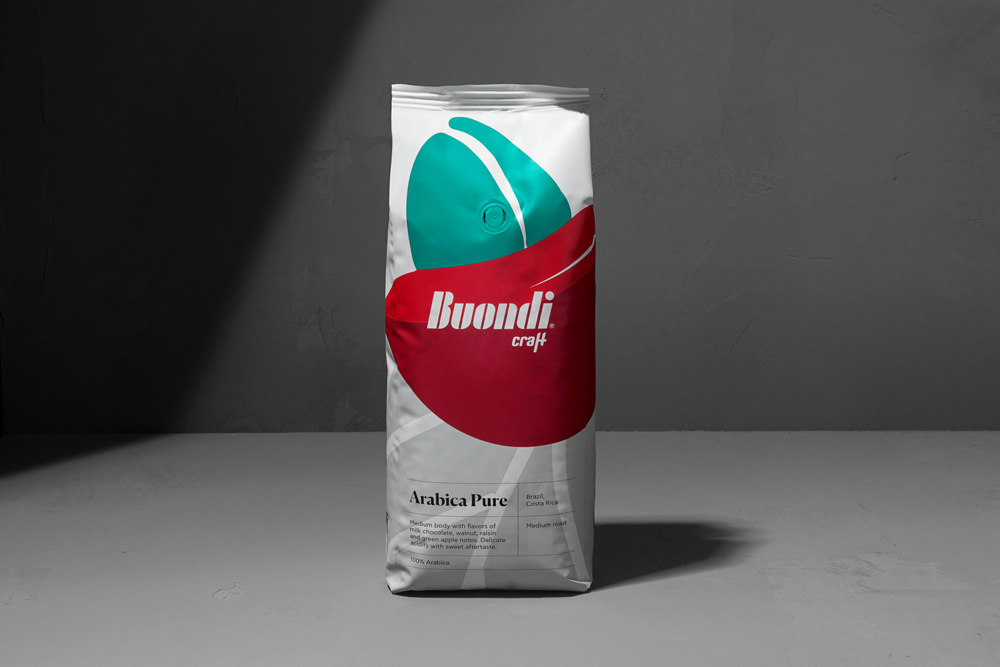
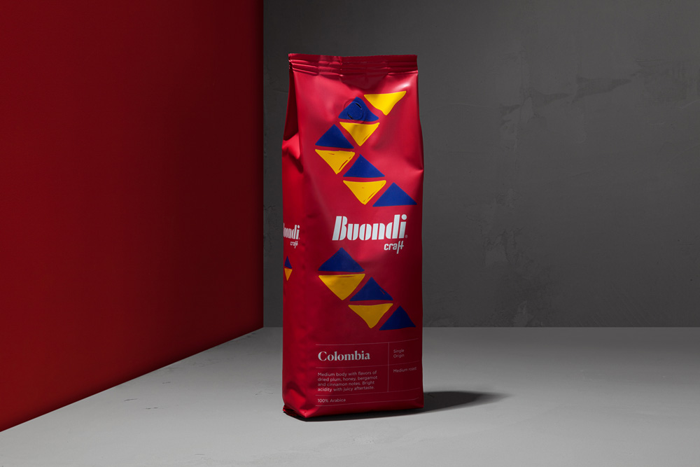
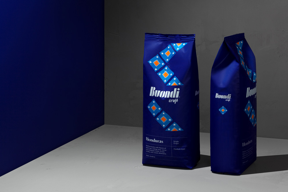
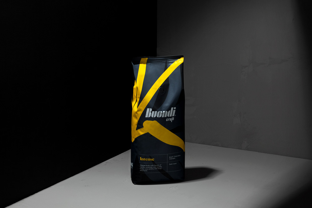
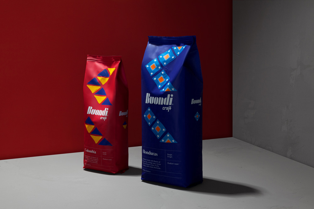
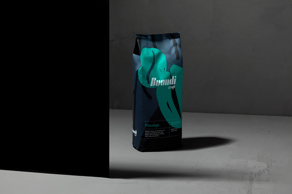
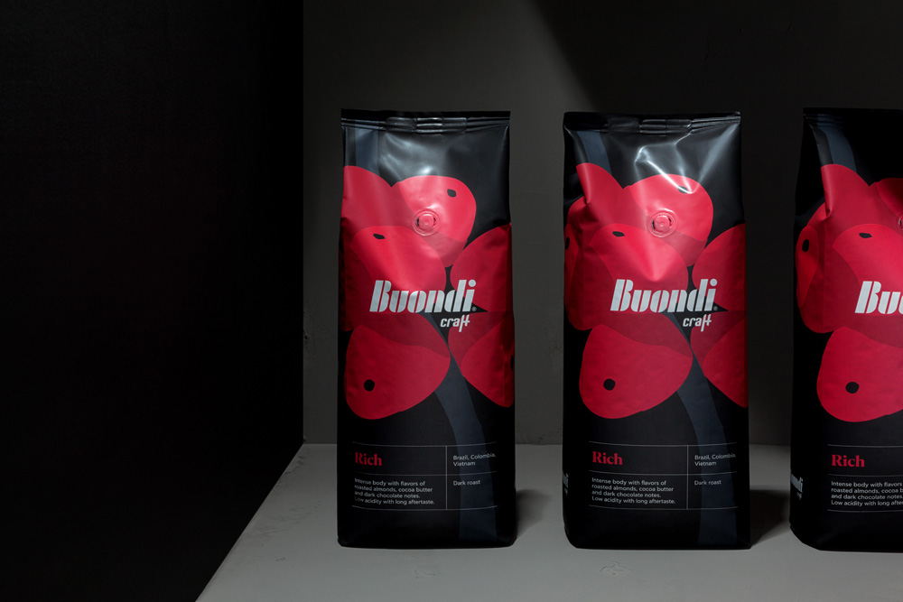
Our branding solutions communicate the client’s obsession with quality, craftsmanship and origin, through a visual journey that unfolds across the front-of-package of the entire product series. Our narrative follows the journey of the coffee bean from a flower on the coffee plant, to a cherry and finally a roasted coffee bean. For the two single-origin coffee products in the series we used a colourful pattern inspired by their respective country of origin. For us, the design strategy was all about finding the essence of Buondi Craft coffee, a process of going back to the source to highlight the brand’s values.
Following the same strategy, we introduced new naming for the products: Intense, Rich, Prestige, Arabica Pure, Honduras and Colombia.
Our packaging design and naming convey the handcrafted, passionate and artisanal personality of the new brand. They preserve positive brand attributes like high quality and sophistication that were associated with the previous brand, and expand these attributes into the semiological areas of “handcrafted”, “artisanal” culture and the prestige of professional barista expertise. At the same time, we developed a visual design language that will make the R&G packaging stand out and become an ambassador for the new brand in professional and retail contexts.”
