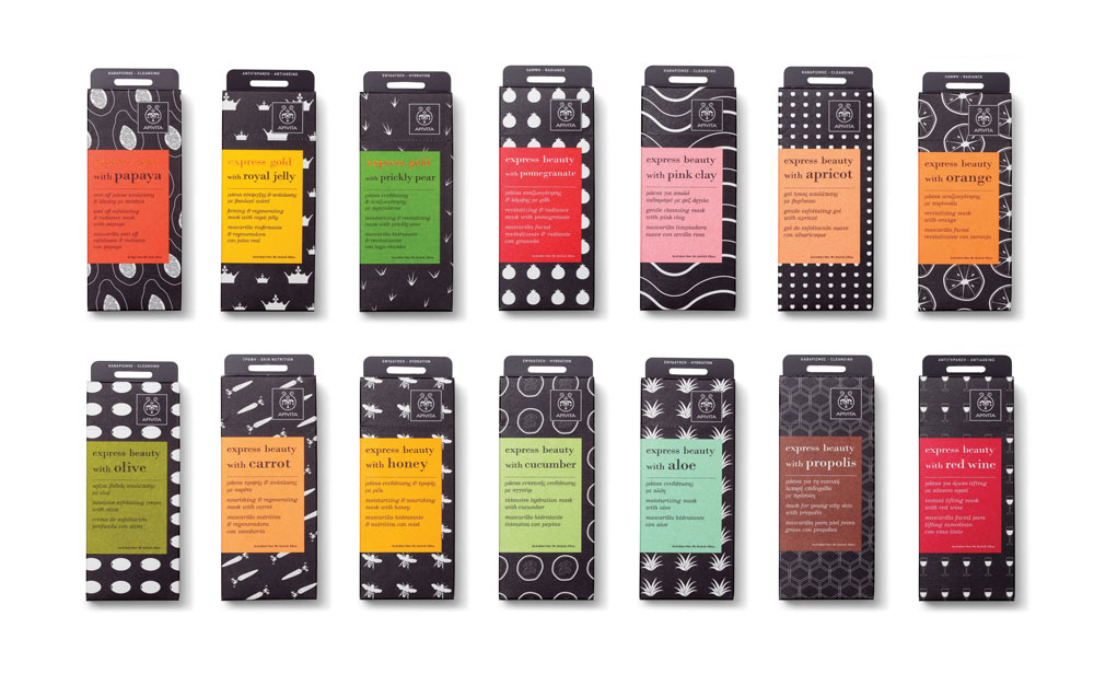
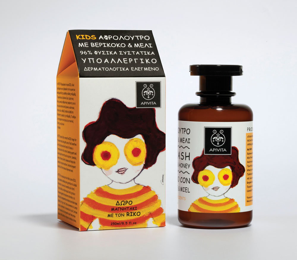
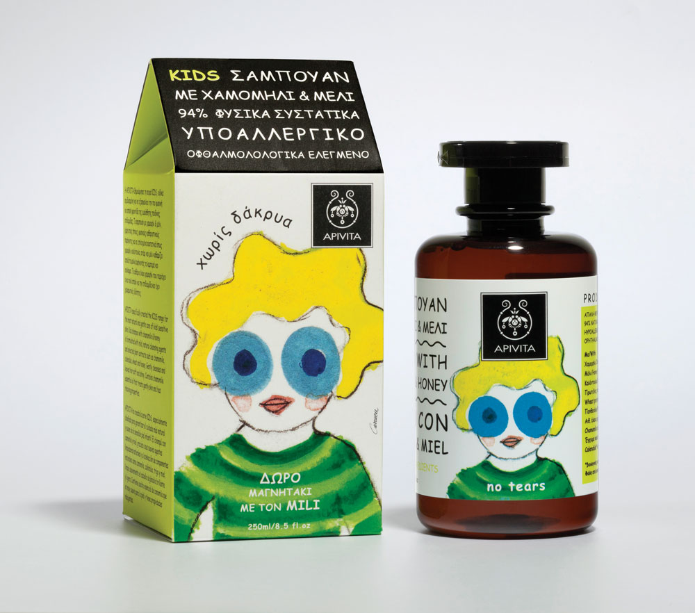
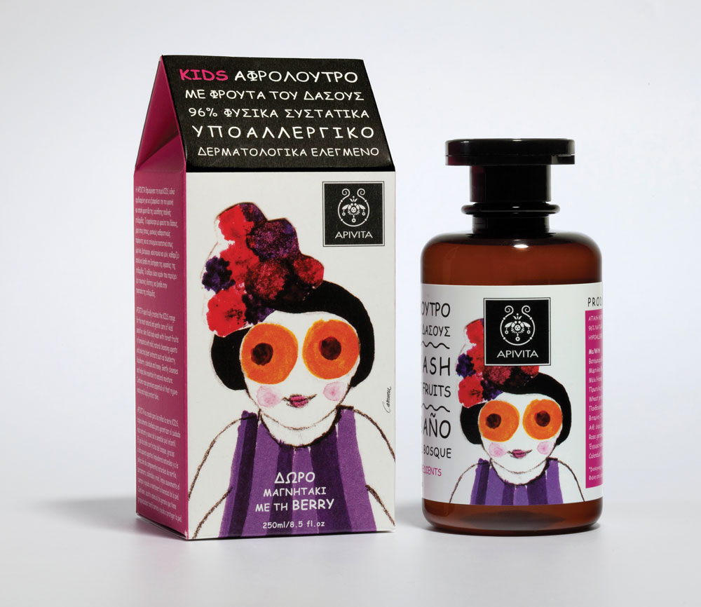
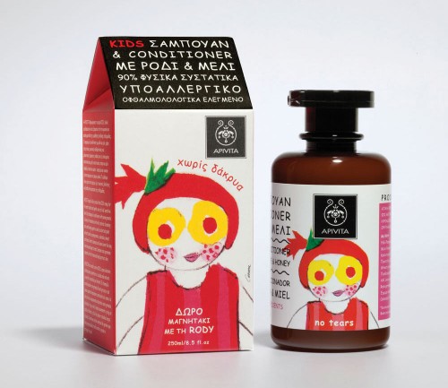
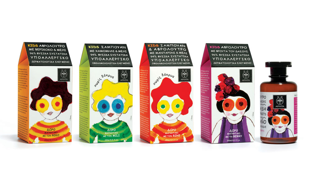
Apivita’s new range of products has been designed with the intention of being visibly noticeable to a consumer without detracting from their pharmaceutical and ‘natural’ identity. Apivita Kids features a series of playful character illustrations that are easy to remember for consumers and children in particular. Each of the packages features a different color and individual look, representing the shampoo’s main natural ingredient, such as apricot, tangerine or wild berry. The naive and childlike illustrations serve as affectionate mascots and brand ambassadors, while the unusual shape of the packaging also helps to further differentiate the product.
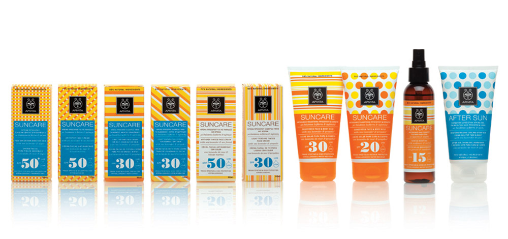
The overall notion of balance between pharmaceutical credibility and fun is also present in the packaging range of the sunscreen series. The striped packs have references of beach balls, changing rooms, bikinis, picnic blankets and other summer emblems, distinguishing them as the Apivita Suncare range and maintaining the balance between fun and effectiveness.
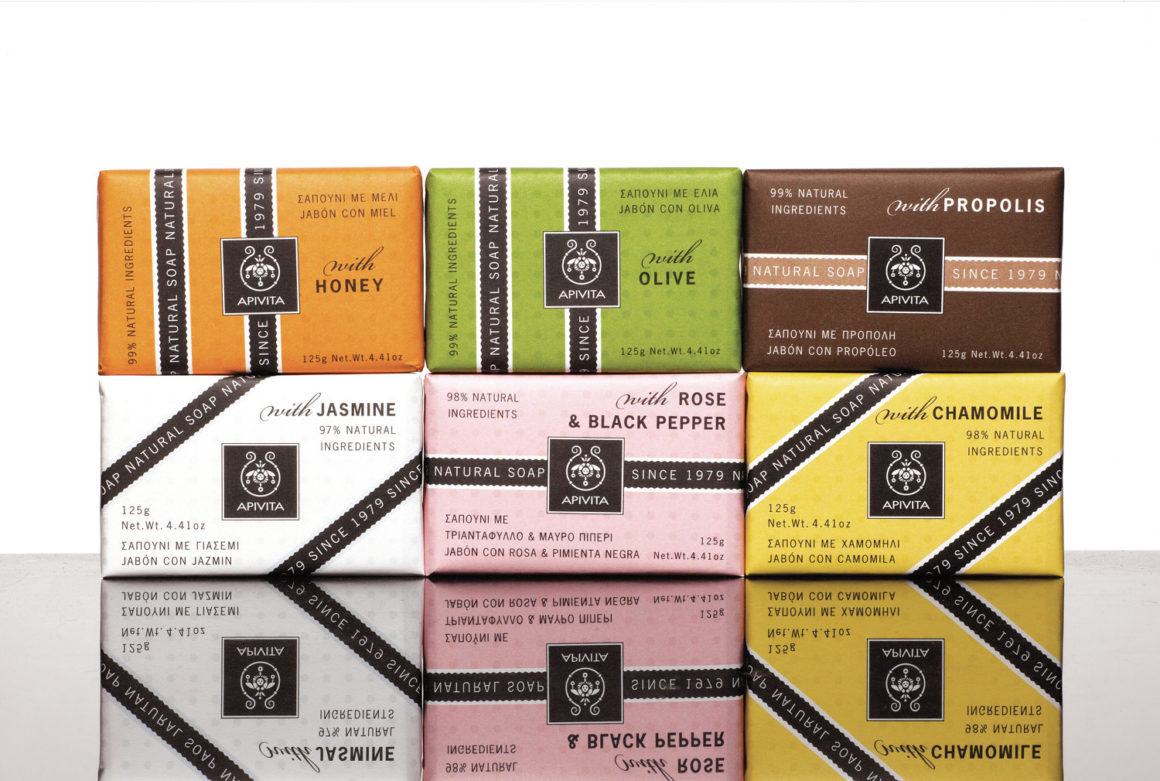
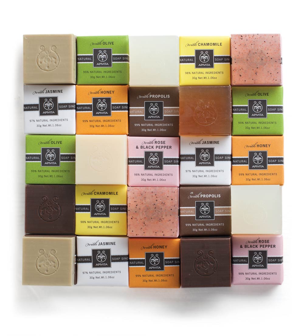
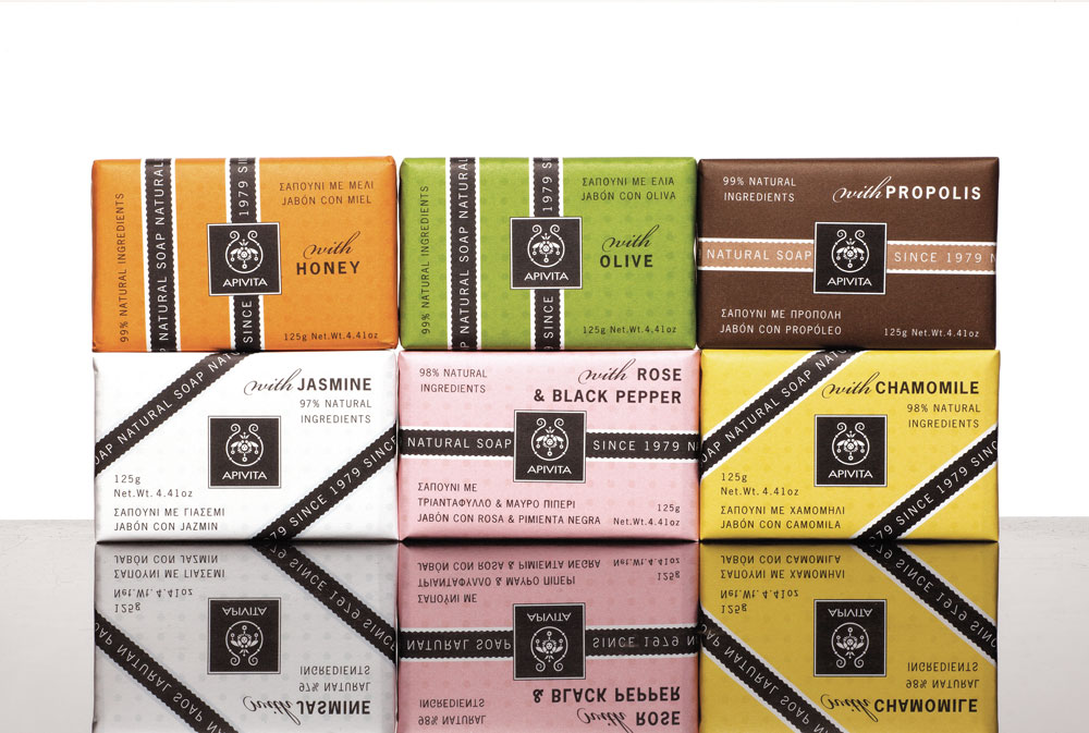
On the other hand, the design aim for the soap bars was to remain aligned with their traditional quality, as the first products of the range were launched over 30 years ago. A retro-modern look was therefore applied by combining a black stripe with vibrant colors, making each bar of soap easily distinguishable within the range.
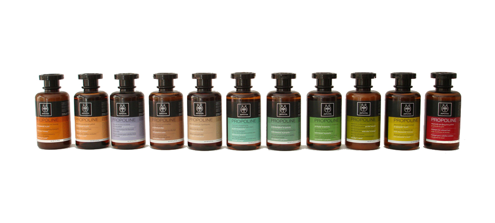
The different hues coupled with the black lines create an interesting array of patterns when placed together on display. The collection has won a number of awards including EVGE Greek design awards, Red Dot awards, IF awards and European design awards.
