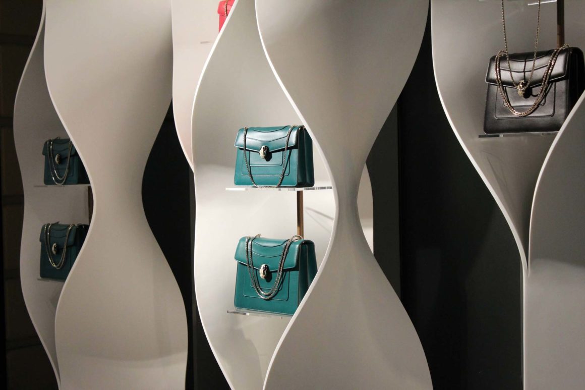
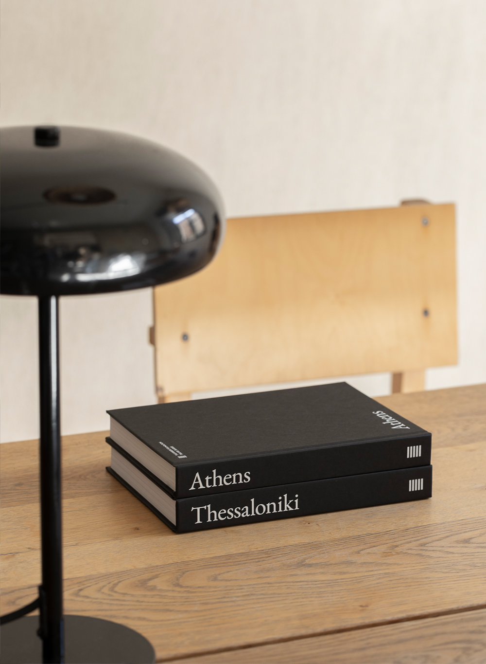
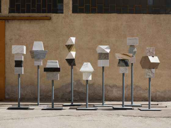
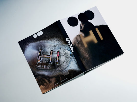
Not a Number Architects designed this set of pop-up displays to showcase handbag collections and fine jewelry series for Bulgari’s first-ever appearance in a department store detached from its exclusive shops. The main challenge of the design was to radically rethink the display aesthetics for the historic brand whilst bearing reference to its roman heritage. At the same time, it was required to maintain a modular approach, in order to adapt effectively in the different spatial conditions of the various department stores.
The showcases are made of double-curved solid surfaces that form three-dimensional sculpture-like patterns. The design is based on two panel components of different size and curvature that are multiplied in order to frame the products. Repetition and a restrained palette of colors were used in order to deal with the multi-brand polyphony of the large retail environments and make a uniform and distinct image for the installation. Although scattered in space, the display elements bear a visual connection to each other, guiding the customer from one to the next and offering a shop-in-shop experience.
