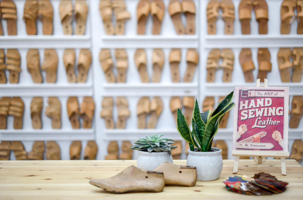
“A family footwear business, active since 1941, has commissioned to design its new gallery and store. The new store focuses on product design. The spotlight is reserved for processed leather products, aiming to blend the quality of traditional craft with fresh, modern design.
Our new design draws particularly on this blend to create a showroom and sales store faithful to the spirit and character of the product. The area designated for the store lies in the heart of the old town market; an old, high ceiling industrial structure with wooden roof.
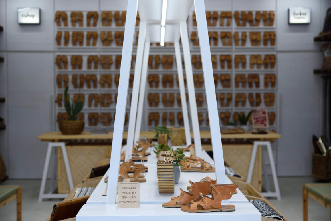
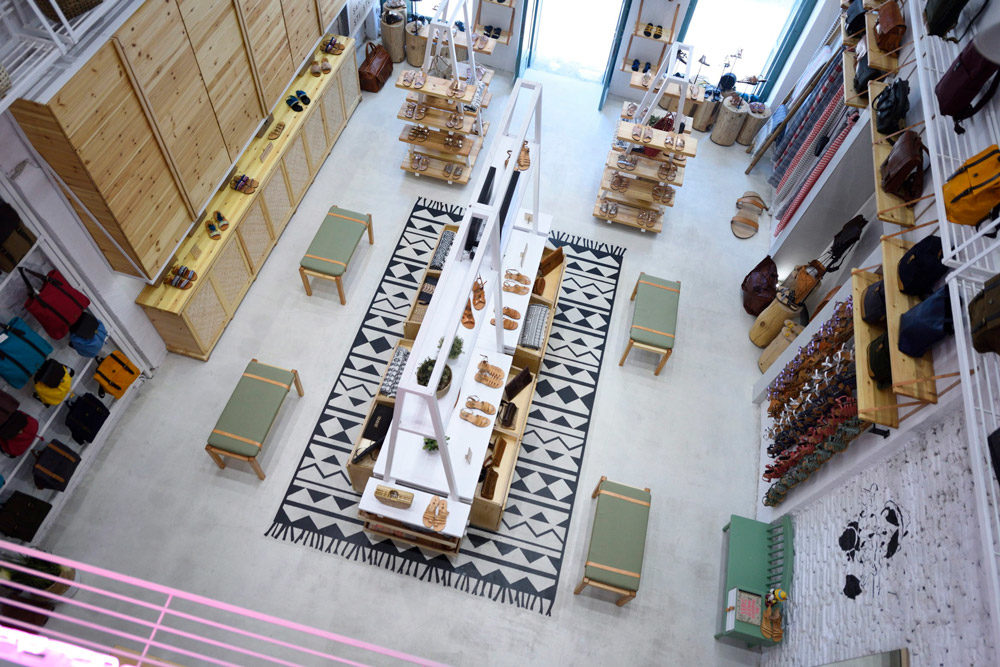
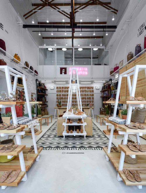
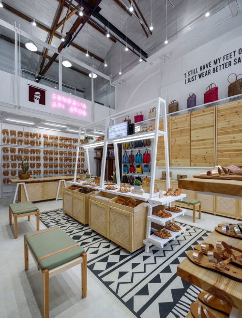
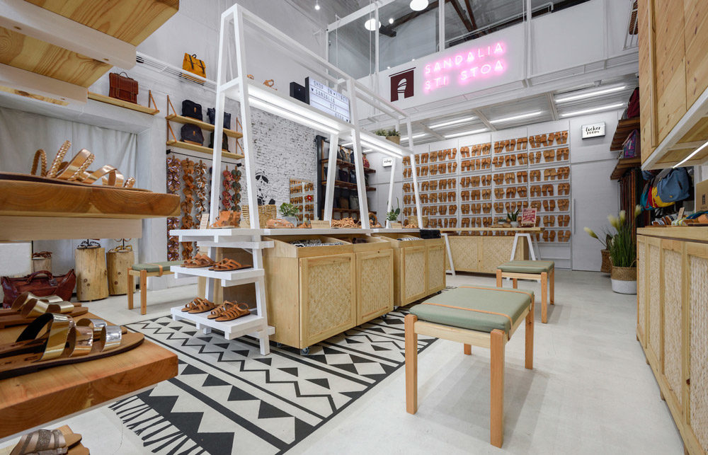
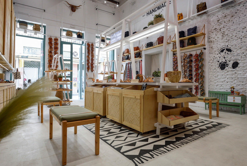
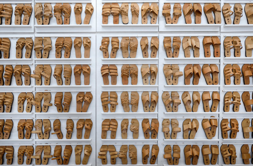
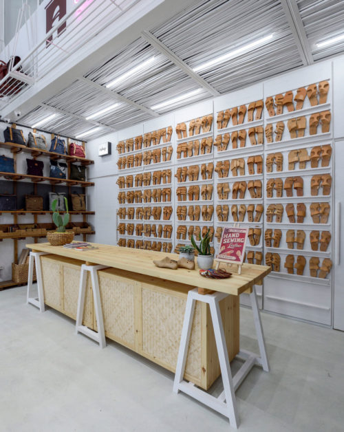
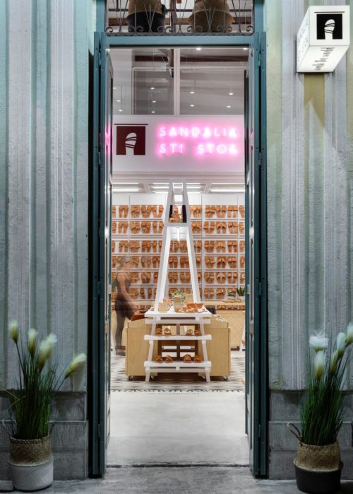
The principle axis of our composition was to design a large central bench to display the products. The bench organizes both the store areas and the visitors’ movements around it. Making good use of the large height of the two walls on either side, white metal shelves were designed and fitted to showcase all products. A lightweight structure was designed as a drop in the background to accommodate the secondary uses of the store. The office is located at the highest level of the building. All storage spaces and fitting rooms are placed in succession below. Finally, the front space houses the cashier counter and a display panel to showcase the store’s main processed leather product: sandals.
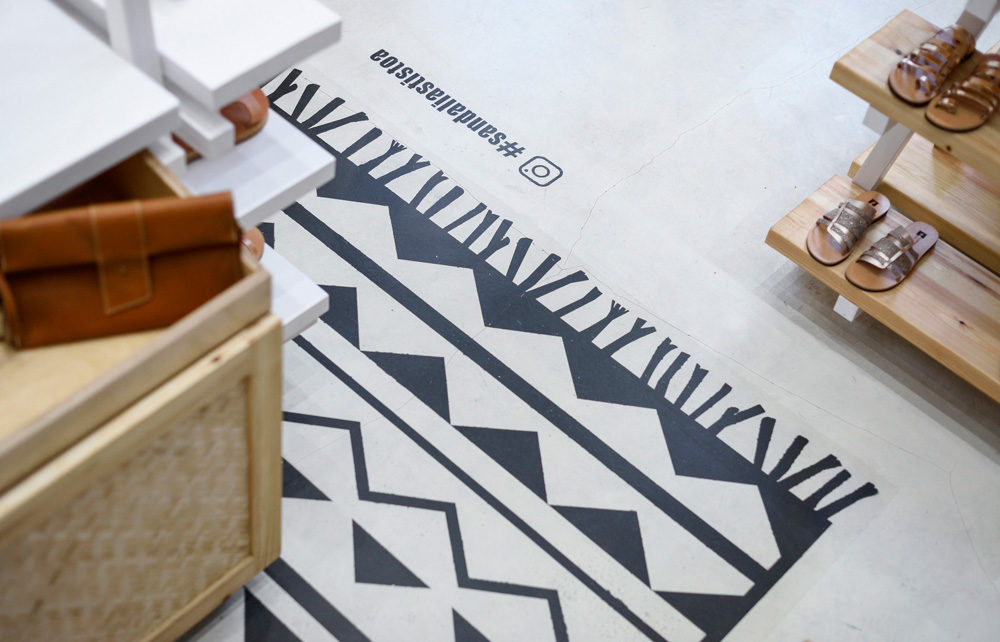
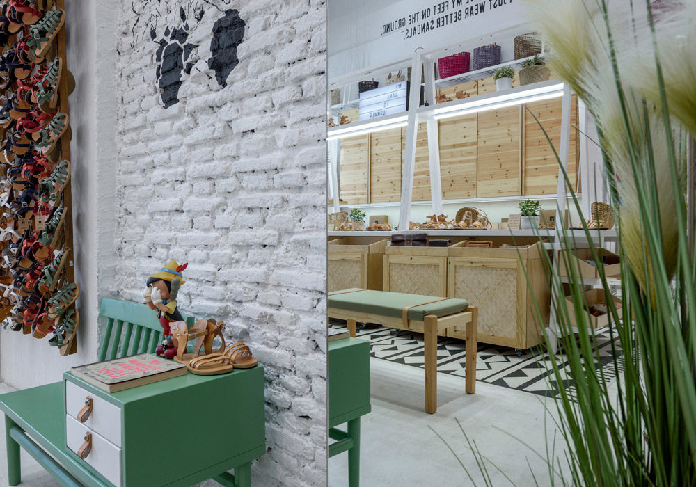
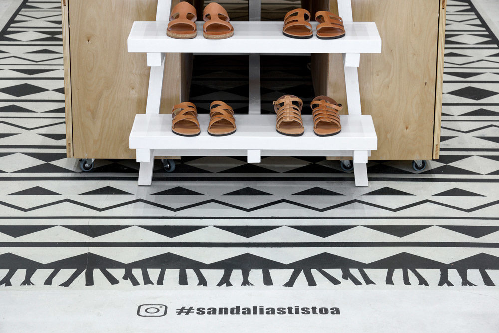
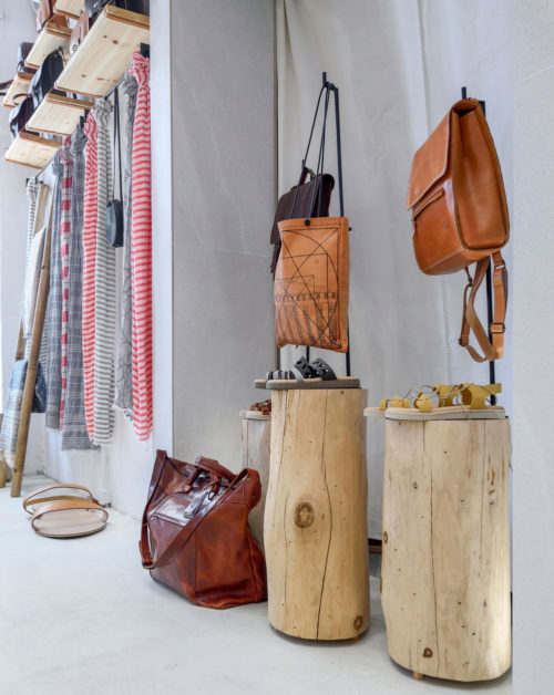
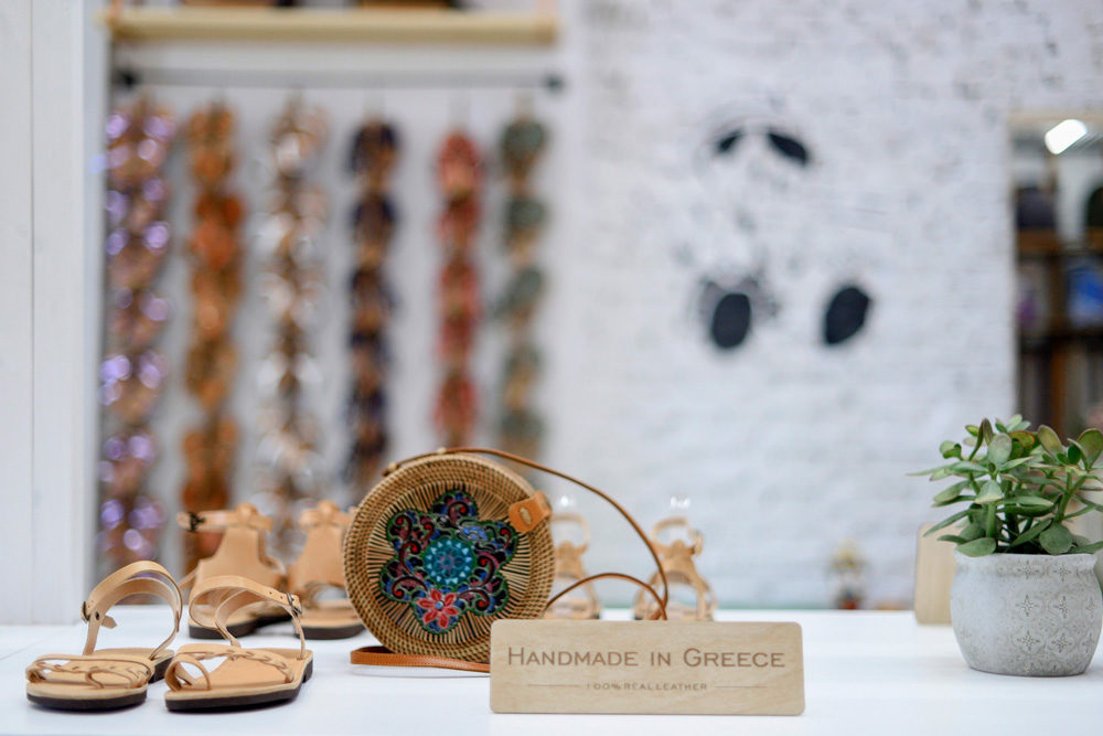
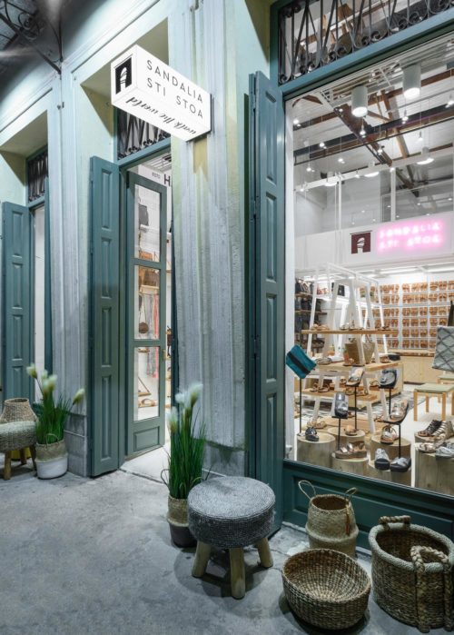
The interior is dominated by white. That is both to let the visitor experience fresh summer vibes and to serve as a backdrop against the showcased leather products, which range in shades of brown. All constructions are made in natural shades of wood or white. The floor is coated with industrial off-white concrete and covered by a large rag; a white canvas painted with black geometric motifs in black inspired by Cycladic art, an element of contrast that nevertheless enhances the harmony of white in the space, adding an oriental touch to the visitor’s aesthetic benefit. Materials such as white reed, handmade mats and loose trunks complement the setting.
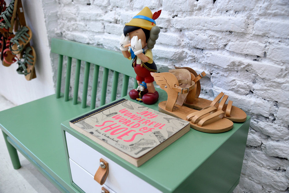
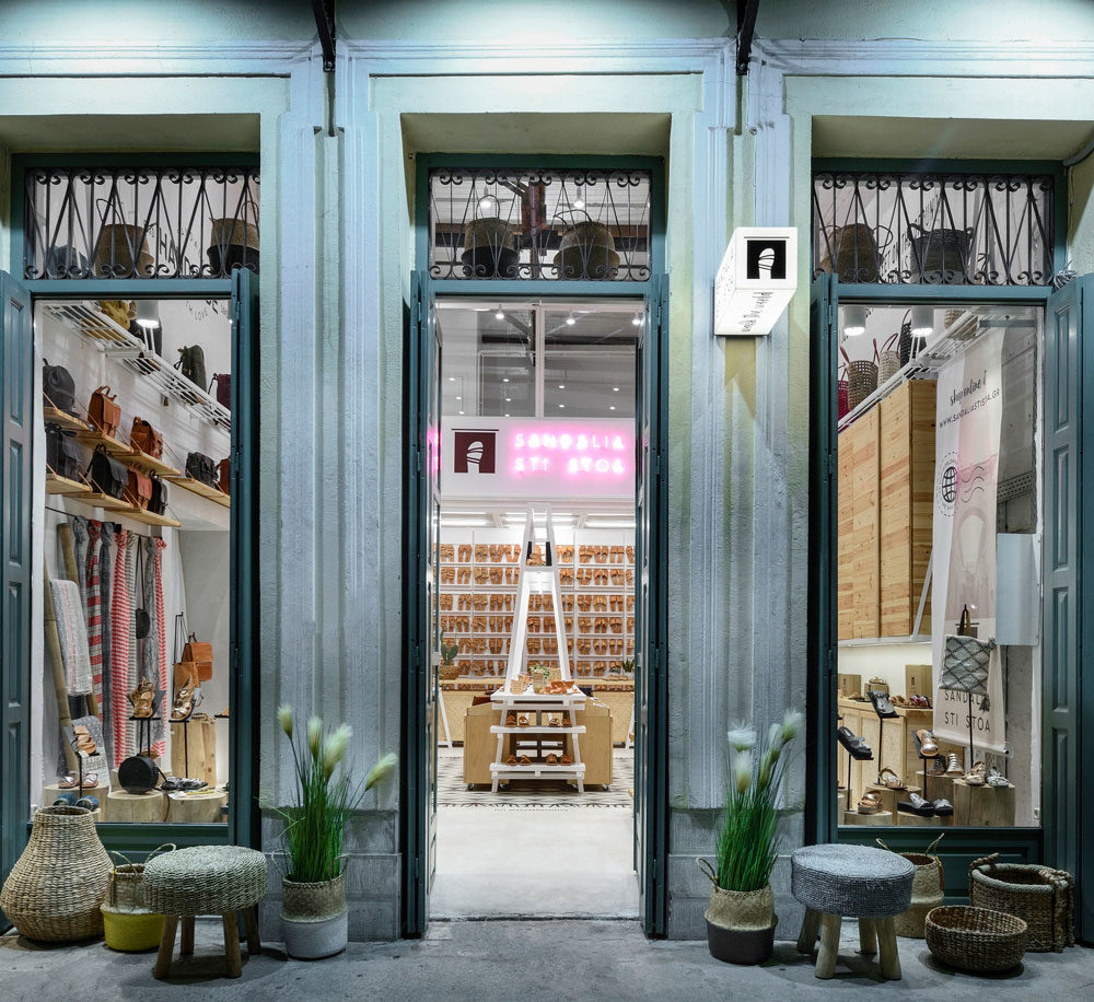
The whole arrangement is framed by two large quotes at the highest level of the walls. Namely, a stencil with the childhood hero Pinocchio, some related #hashtags on the floor, as well as a neon sign in bold colour displaying the store name, all oriented towards upgrading the visitor’s shopping experience and reinforcing the store’s brand image. On the outside, two tall doorways on either side of the entrance are used as window displays and enhance the visibility of the products outwards. While preserving the original qualities of an 80-year-long family business, this new design provides for a contemporary space that is both functional and worthy of handmade products, aiming to hand them down to the next generation.”
