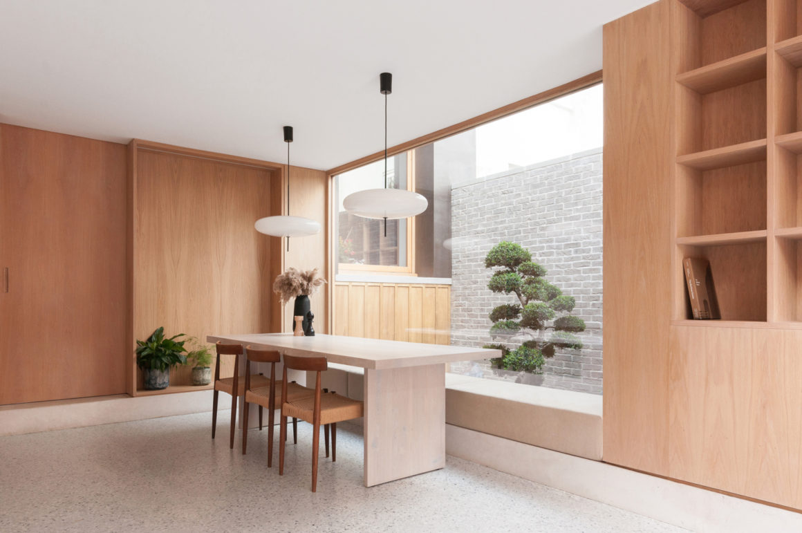
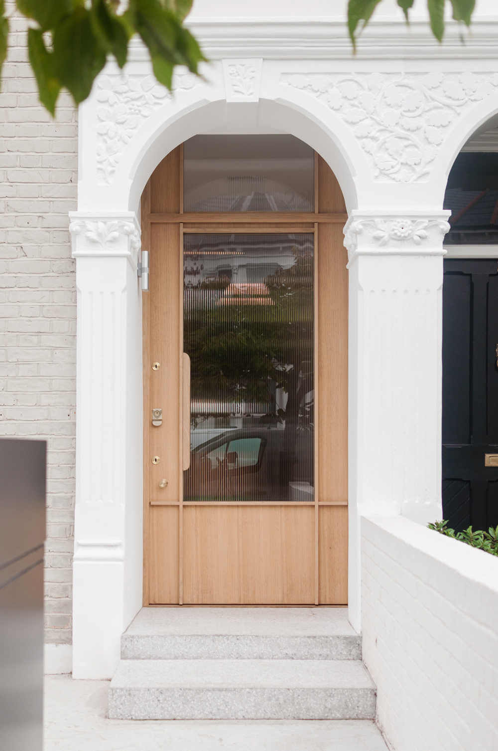
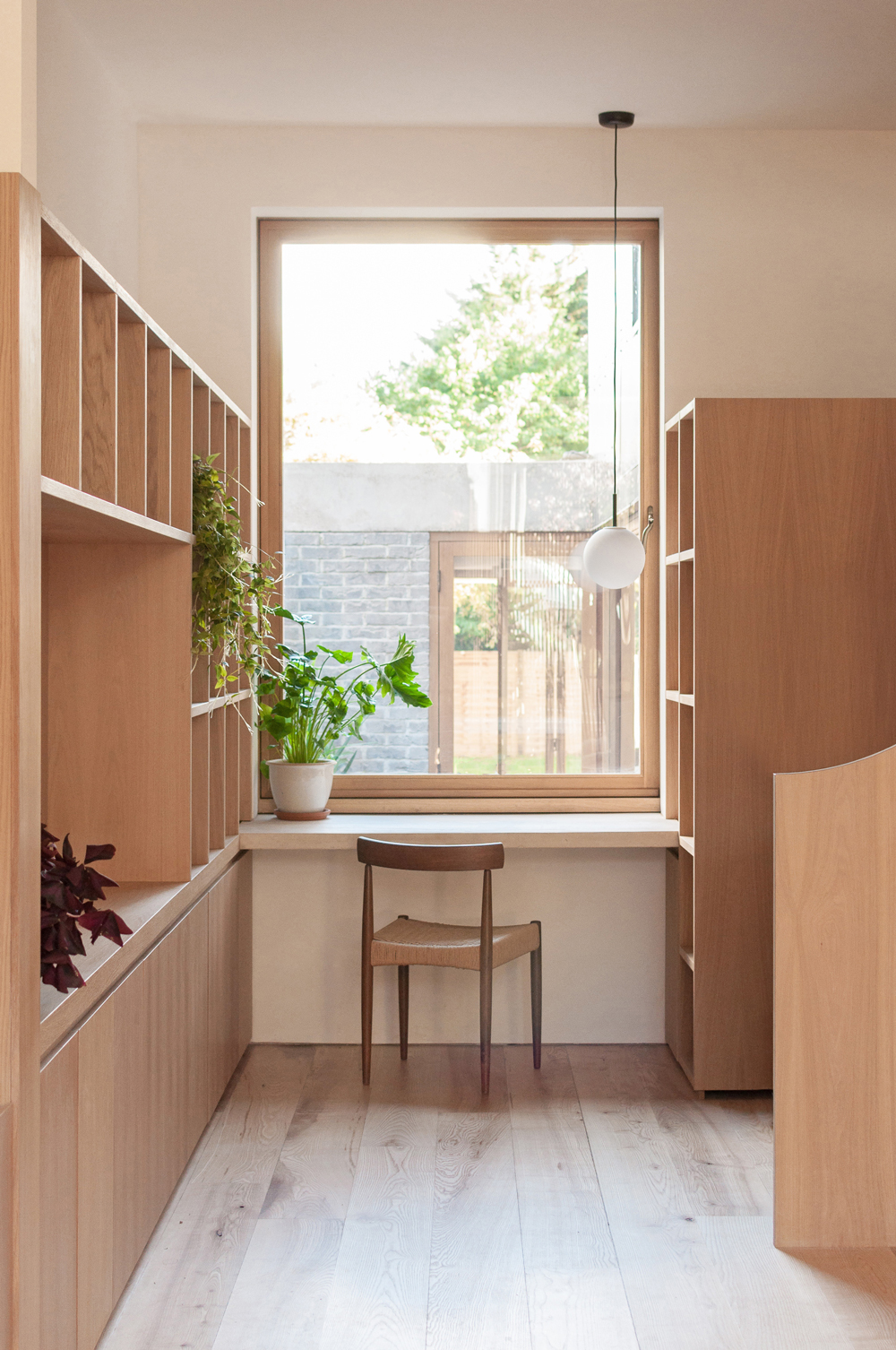
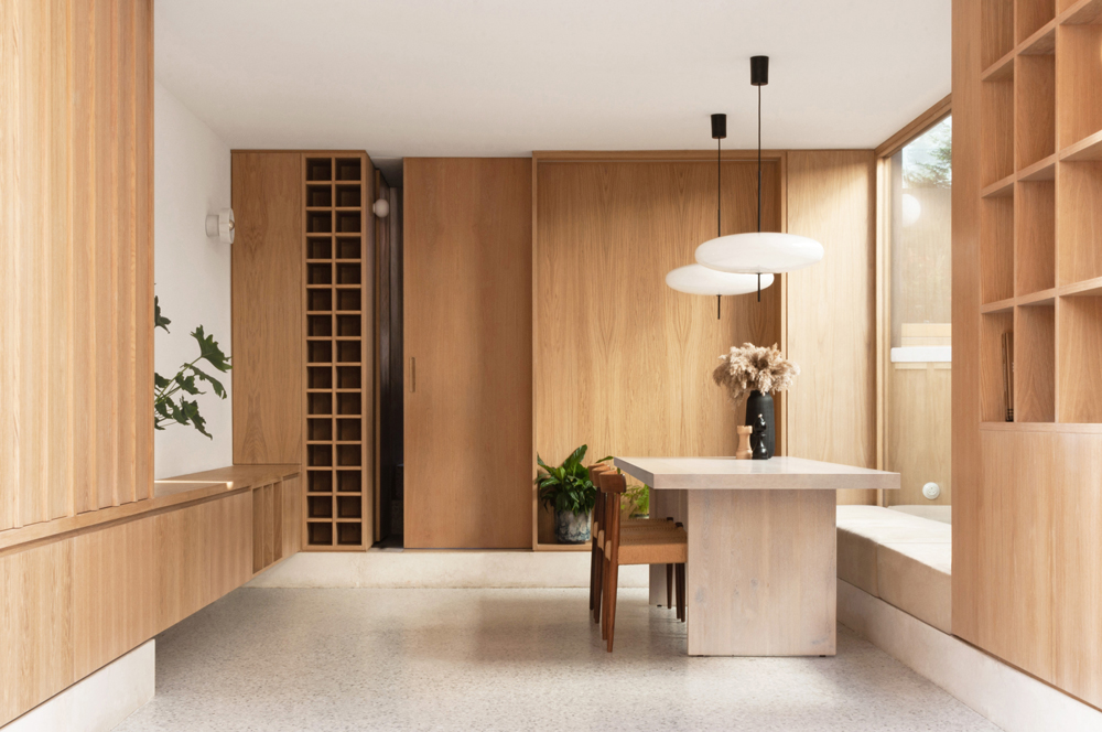
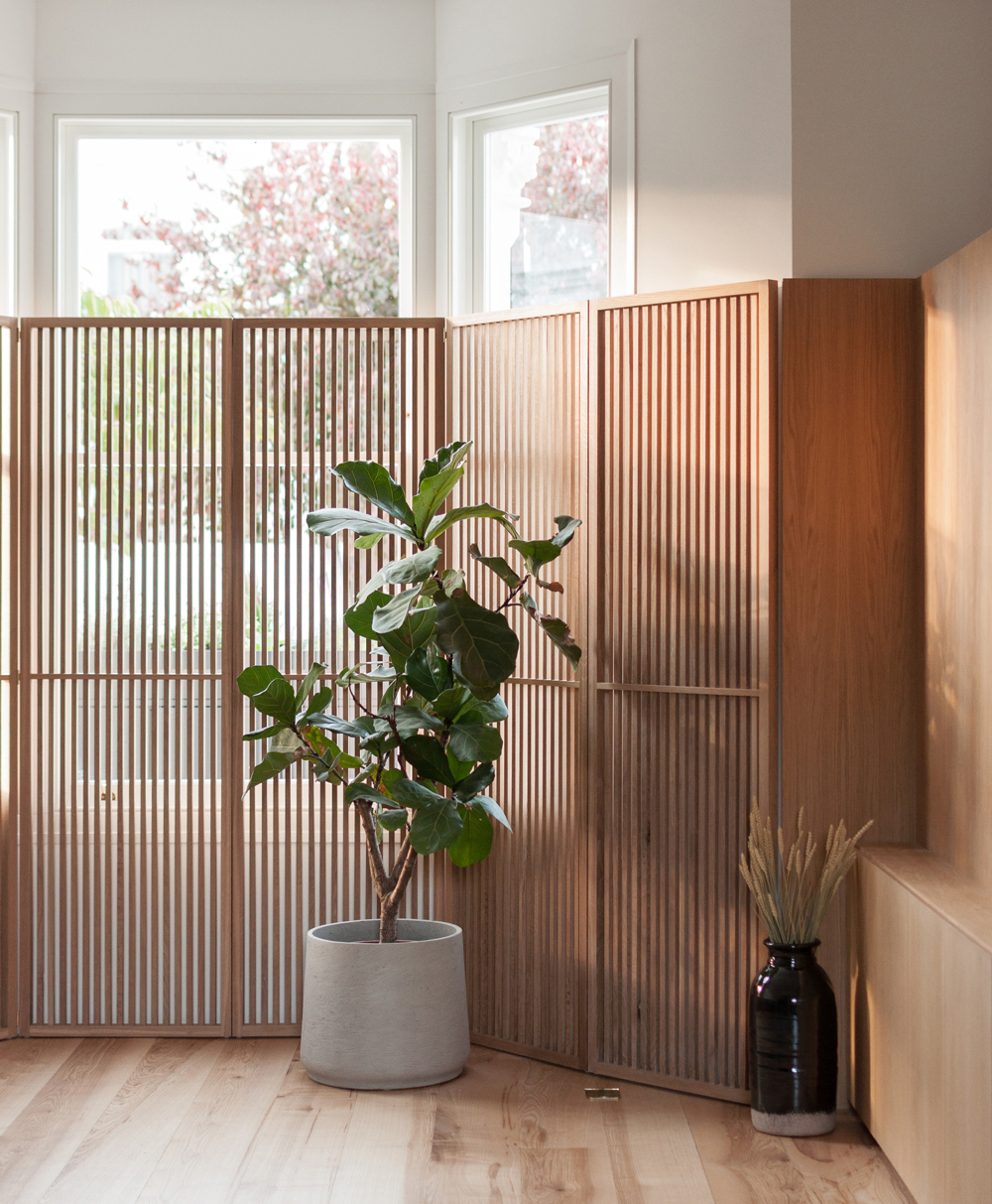
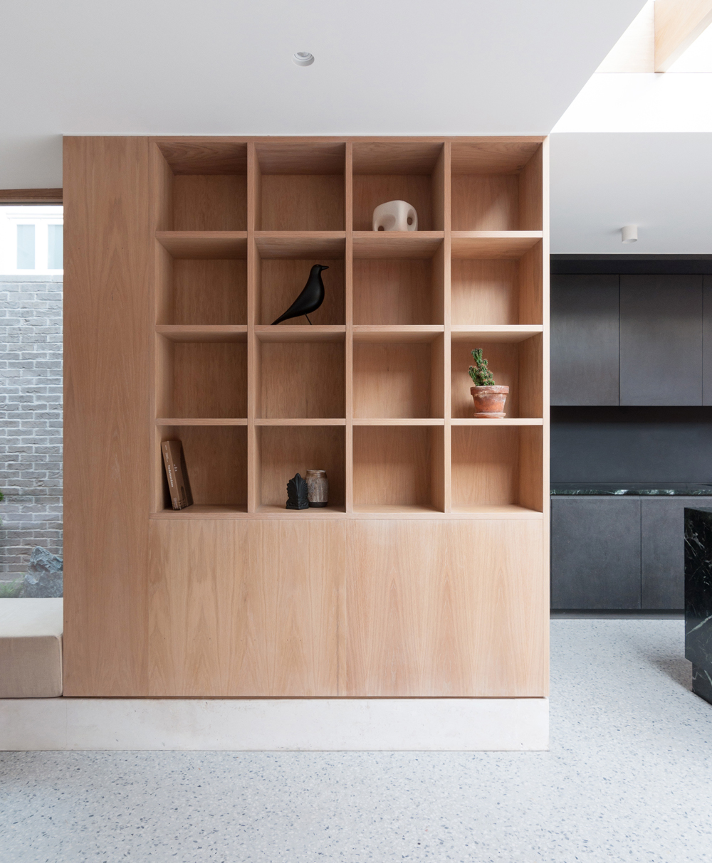
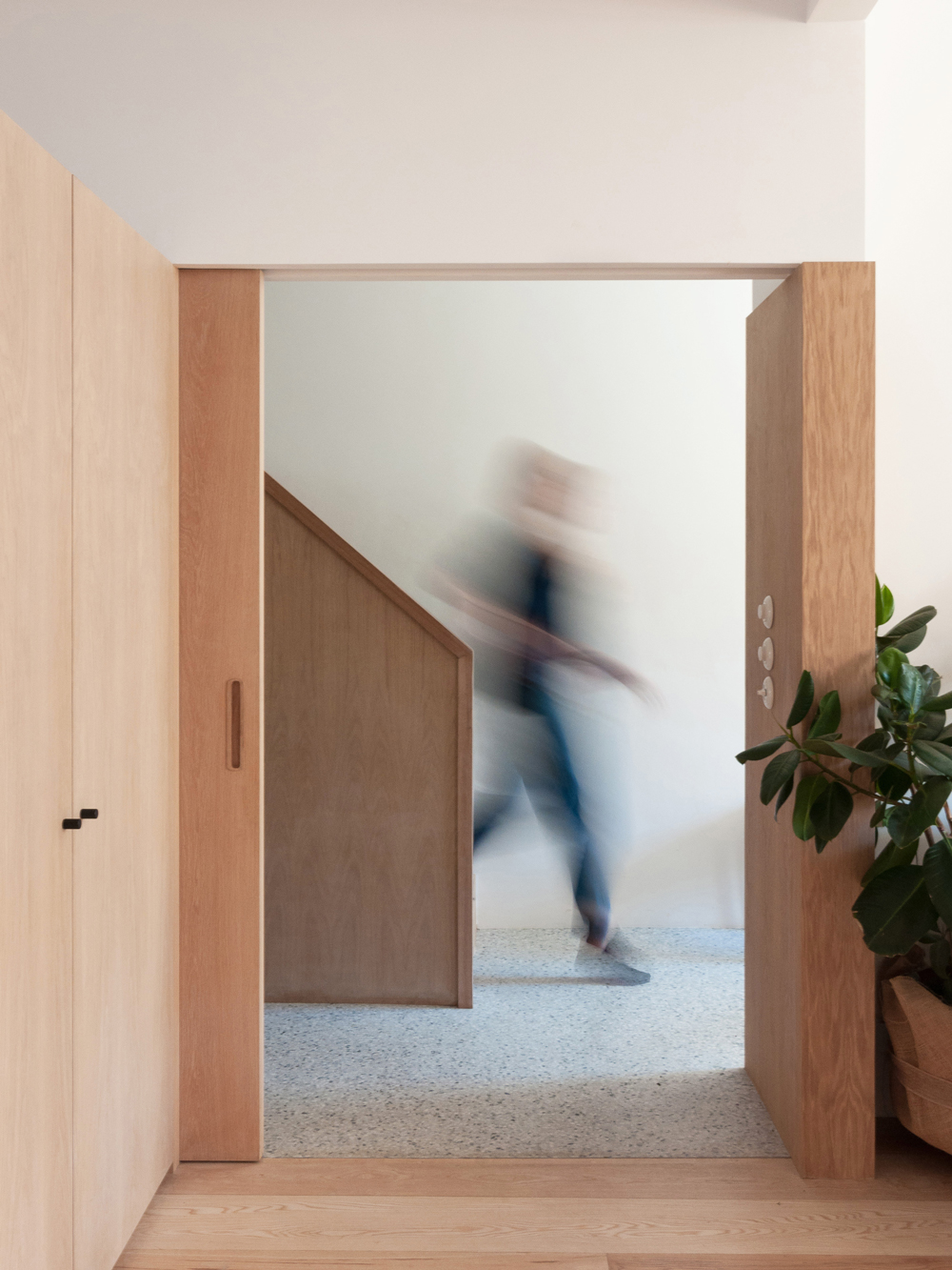
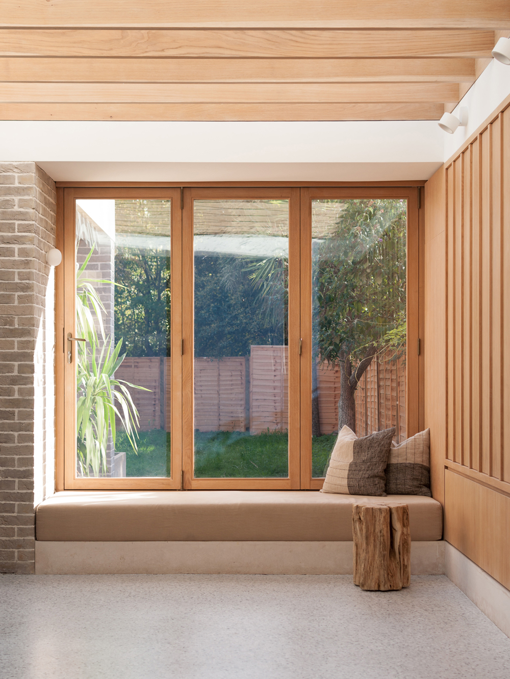
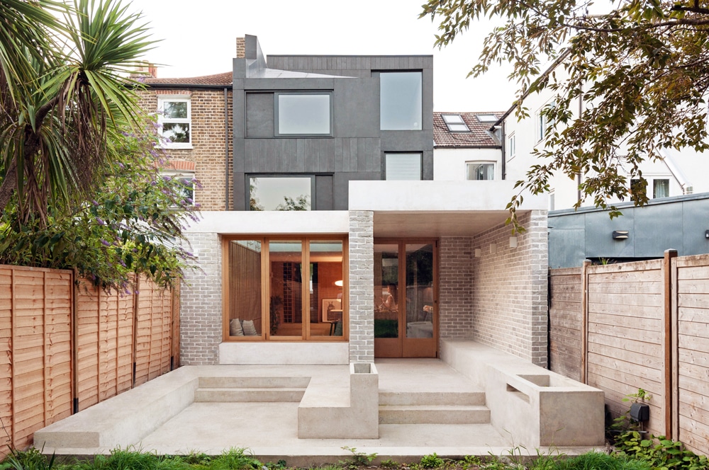
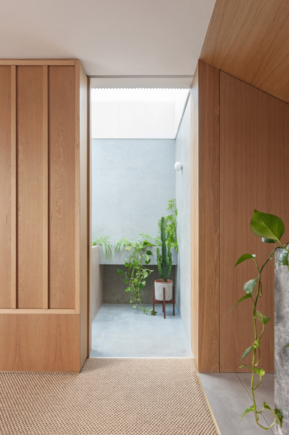
Yellow Cloud Studio has redesigned and extended a terraced Victorian house in Stoke Newington, north-east London. Sitting comfortably in its early Victorian surroundings, the newly-redesigned property has a rear garden that is now retained as a courtyard bringing more light into the interior while enhancing ventilation and visual connection. The focal point of the space is a Japanese cloud tree that occupies the courtyard, framed by a 3.7m long fixed glass. A large pivot window and a glazed door connect the front of the house to the rear through the courtyard, as the breeze lets sounds and smells travel through the entire house on summer days.
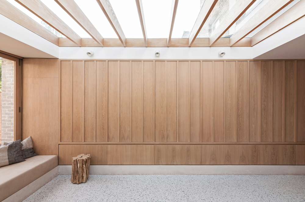
As the architects describe, “The rear part of the house is extended to fit a large kitchen and dining area, with generous circulation space and a seating area where the rear garden views can be enjoyed. Oak doors fold to one side and the internal area blends with the outside, inviting the user to experience the space as a continuation of the garden. Part of the rear façade comes out, forming a covered pergola and a concrete seating area is sunken a few steps lower, in order to allow for unobstructed garden views from inside. A large skylight provides wide sky views and allows for abundant amounts of natural light to flood the space”.
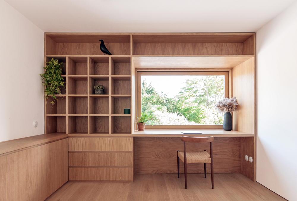
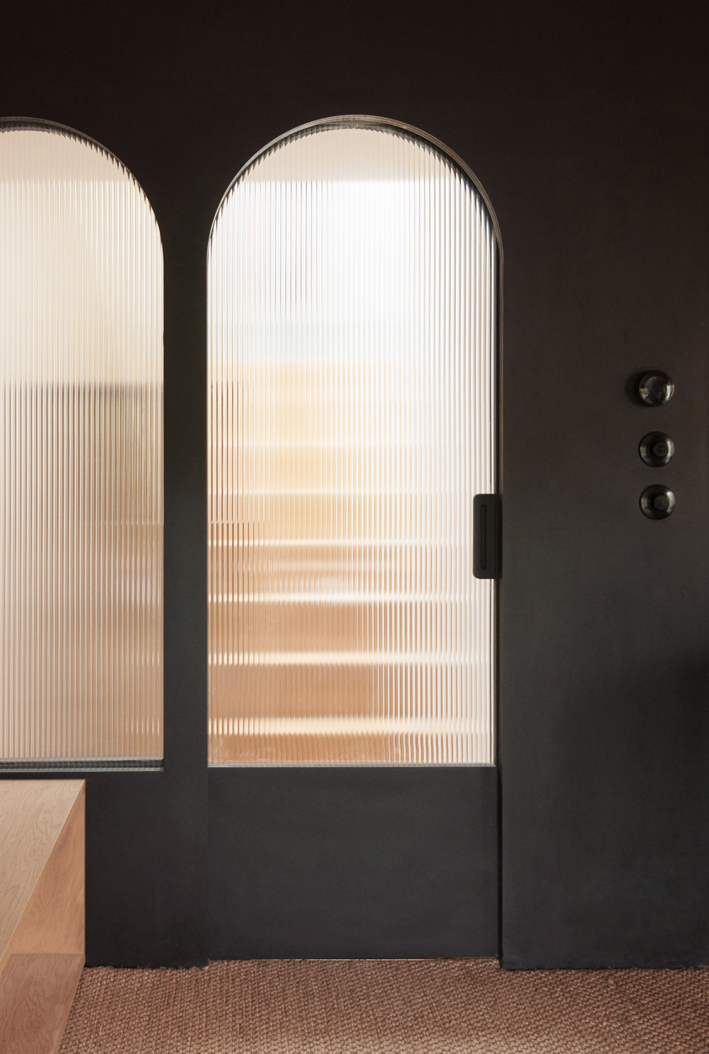
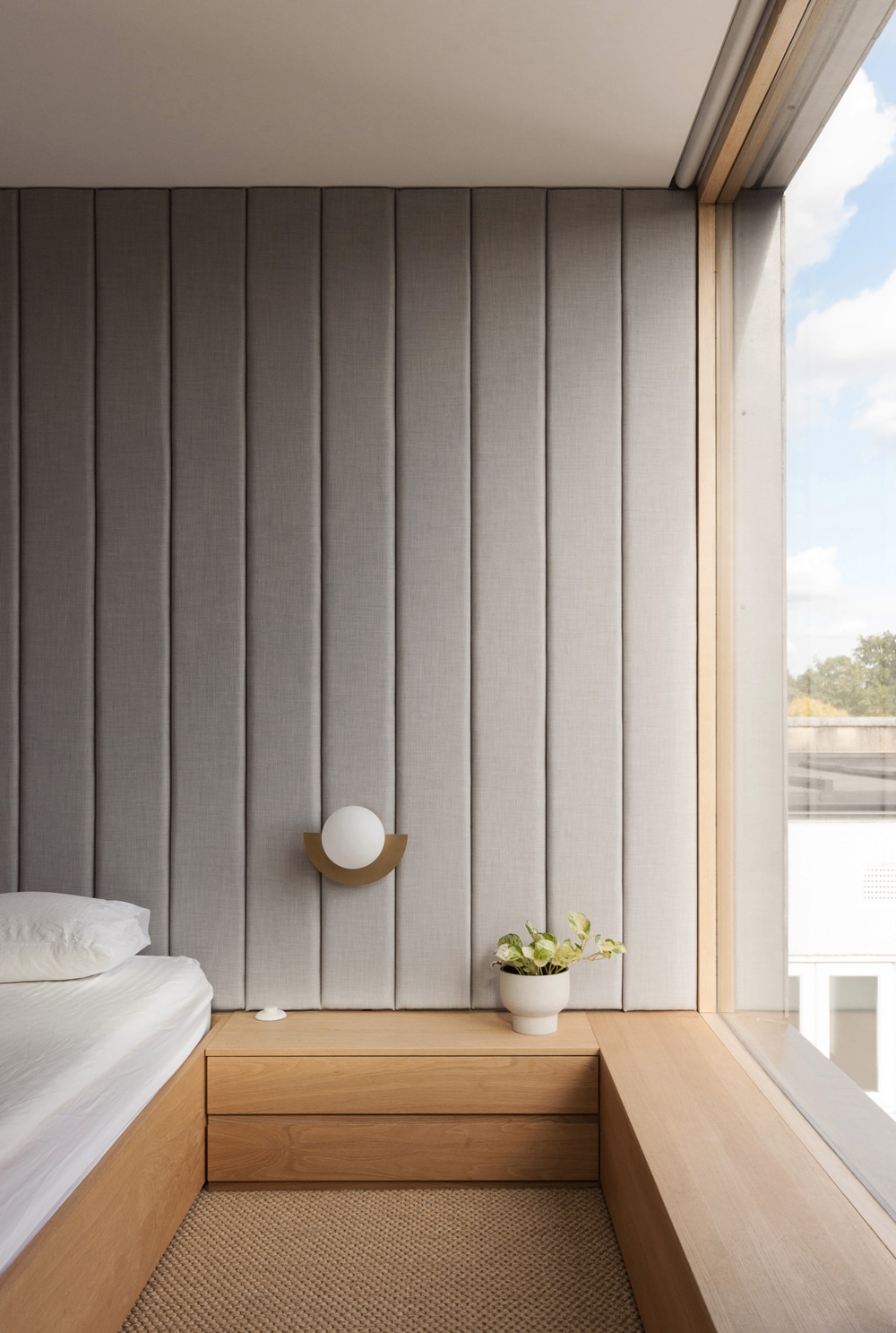
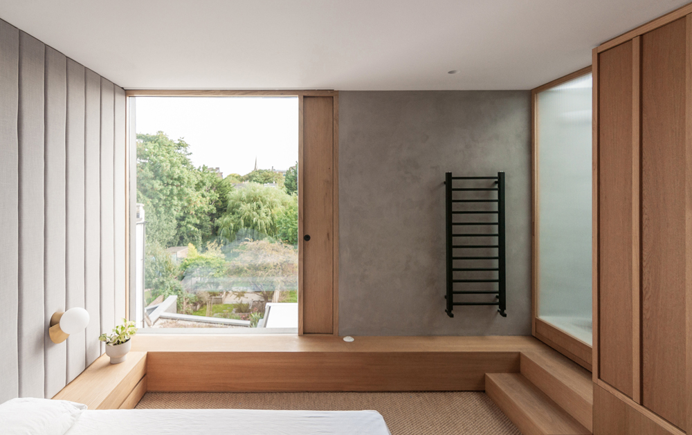
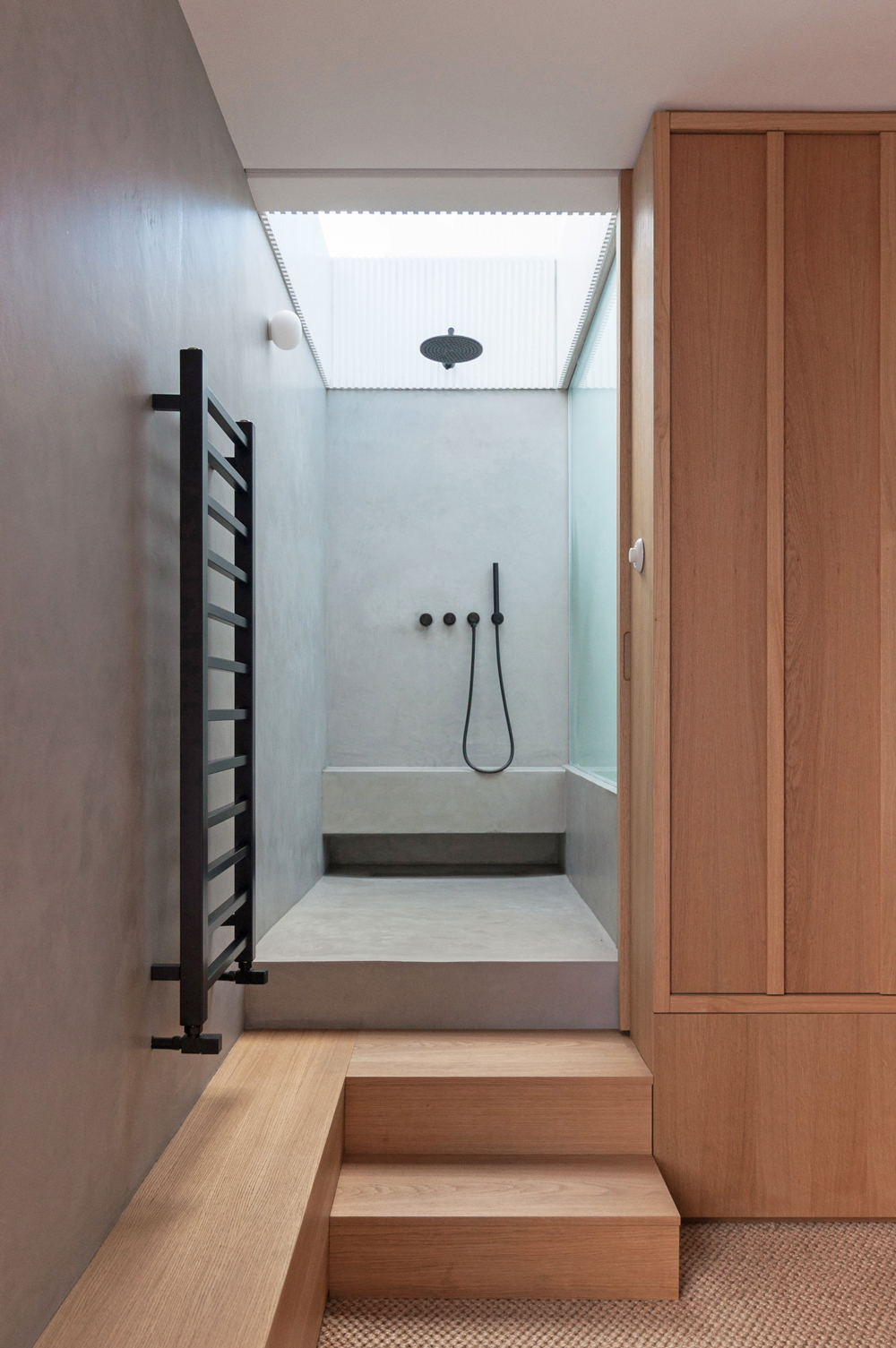
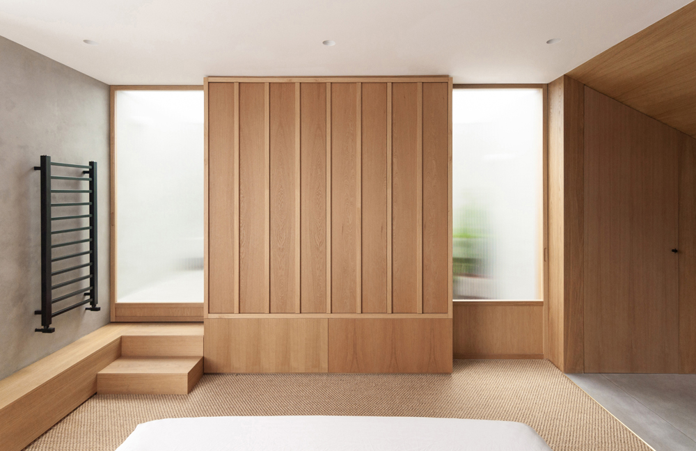
The added top floor works as a serene, bright and private space for the master bedroom suite. An almost floor-to-ceiling fixed window is installed to frame the lush and long view, with only an opening side panel for ventilation. A storage unit acts as the focal point and two fluted glass sliding doors are designed to disappear inside the unit, giving a sense of symmetry when closed. Behind one of them is the entrance to the room and behind the other is a shower that sits suspended above the staircase. When opened, the doors disappear and ample light floods into the bedroom, again playing with the user’s perception of outside space, accentuated by the added element of a long, linear planter for vegetation under ideal lighting conditions. Materiality is key to visually navigating the space, with softer tactile surfaces meeting harder, more durable elements and vertical lines adding height and elegance to the room. The main aim of the project is to provide a unique user experience, with a methodical layout that makes navigating through spaces seamless, sensory and pleasant.
