“It was the first time that someone entrusted us such a project, so our excitement was enormous.
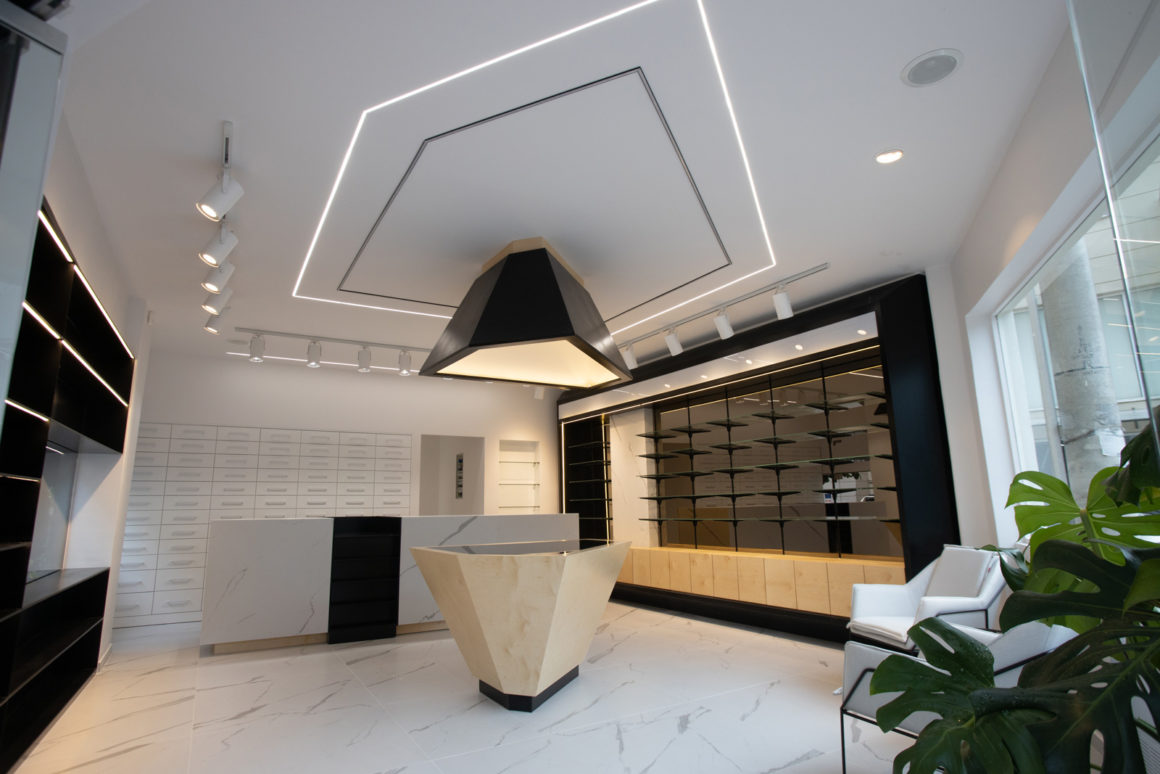
Our biggest challenge was to find a way so the interior would communicate with the exterior. Making our self-criticism we realised that we should respect the building itself. On the other hand the client wanted his store to stand out. We started designing the interior’s functions, always keeping in mind our challenge. We had an idea that fitted in well in this specific project. The space had two very big openings. The main disadvantages of that were that the Greek sun and hit were entering the space directly and we had less walls than we needed to expose the products. We designed two big metal constructions as a solution for the above. These constructions were going to flow through the openings in a such a way so they can bring the inside outside without damaging the exterior.
The big tiles that look like marble create a pattern inside the pharmacy. The reception follows this pattern and it looks like it emerges from the floor. In the back of the reception the main drug store, the heart of the pharmacy, is dressed in whites. All the other products are exposed in black metal cases of a polyhedral design. In the center, there is a main front to showcase the high quality products. We used three main materials: metal painted black, plywood and tiles. The secondary materials are glass, mirror and laquer paint on mdf.”
