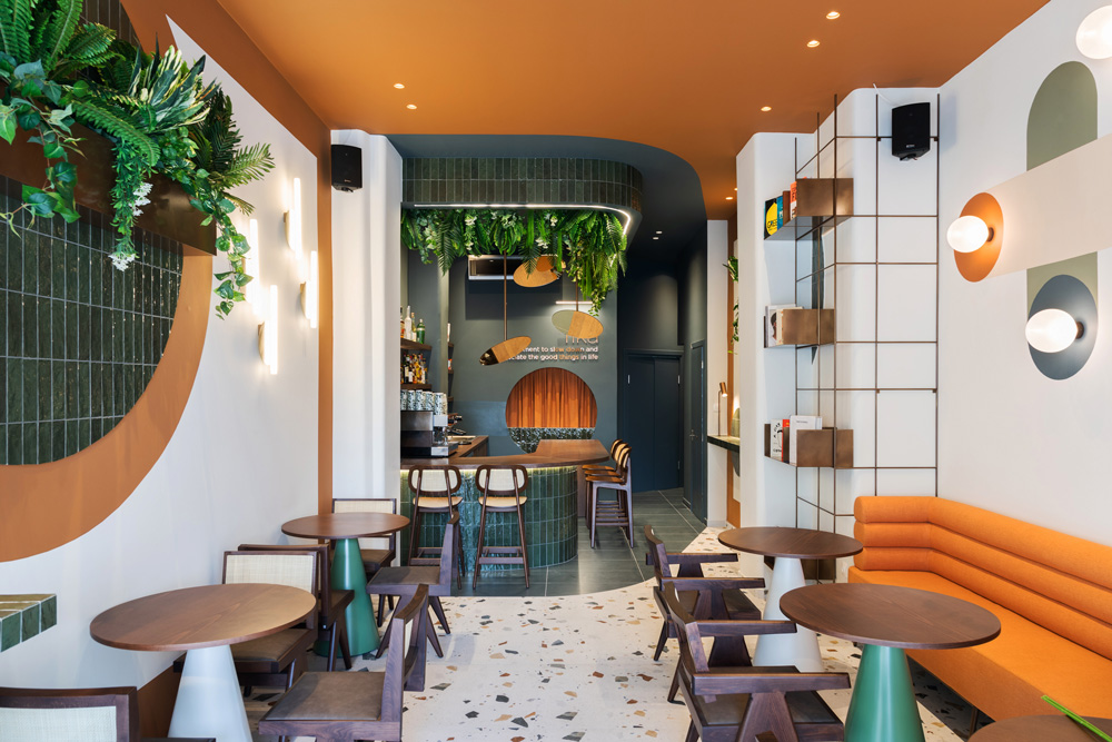
Fika is not just a word in the cultural vocabulary of Swedes; it is actually part of their mentality. It literally means to find some time during your day to enjoy a cup of coffee with friends, but it’s so much more than that. It is this time of the day where you slow down, indulge yourself with coffee and a sweet, preferably homemade and well-presented and socialize. Ideally this should be taking place in a design, comfortable and well lit area.
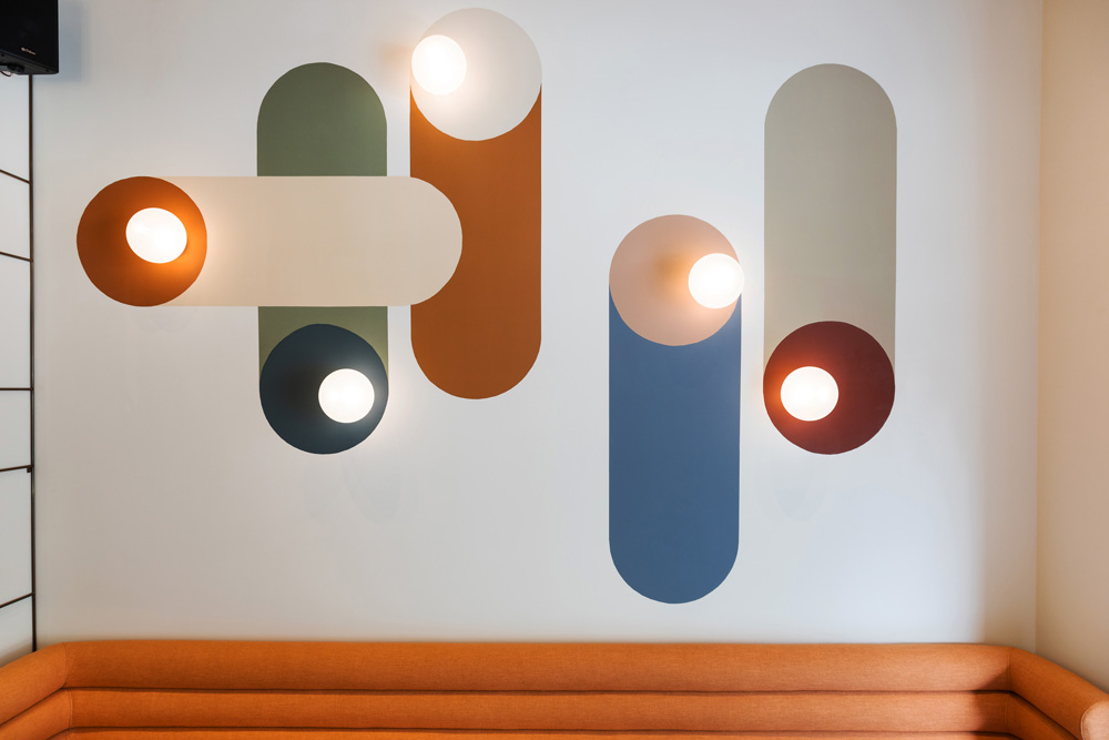
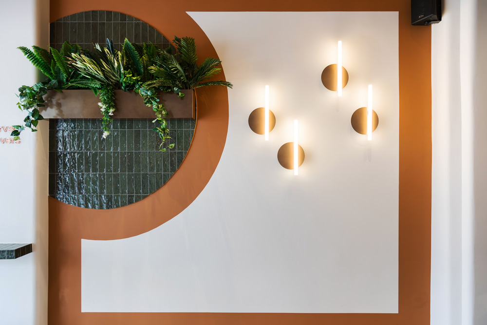
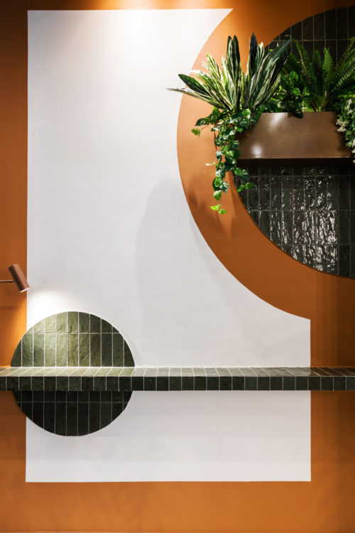
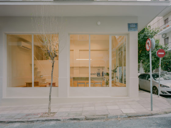
“Our central idea for Fika was inspired by the Scandinavian graphic design, with its simple yet sophisticated style. The space functioned as a white canvas where clean straightforward colorful lines give the sense that the walls are part of a poster.
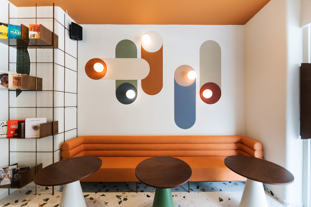
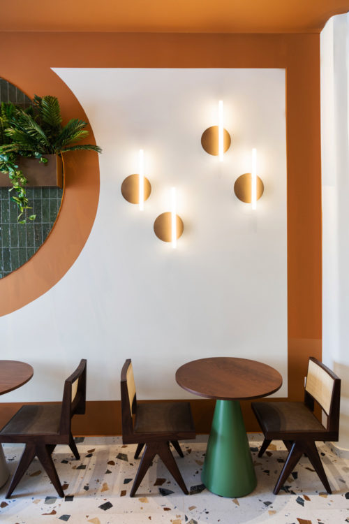
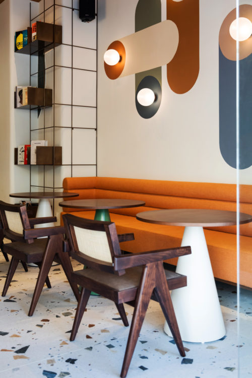
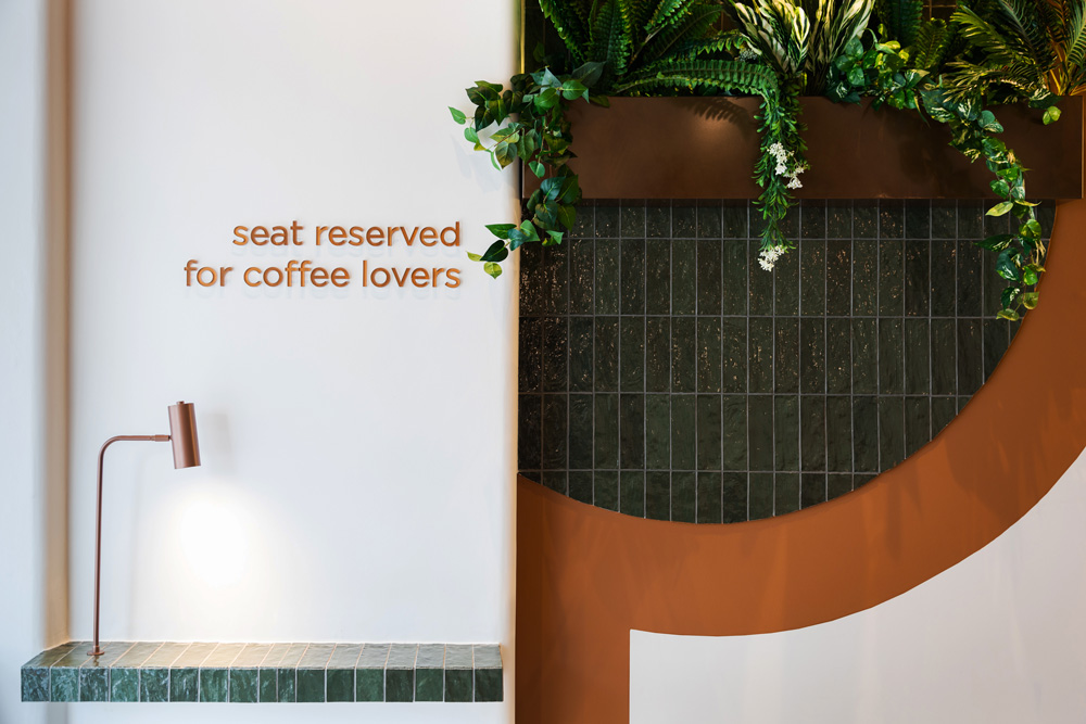
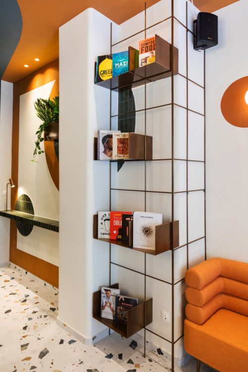
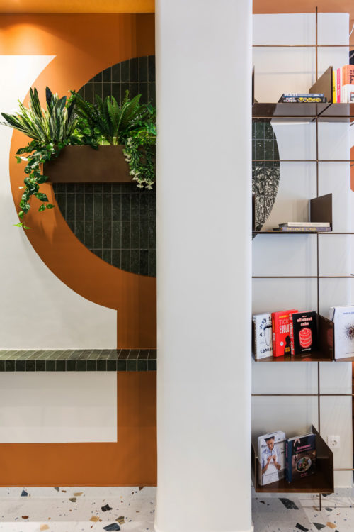
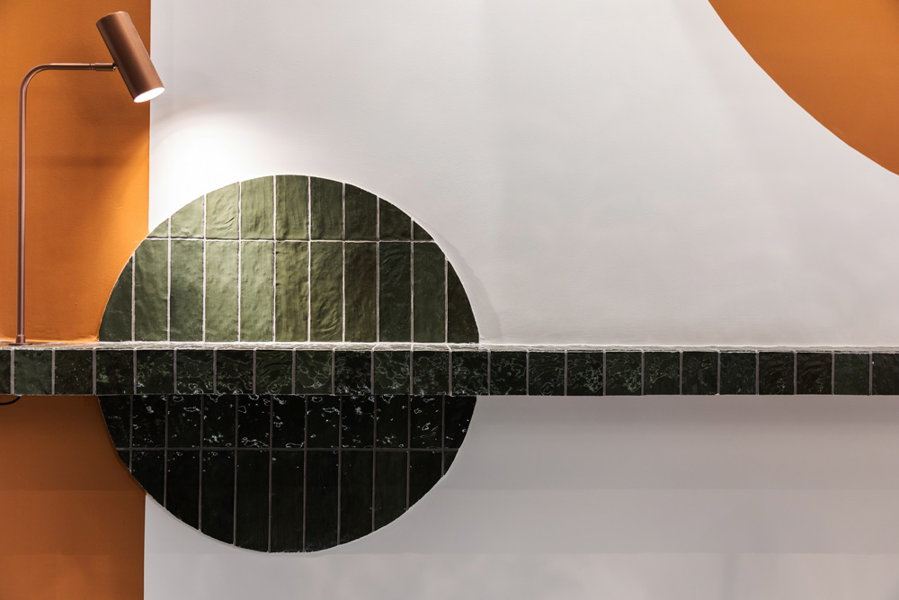
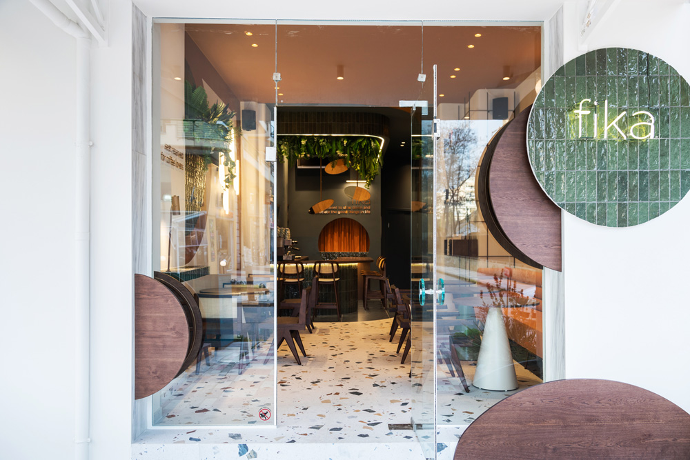
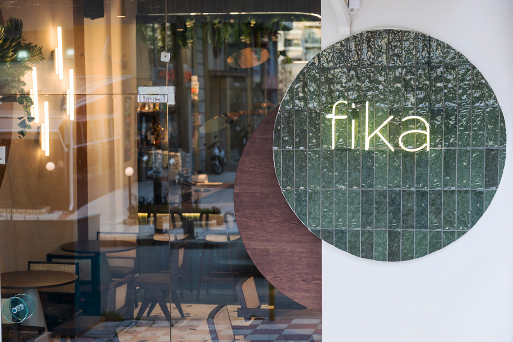
In the entrance, the multi-colored terrazzo welcomes guests to the sitting area with the orange couch and the wooden chairs with the woven backing. The conical tables in green and white add a touch of whimsy. The metal shelves of the library, featuring cookbooks, seam to hover over the space. The distinctive graphic patterns create bold shapes that form lights, while others contour the outlines of the walls. Some patterns are formed by green brick shaped tiles and others by paint.
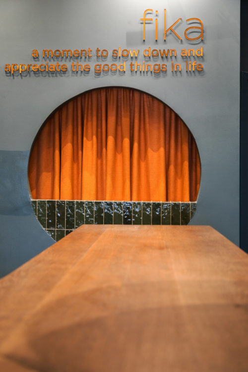
The bar is nestled at the end of the space, creating a visual blue tunnel that leads to the kitchen and wc. Round metal mirrors are hanging down from the ceiling to the bar reflecting the freshly baked goods. The round hole at the back of the bar, partially covered in tile, unites the kitchen with the front.
The cafe adds a pop of interest that feels edgy, cozy and whimsical all at once.”

