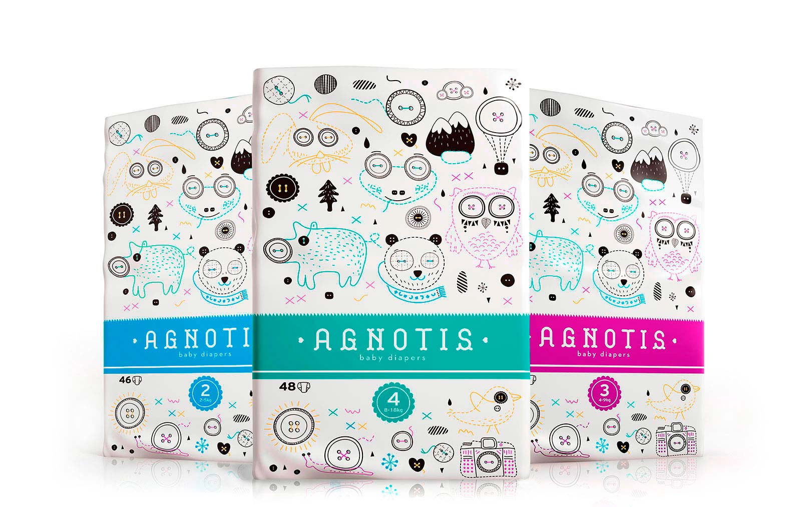
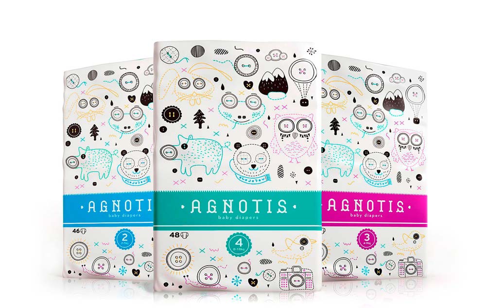
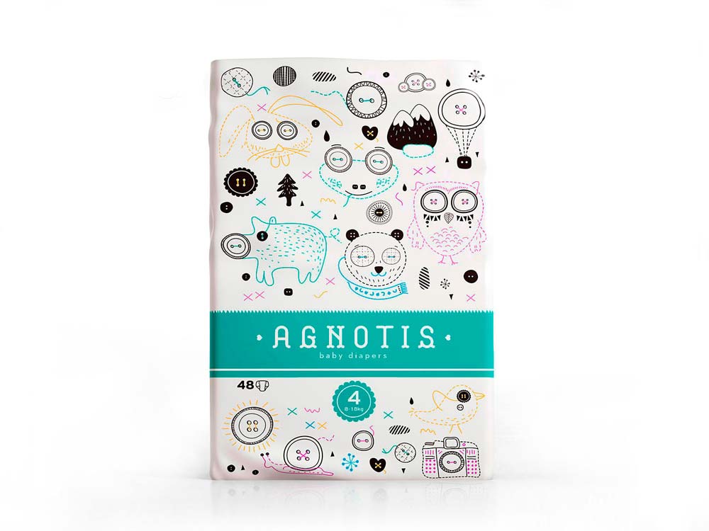
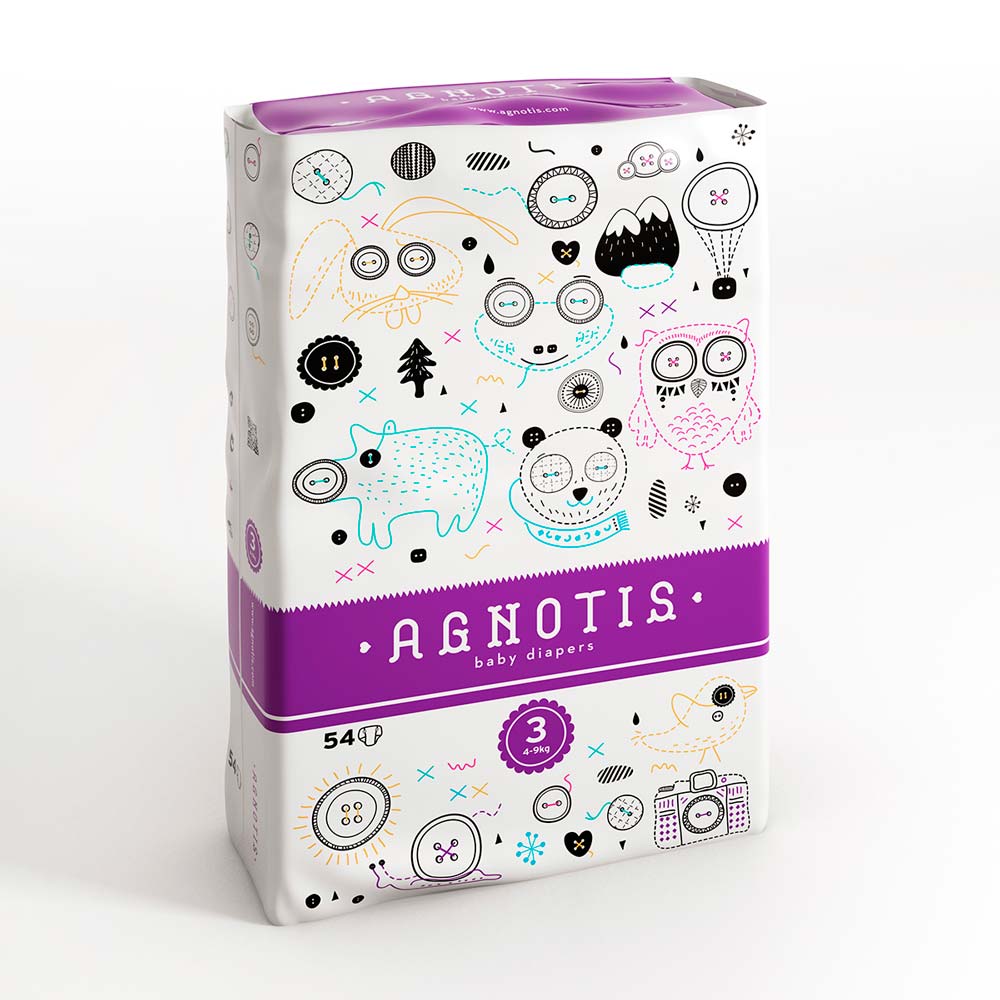
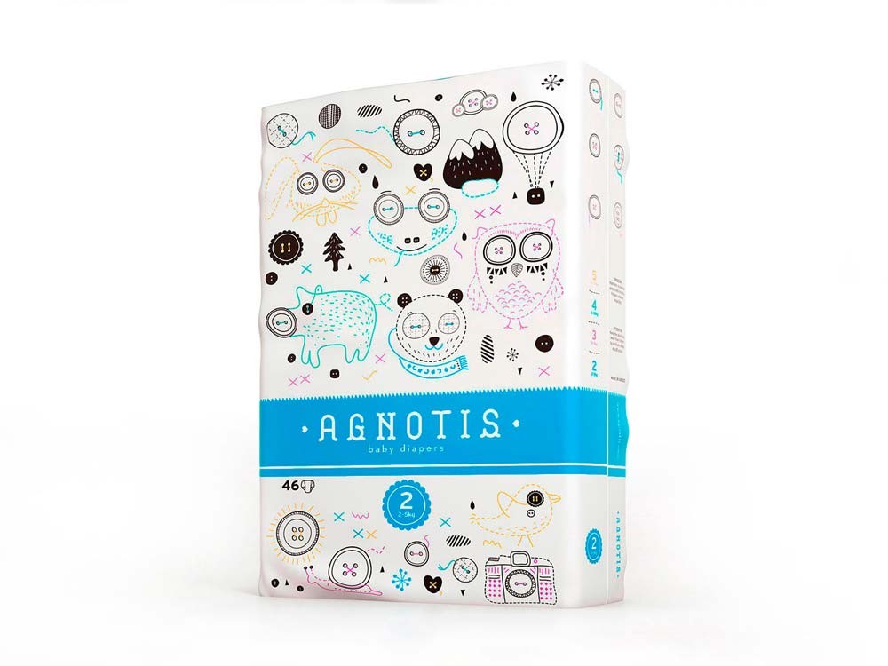
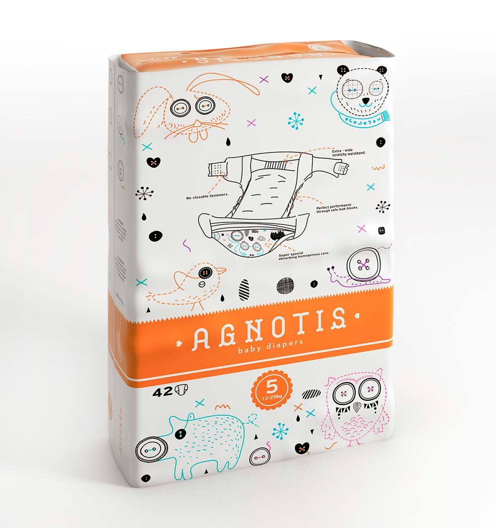
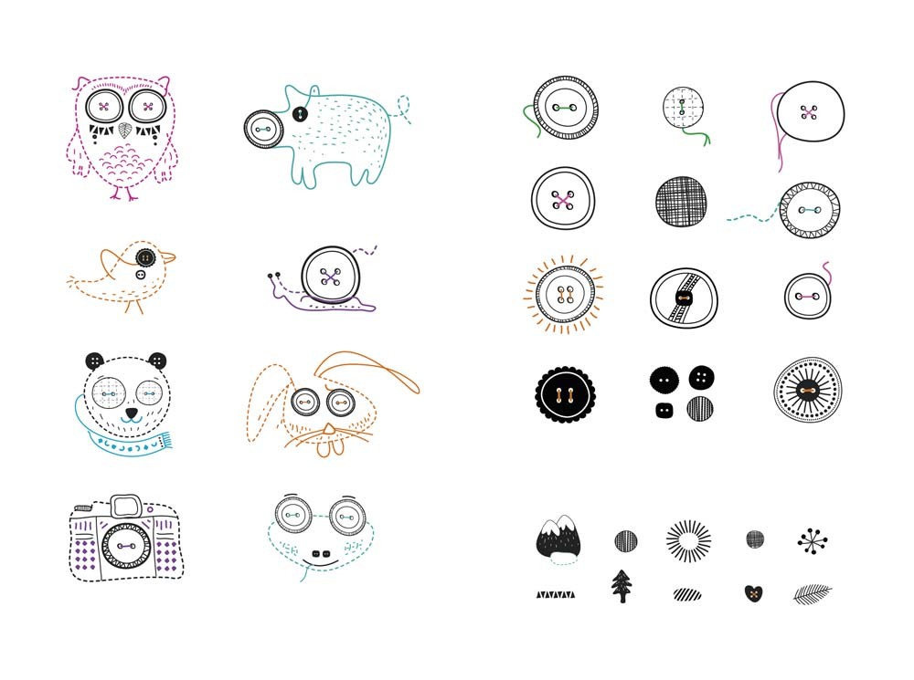
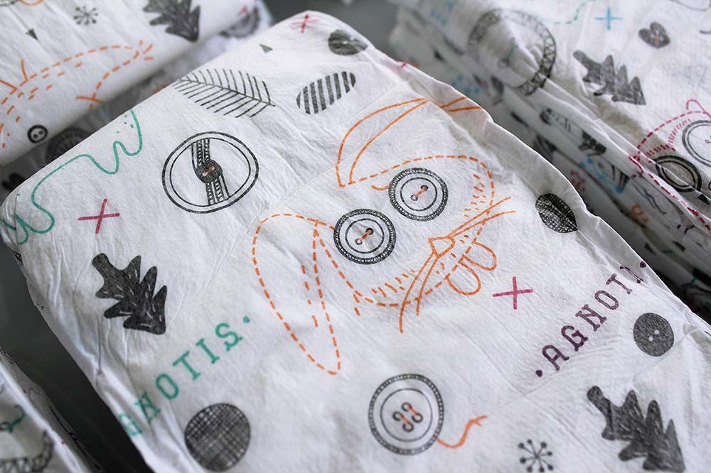
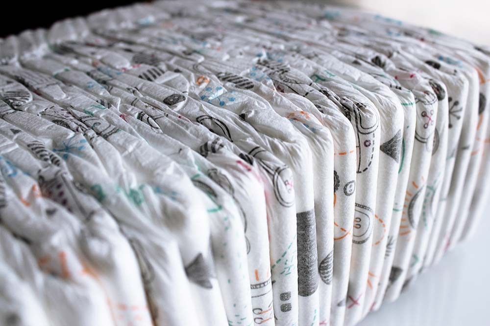
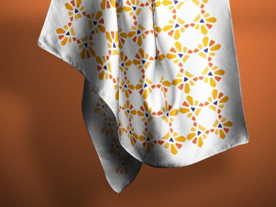
Dolphins Communication designed these diapers for a newly established hygiene product company, using simplistic stroke lines and illustrations that bring to mind children drawings. The main intention was to differentiate from the competition, and consequently, stand-out on store shelves. Hence, the use of infant photographs that usually adorn this kind of packaging was avoided. The consideration of the diaper as a garment led to the use of the ‘button’ as the main element of decoration. Animal characters and items are largely used in the general design and illustration; the simplistic stroke lines create a ‘naïve’ artistic quality that resembles children drawings. The loose creative linchpin was the overall fresh, clean and friendly feeling of the design.
Agnotis by Dolphins Communication Design
