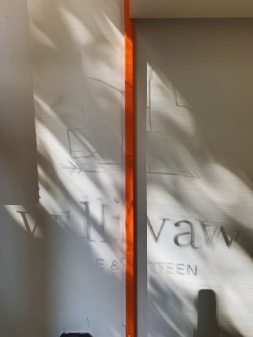
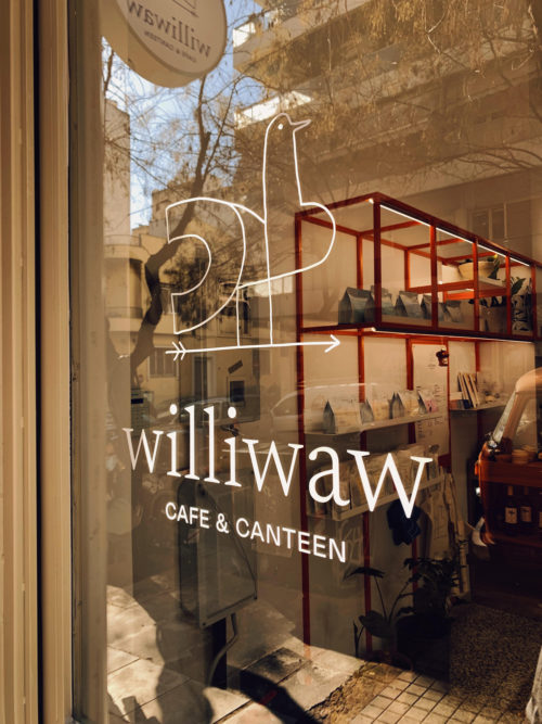
One can find Williwaw café & canteen on 69, Kerkyras str, after enjoying the sea view for a while from the top of the street, and then “diving” in the shade of the “akakies” trees lining up on both pavements.
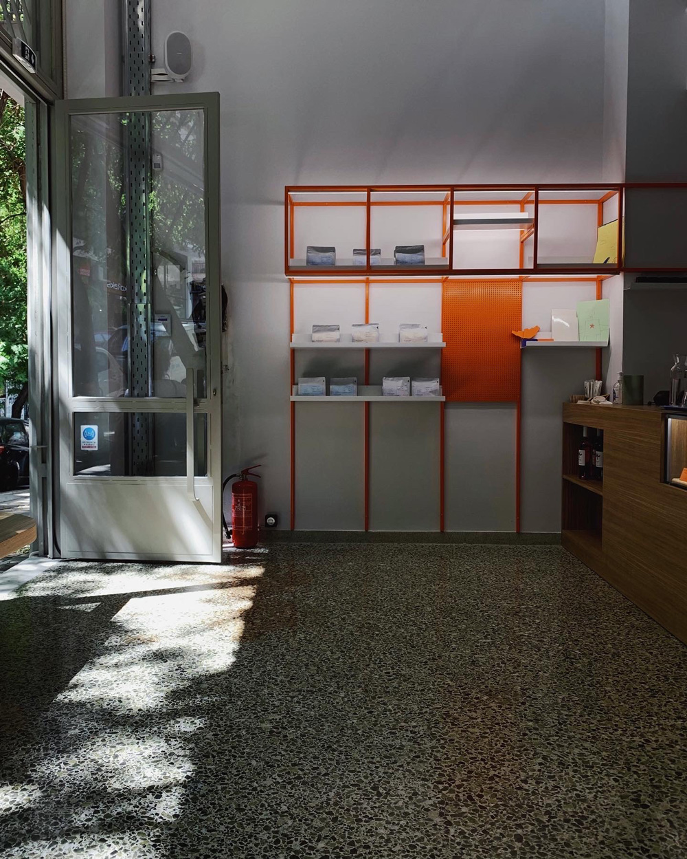
“When we first saw the place, there was a suspended ceiling lowering its double height, and the bottom half of its former iron façade had been replaced with white aluminum frames. Those were the first two architectural elements that we decided to restore as we found them more interesting in their original state. We also decided to maintain the mosaics covering the ground floor and the mezzanine. We all like Athens and we find charm in details such as a door handle on a beautiful post-war “polykatoikia” entrance, or the relics of a tiled wall on a demolished building site.
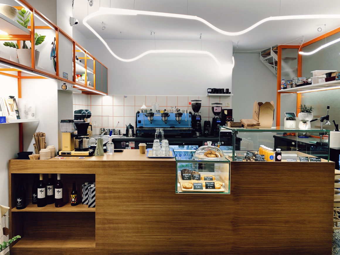
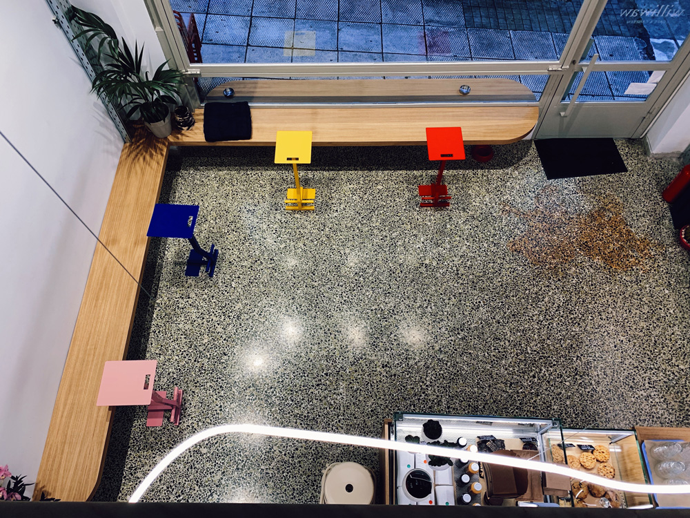
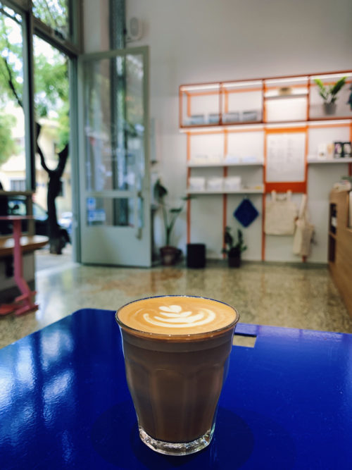
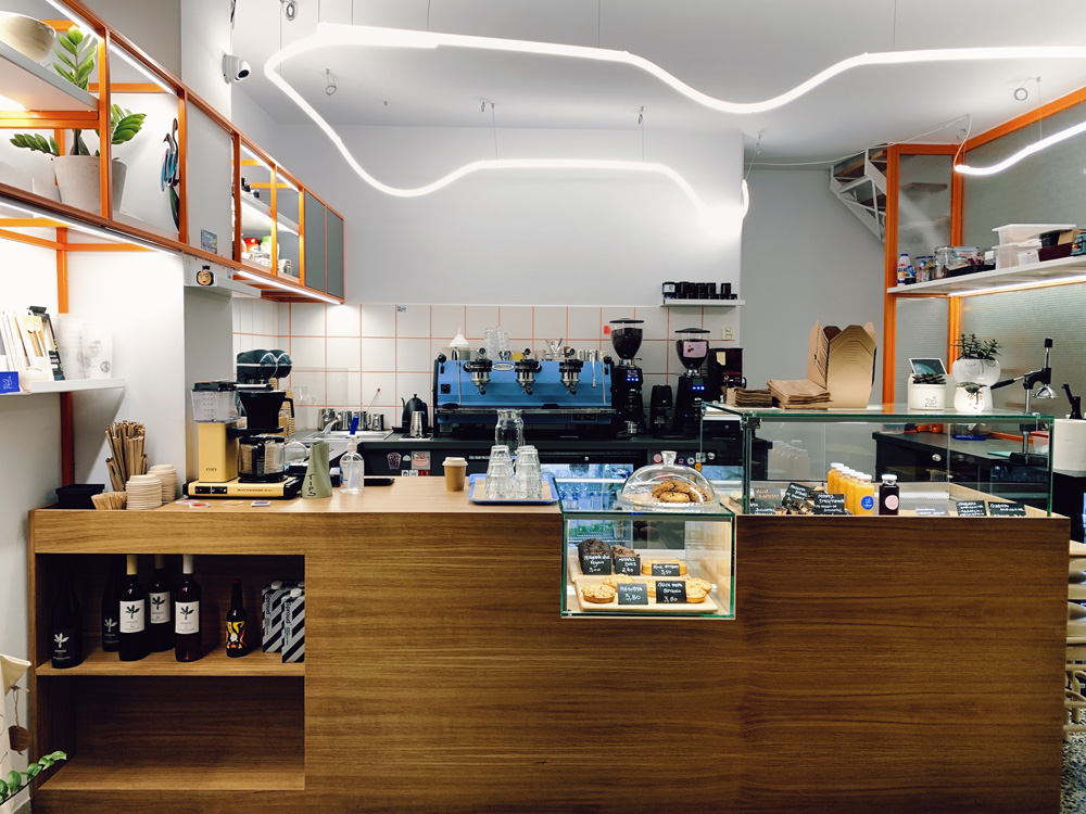
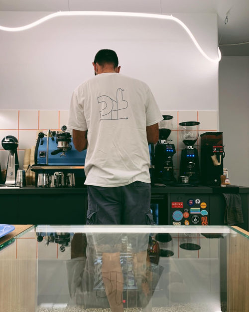
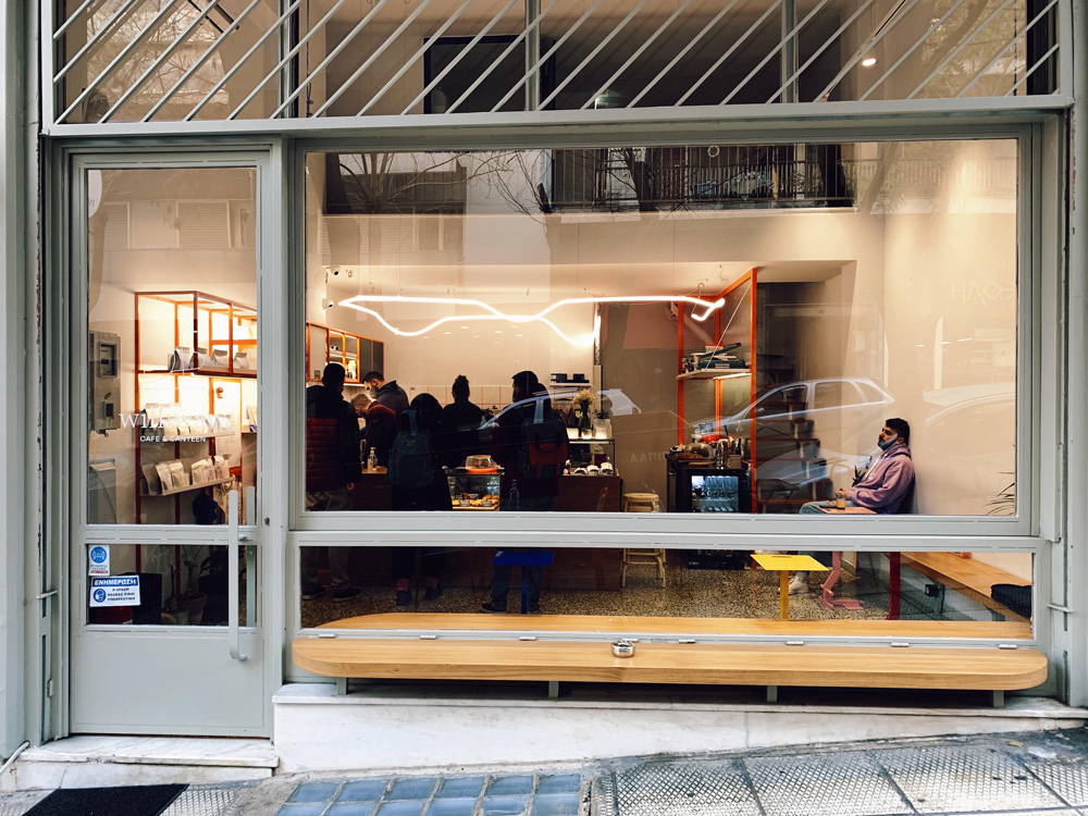
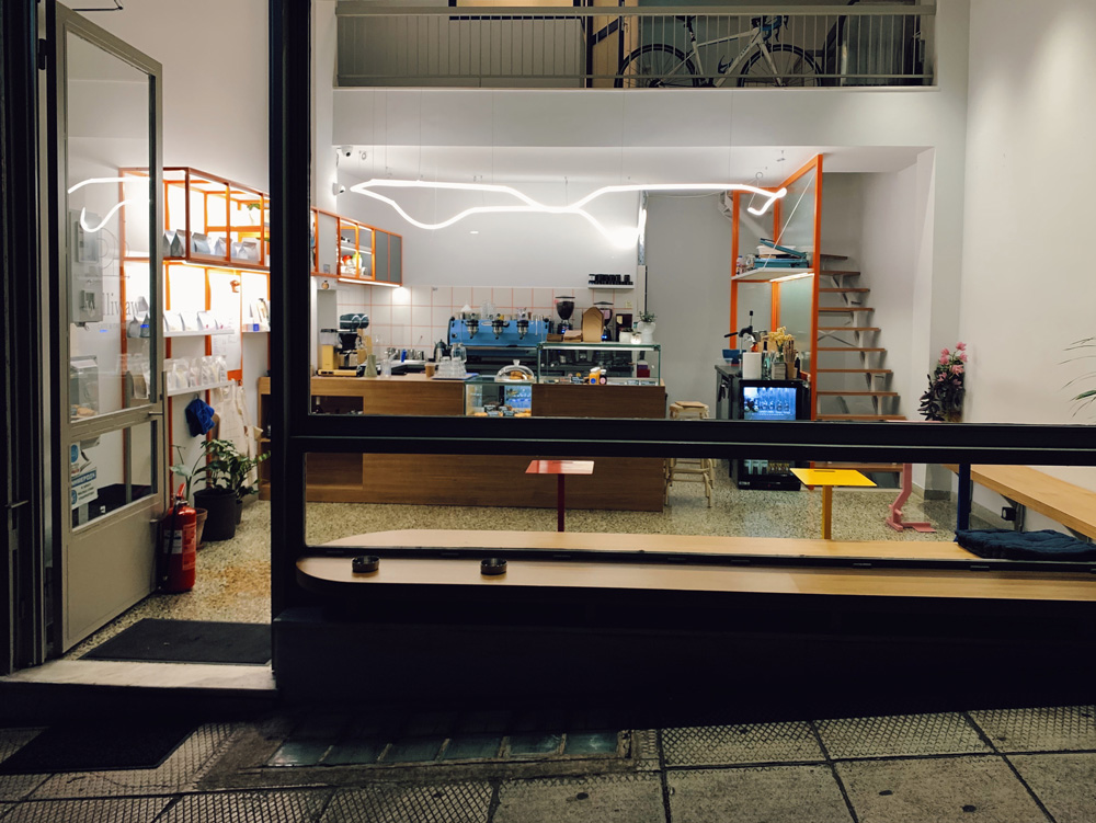
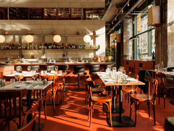
Wishing to maintain some flair of the 60’s era, when the store was built, but also make it feel contemporary in a casual and effortless way, we used simple design principles and materials, taking into consideration the existing construction as well as elements from the wider area of Kypseli. A main choice for the interior design was to make the preparation of coffee a core element of the space synthesis, so that the clients can have constant and direct contact with the process. That is why we placed the coffee bar on one corner, underneath the mezzanine, and the main seating area on the other, with benches facing towards the bar. In that concept, we also turned a big part of the façade into one “sliding” window, so that it allows people seating or passing by outside to have a clear view of the inside.
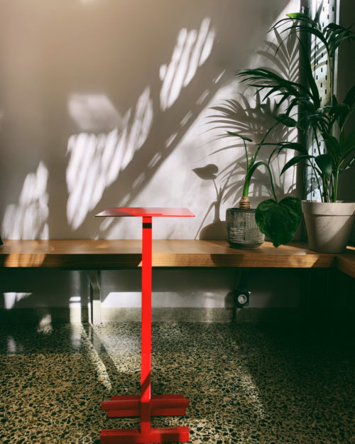
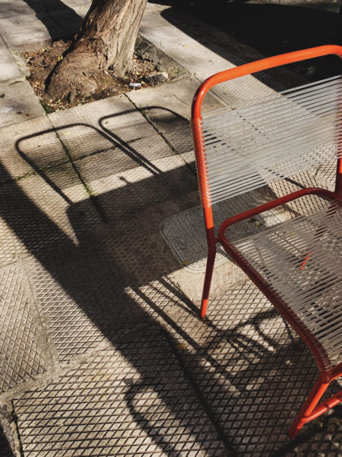
For the benches and the reception counter surfaces, we chose natural oak veneer wood, coated with wax varnish, so that it feels smooth and natural. Smaller furniture and elements were made of iron, because of its finer construction possibilities. Bold colours were used on those elements that are linear or have small surfaces, so that they discreetly impose their presence in space. The façade colour matches the shades of the mosaic floor, so that it also contributes to the interior and exterior unity. The walls were all painted off-white so that they emphasize on the store’s double height and reflect natural light as much as possible.
Lighting design’s basic principle was to add to the theatrical impression of the coffee preparation area. So, the main lighting fixture was placed above the coffee bar and has a freeline form so that it contradicts with the rest of linear elements in space. The rest of the lighting at the bar area underlines the linear elements, to add focus on the retail products and decoration. Above the benches’ corner, spots were used to light the seating area but also provide the possibility to use the wall as a space for artworks.”
