A family-owned business with a 35-year history in the catering, patisserie and bakery market, Begnis Catering combines the traditional values of personalised care and attention to detail, with an innovative spirit towards taste.
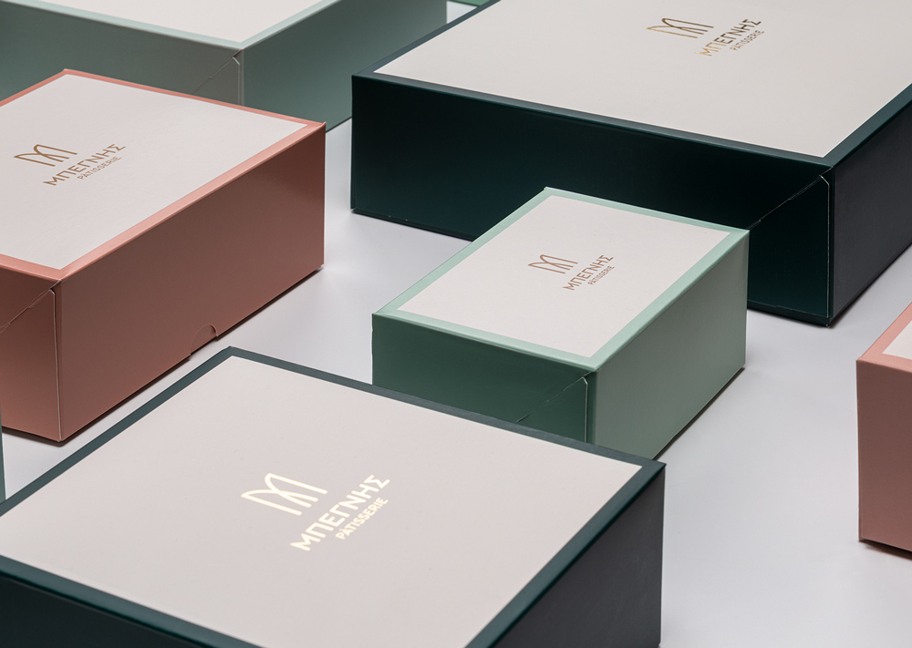
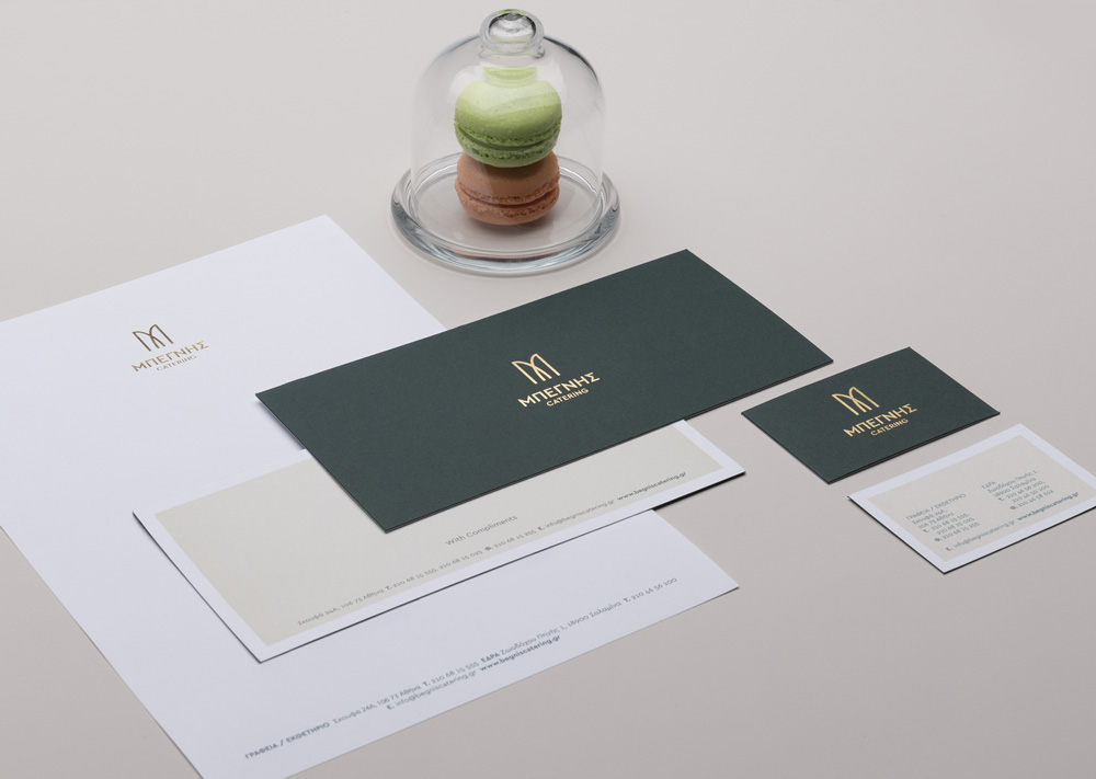
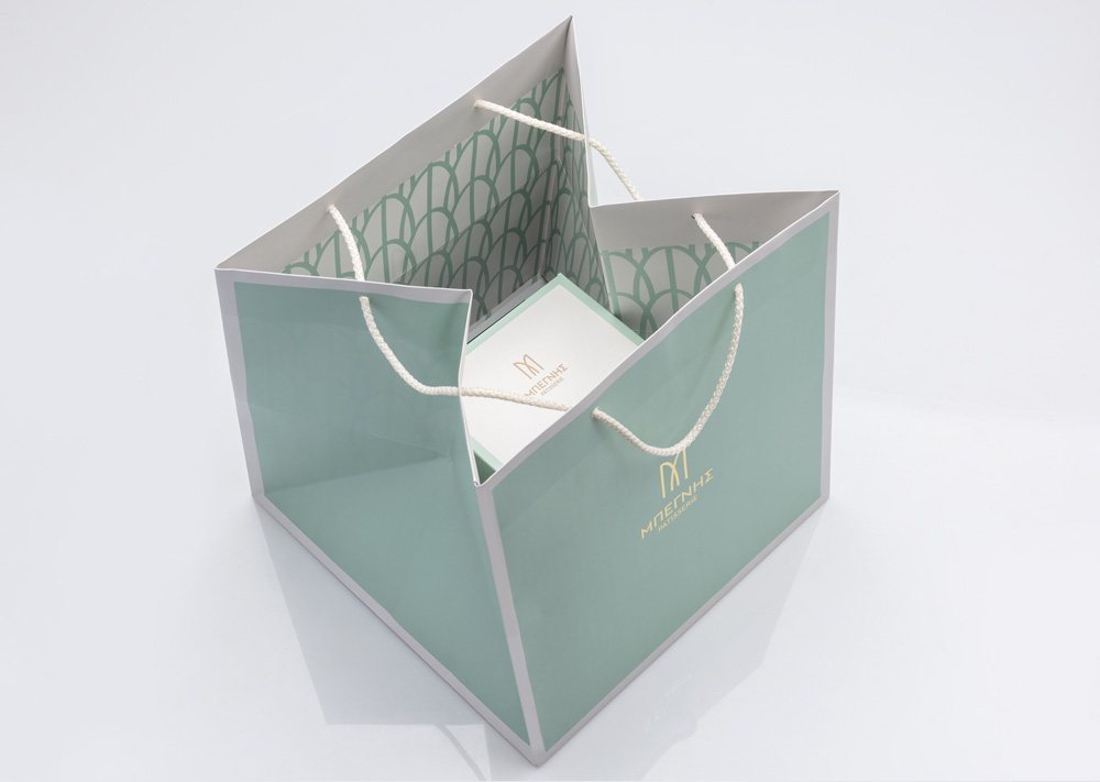
The new typography-based logo reflects this bond between customer service perfection and original gourmet experiences. Focusing on the first letter of the name «Μπεγνής», the new logo consists of two mirroring arches which meet one another to represent an all-embracing approach to events of all sorts. Gold lettering defines the exclusivity and high-quality of services, while the capital fonts give shape to a prestigious signature.
The stylistic approach on Begnis’ identity for Catering Services is defined by a bold colourway, contrasting a deep forest green with an elegant beige. The sleek colour combination is underlined by golden details, conveying the essence of haute cuisine.
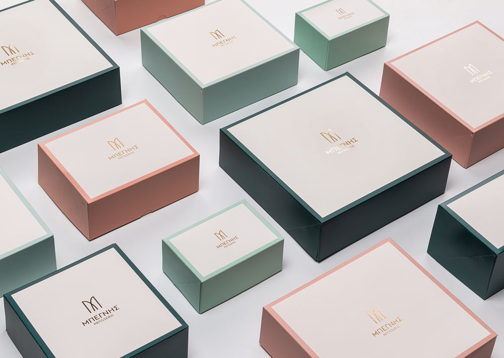
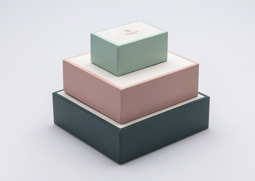
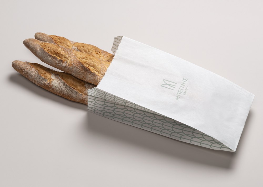
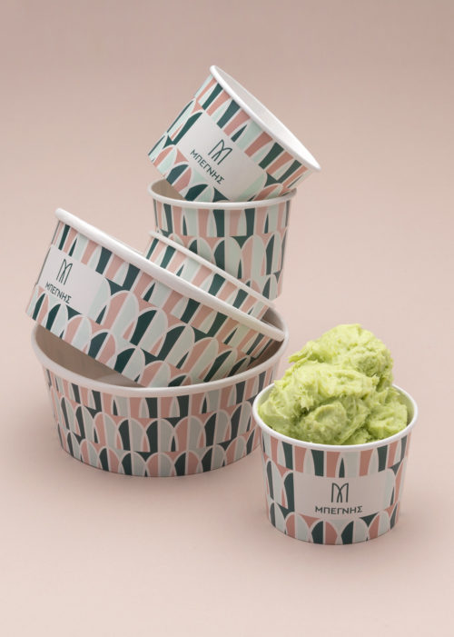
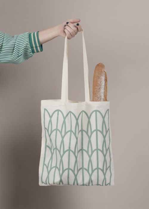
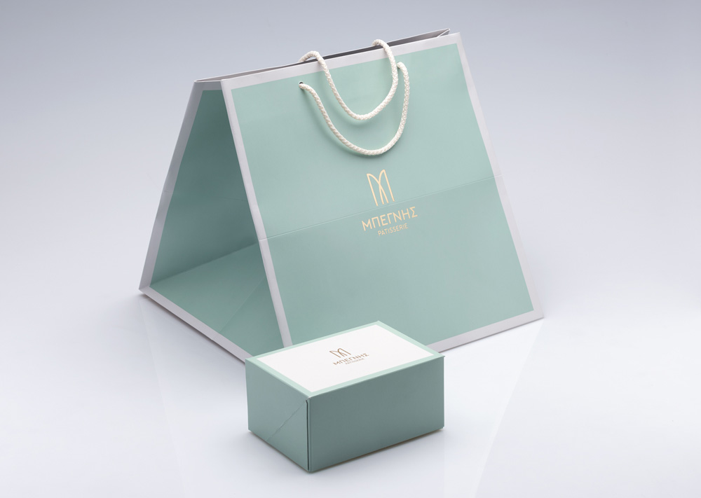
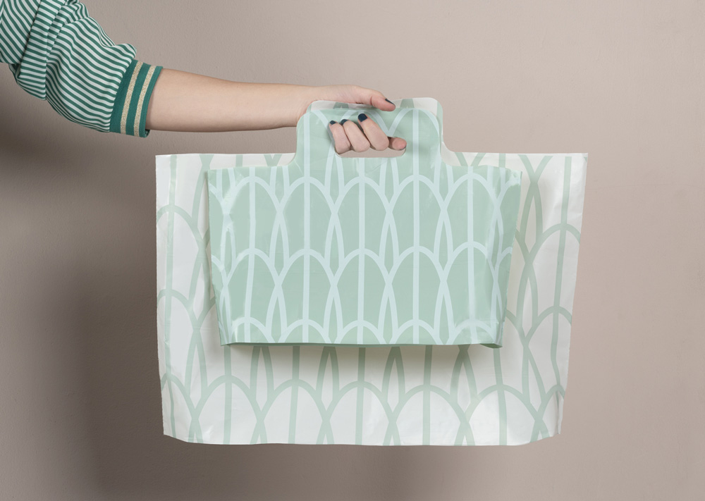
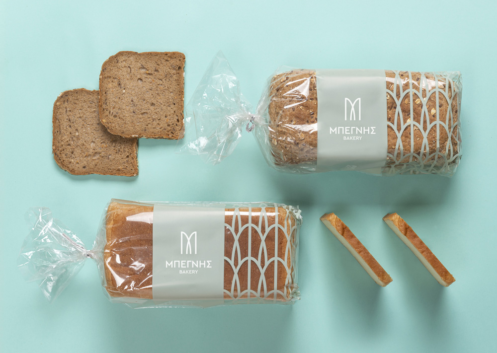
When it comes to Begnis Patisserie and Bakery, the colour palette is enriched with pastel hues of beige, mint and pink. The monogram logo has been repeated to create a unique and lively pattern, aimed for packaging and other adaptations. Exclusively for ice-cream packaging, the above colours were used in a bolder, playful combination.

