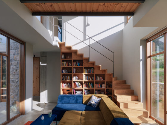
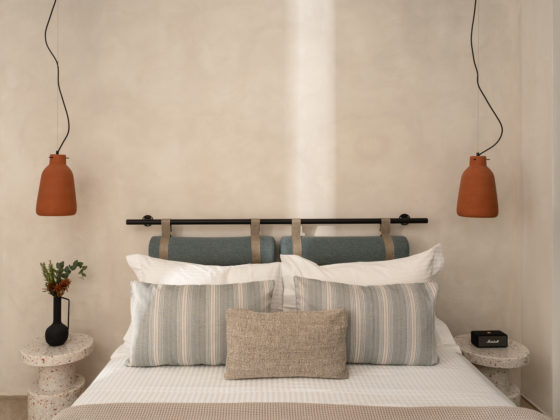
In the heart of the historical centre of Ioannina, in one of the most beautiful pedestrian areas, in a neighbourhood where just a century ago the Greek, Muslim and Jewish communities met and gave out a scent of multiculturalism and metropolitan elegance, an old two-floor residence is reconstructed and transformed into a boutique hotel, offering a new place for accommodation.
The basic designing principle was to showcase the building’s history both inside and outside in combination with the needs and functionality of a modern place that offers the experience of accommodation in the historical centre of the town. The building is constructed in two discreet time phases. The first one concerns the main building in the first decades of the 20th century (in about 1917 according to records) while the second one is about later additions.
The total surface of 445 square metres is divided in 4 levels. All the utility rooms and the breakfast area are in the basement while the 8 rooms occupy the other three levels. The reception area is on the ground floor. The yard is at the back of the hotel accommodating the preparation area as well as an open air space for relaxation.
Basic construction principles
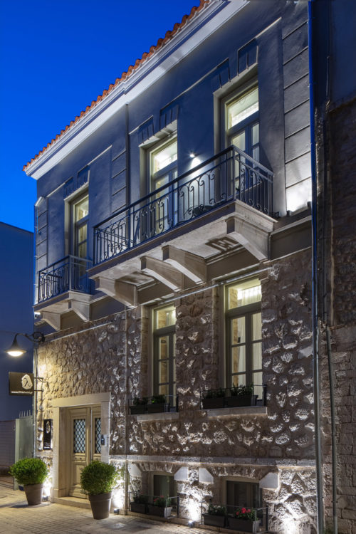
The choice of the construction materials (stone, mosaic, marble, wood) was such, to honour Ioannina’s traditional architecture and the special history of the wider area of the Castle, making the memories more vivid through picture. With respect to the architectural identity and the bulky building, our main aim was to highlight the neoclassical elements and maintain its identity through the prism of a modern architectural design. The stone masonry wall of the main building was boosted with the proper methods and in some cases revealed bringing the façade to its original construction. The later additions that were in bad condition due to poor construction, were knocked down to the biggest part and constructed again, maintaining the original geometry and the law standards of the historical centre of the town.
The building statics was one of the biggest restoration challenges since the inside part had to be totally knocked down, in some parts there were no foundations while many cracks were spotted mainly in the corners.
Due to the lack of space and the construction difficulties, the mixed construction method was the most suitable. The basement was boosted with interior reinforced concrete masonry, creating at the same time the base for a new metal frame. This was measured in such a way so that in case of an earthquake the repositioning tolerance will not affect the external stone masonry wall.
The part of the wall that remained exposed, was cleaned and grouted in depth while the other part was boosted with grate and then stuccoed. The tie rods both for the corners and the masonry played a great role. Lastly, the construction of a reinforced concrete barrier section at the front of the building was necessary.
Emphasis was placed on the building’s energy upgrading without affecting its character. Thermal insulation was used in the interior while the additions were easily insulated externally. The window frames were replaced with new, wooden, double glazing, energy efficient ones. Heat pumps are used for the heating, cooling and the DHW.
The basic shell structure of the building was used as a base for the internal architectural design making the best use of the high ceilings with the aim to reorganise the levels. The new planning led to the creation of different room types, avoiding the repetition and offering the visitor a different experience each time. One main entrance replaces the two that were created for the needs of the building in the past, restoring the main facade as well as the traditional design of the main entrance.
The reception area
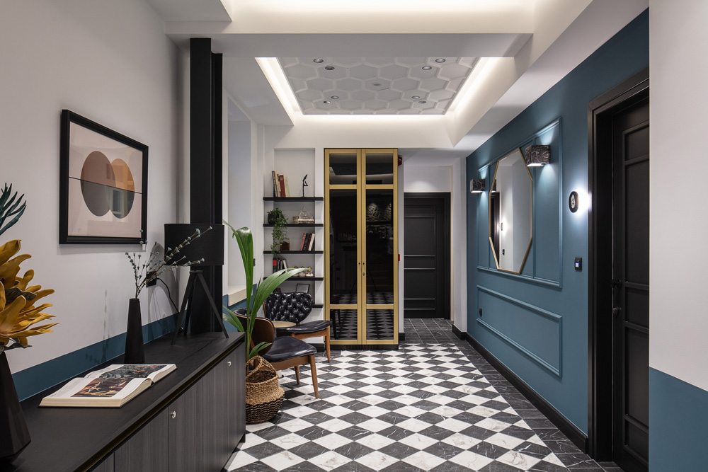
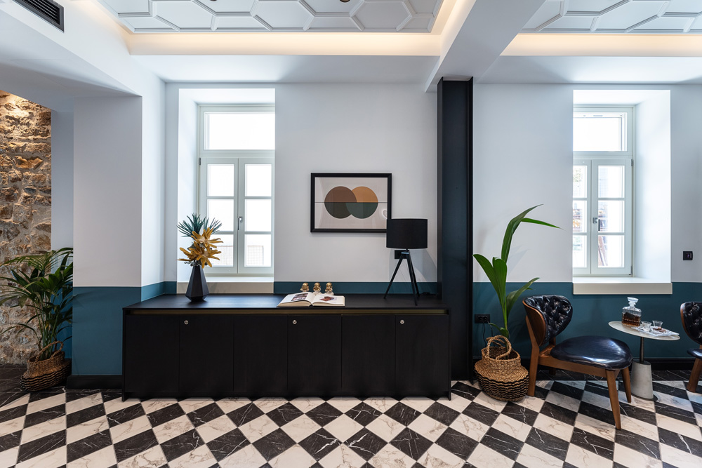
The main entrance is from Soutsou pedestrian street. Getting in the hotel and walking up just a few stairs, a cosy atmosphere welcomes the visitor. Special constructions designed to suit the modern surrounding are in accordance with the traditional elements in a creative way. Both in the reception area as well as in the common areas, a faux marble checkered floor tile is used, making a direct reference to the past. The open cell ceiling construction, frames the reception area which creates a simple, modern, cosy and timeless space supported with proper lighting.
The old wooden staircase was replaced with a new one while the new metal black and white linear railing gives the identity of a modern construction.
The rooms
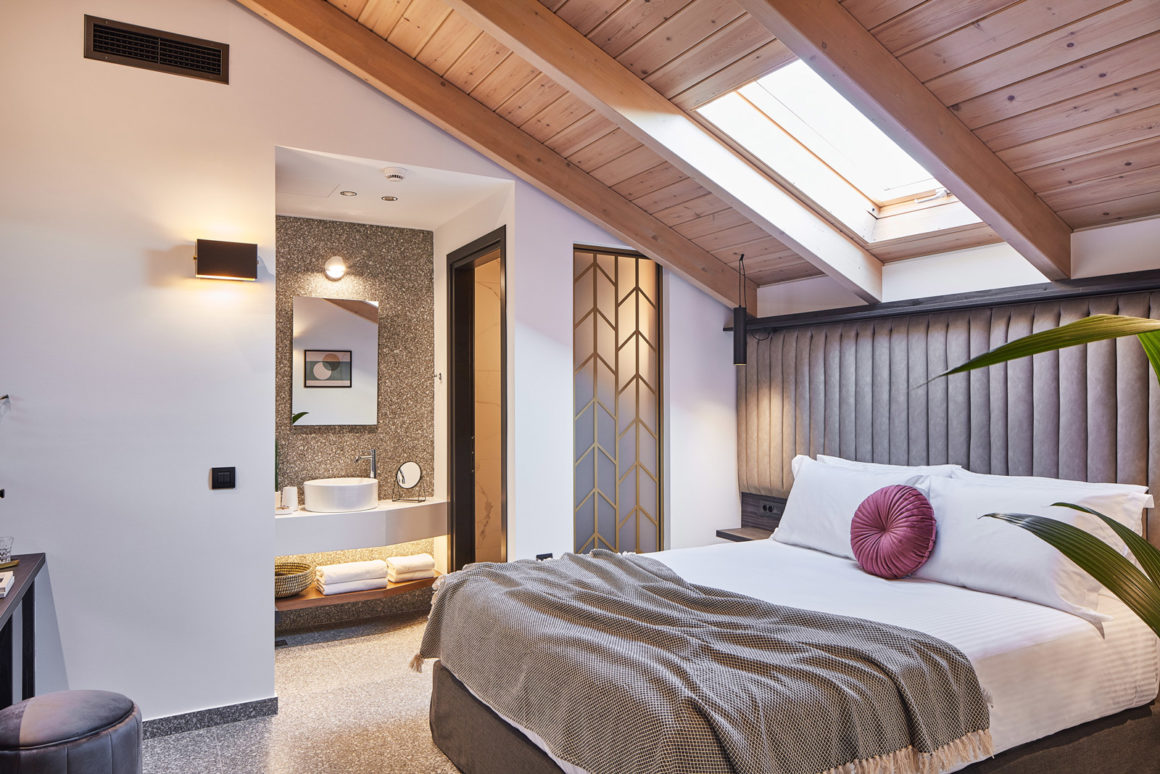
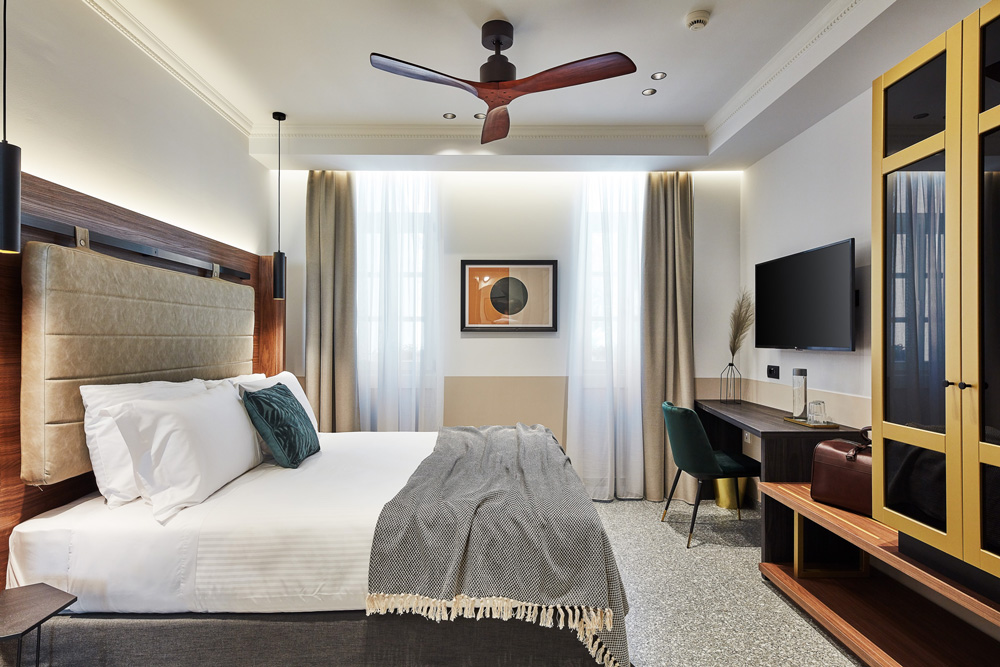
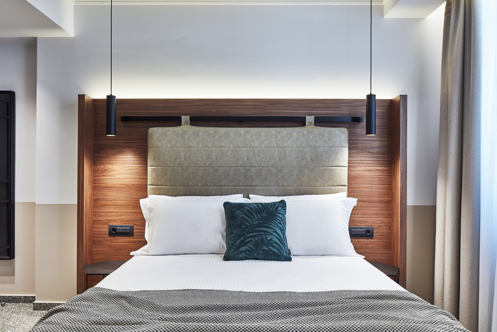
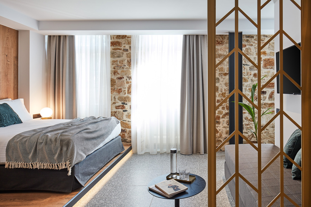
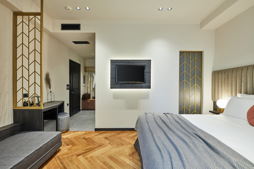
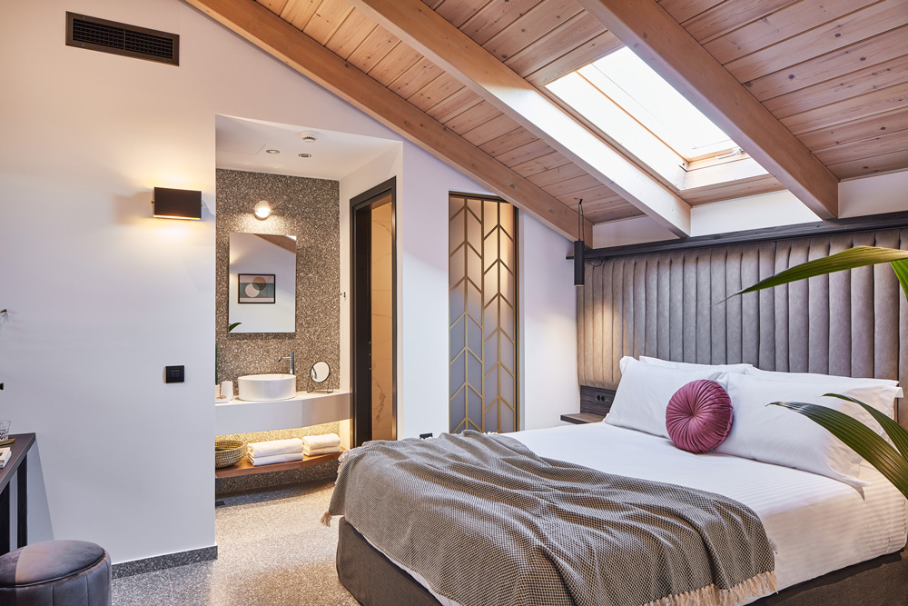
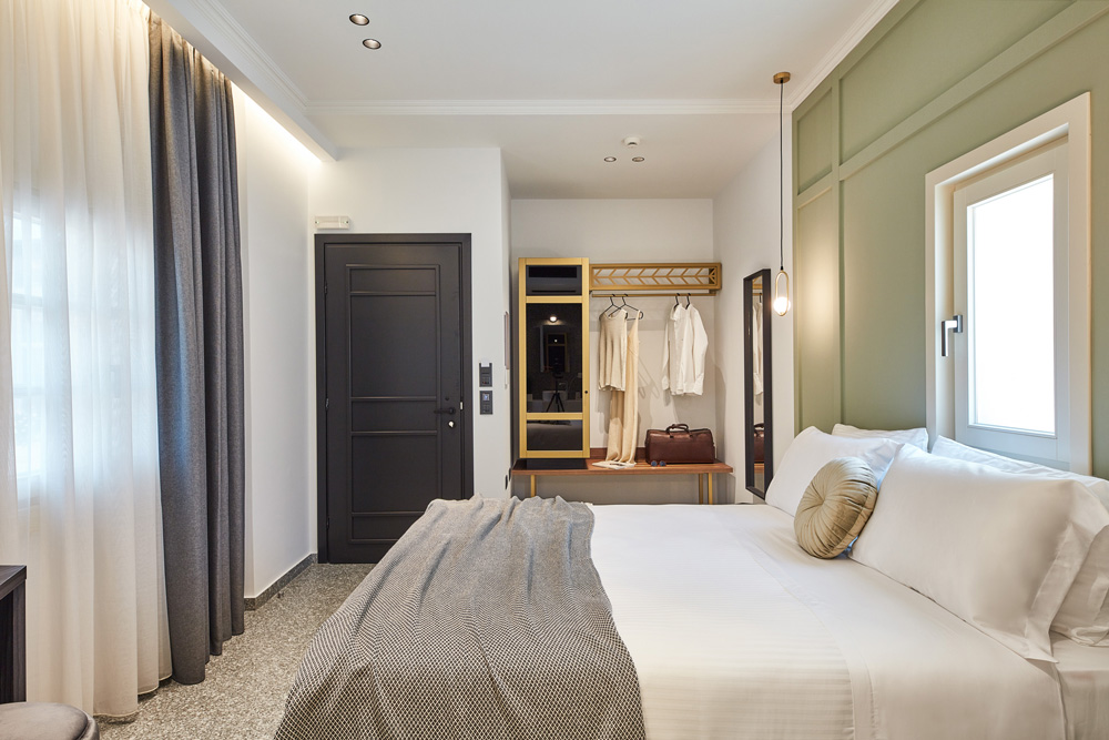
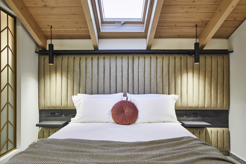
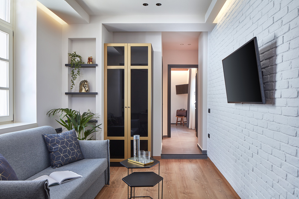
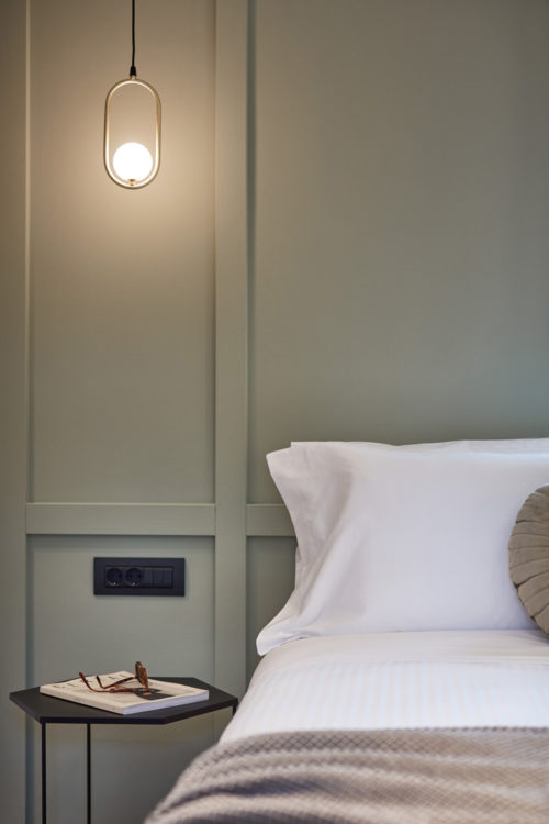
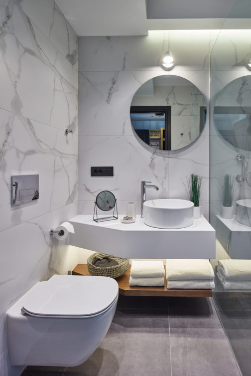
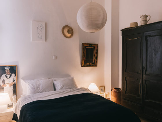
There are three rooms on the basement, around the reception area, three on the first floor and two on the roof level. Making the best possible use of the natural light and ventilation of the existing openings, and caring about the needs of a new hotel, the rooms are designed in such a way to invite the visitor to a unique accommodation experience in this traditional part of the town. Although each room is quite different, a common designing style has been followed playing with the modern, luxury and the history the building.
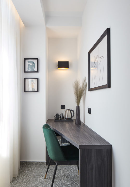
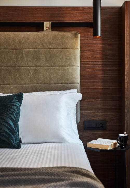
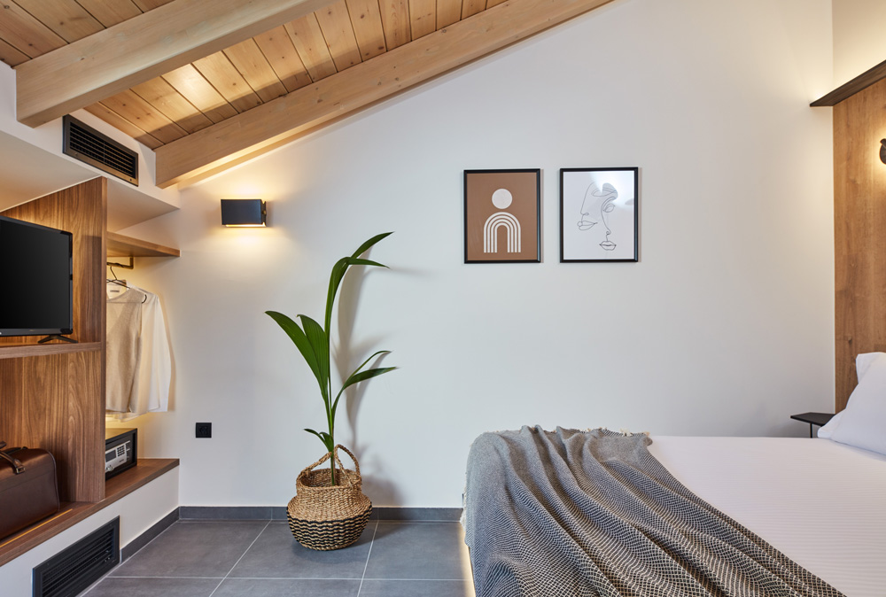
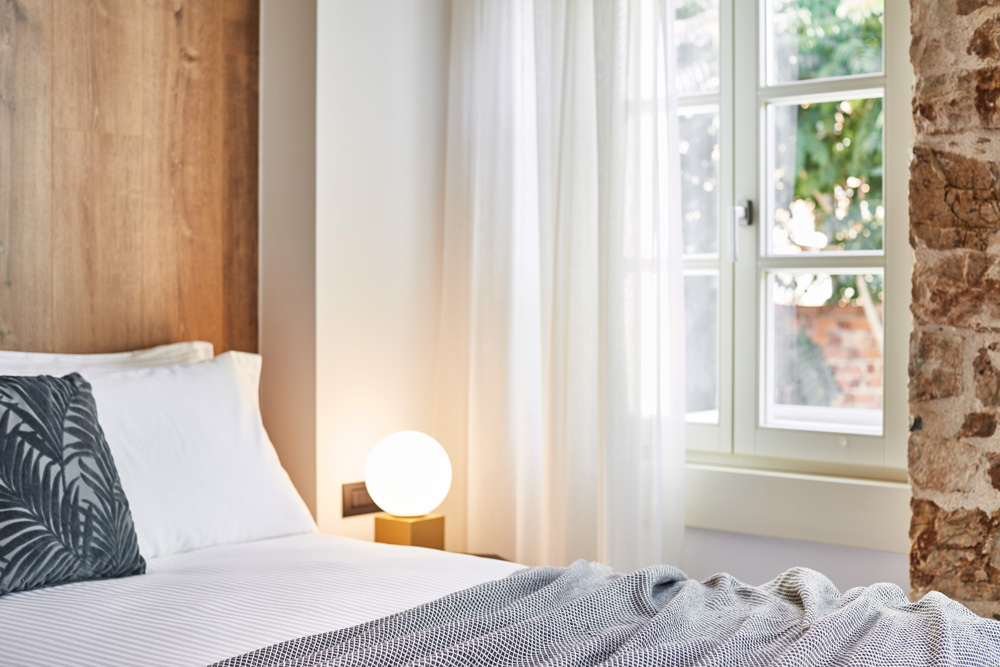
The rough surfaces of the visible stonewalls and the brick cladding on some other walls create a contrast with the warm materials such as the oak in black or walnut shade found in constructions, the golden details in decorations, dividers and lights as well as in warm colour fabrics. All furniture is meticulously designed for each room. Plaster wall frames and ceilings signify a reference to the building’s neoclassical identity.
Earth shades are found in most of the rooms, mainly in light tones in contrast to the intense petrol used in the common areas (reception, corridors and staircase), giving a modern touch in a traditional environment. The use of both natural materials on the floor and walls together with the wood , tiles in different sizes, texture and colour, mosaic and marble, the variety of furniture and lighting, all create multiple scenarios of accommodation in a traditional, yet modern place. The two rooms on the upper floor are characterized by an impressive wooden roof revealing a unique element of traditional architecture.
All the external frames are wooden, in white-beige shade as they were in their original version while the interior wooden doors are black, following a plain aesthetics to mark the entrance of each place.
The yard
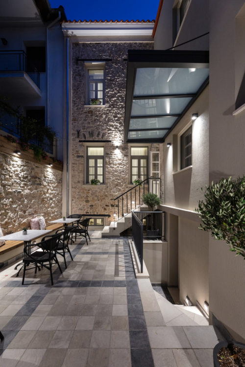
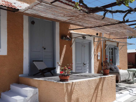
The yard design brings back the traditional typical Greek closed back yard with the necessary space serving as a sitting area. The natural materials are highlighted and the planting of a tree in the middle of the yard as well as the repositioning of a decorative stone well found during the cleanup create a modern space for relaxation in a traditional way.
Both the interior and the exterior lighting highlight the space and create an atmosphere of luxury where the neoclassical identity and the history emerge in space and time through this impressive building. The visitor experiences fully the old and the modern in the past and the present of the historical centre in an urban surrounding.
