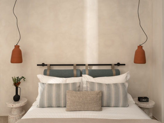
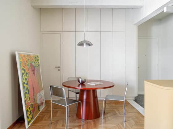
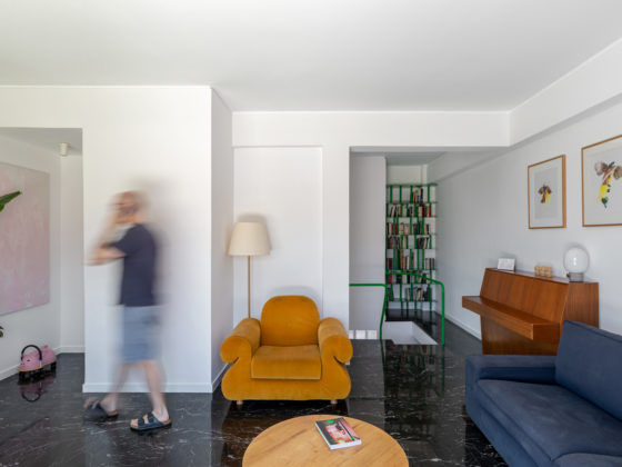
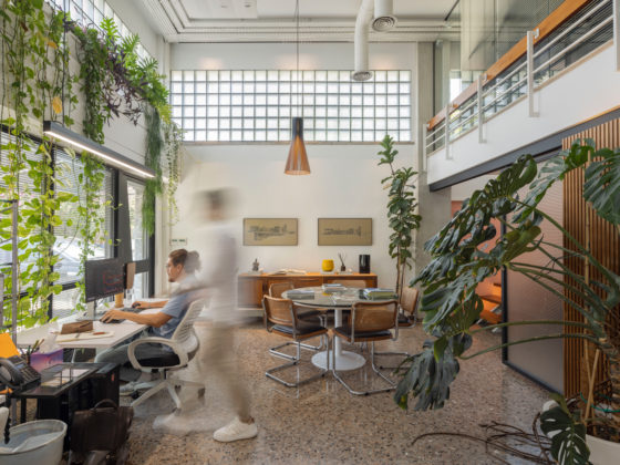
The apartment is located in a typical apartment building of the 1960s, with small-sized apartments per floor, inexpensive building materials, without much comfort, with the ultimate purpose of massive living in the era of reconstruction and consideration.
This particular apartment, originally had a rather complex compartmentalisation, with small spaces and corridors, relatively dark.
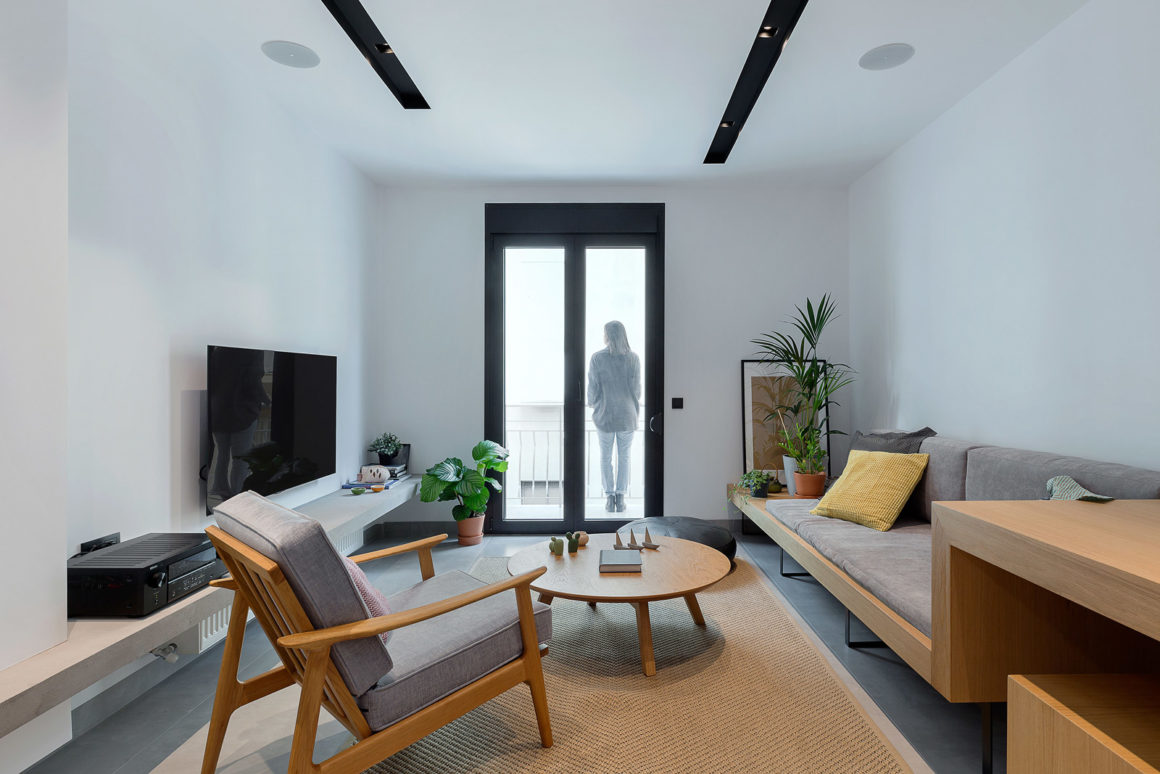
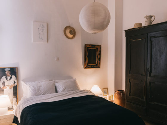
The central idea of the proposal is the ability to penetrate natural light into the entire apartment. The design emphasizes the intense linear shape of the apartment, dividing it into longitudinal sections, starting (from the front) with the living room, a small but useful desk, the two parts of the kitchen on both sides of the luminaire, the dining room and the auxiliary spaces waist. The end of this linear motion ends in a “nest” (the bedroom), a box, elevated slightly from the rest of the apartment, with unobstructed view to the rest of the apartment, but also with point views to the city’s intense urban landscape.
All basic functions are located along the side wall, intensifying the linear relationship of space and the way the occupant perceives and moves inside. A single white and glossy surface reflects the natural light and helps it to enter into the heart of the apartment. Generally, the apartment is a function module that pushes you to discover it. From the kitchen, the auxiliary parts, the white appliances that are absolutely necessary during the tenant’s stay, the storage areas entering the apartment, even the WC, with a hidden door, not even a knob. The user is constantly moving and the polymorphic space prevents monotonous living.
The floor, the walls and the roof are the canvas – the basis of all the elements that surround it and complement it. Choosing a grey matte large tile with the smallest possible joints is the best flooring choice in the particular operation, which integrates both its structural parts and furnishings. The walls and ceiling are selected in white color, in order to let the light penetrate in depth. The unique building elements that are differentiated are the central column with the beam that penetrates it. The visible concrete, as it appeared when the plaster was dismantled, is in complete contrast to the modern construction, the perfectly correct geometry, the clean colors and the elaborate materials.
The kitchen is one of the most basic findings of the whole proposal. In the first phase, closed, white and glossy, it complements the canvas of the space, but it also helps to penetrate natural light. It enhances clarity but also conceals unnecessary functional elements of the daily living of a non-permanent habitation.
In a second phase, and if the user wishes to do so, by opening the sliding doors, he can use any part of the kitchen he still wants to give him access to an additional opening in a light pipe. The kitchen is black as a whole. It is the biggest contrast in the apartment. The reason is simple. With the opening of sliding genders, the user discovers a new utilitarian space with periodic operation. Black gives depth, grows space, and pushes the user into a temporary illusion that behind the white doors, there is something bigger that is not discovered yet. This illusion pushes him to shut the doors again, so he can restore calm and balance in space.
