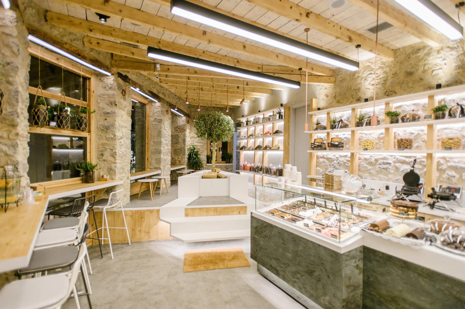
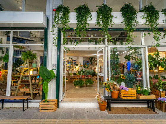
Sweet Garden is the third concept store designed by Athens-based ADD Architecture Studio in Arachova, Greece. Having to cope with the programmatic use of pastry, sweet bakery, coffee and ice cream, the design aspired to create a homely atmosphere matching with Arachova’s cold winter and hot summer.
All of the façade’s existing frames were replaced, the rock masonry was preserved and carefully lighted so as to act as a soft, but characteristic background. The roof’s wooden beams were restored to their original color palette, whereas the rest of the roof’s wooden planks were de-saturated. This works in favor of a phenomenological aspect of the shop’s length, eventually making it seem larger.
The space is divided longitudinally by an existing height difference of 0.5m which was integrated into the design, signaling the programmatic division between circulation/preparation and sitting area. The necessary stair bridging the two spaces was formed from white-painted steel and left hovering gently above the ground. The stair is part of a larger piece of furniture, featuring a hollow triangular receptor where a small olive tree is placed. So, the white metal sheet unravels becoming stair, flooring, plant pot and eventually a sitting bench.
The sitting area deals with the primordial Greek notion of “estia”, which symbolizes the center of the ancient house, the place where every member of the dwelling would gather around. In that case the “estia” is signaled by a small olive tree – a direct reference to the ancient site of Delphi.
The triangular outline of the bench combined with the narrow perspective of the space creates a visual dynamic as the former refuses to touch the ground. The shelves act as a foreground-construction creating a sense of unity between the shop’s preparation and sitting area. The gentle design process reaches its final touch through the adding of green hue in the cladding of the base of each main showcase consisting of green marble spotted with mild watermarks.
The eye instantaneously conceives a silent “agreement” between the marble and the olive tree. The surgical use of led tapes highlights different aspects and materiality choices and the lighting spots placed over each shelf pseudo-column create a strong vertical rhythm bringing together the shop’s whole area. The horizontal perspective is only “disturbed” by black hovering thin light providing the exhibition space with necessary extra light.
