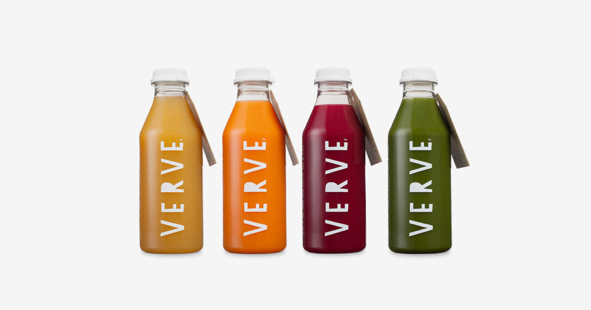
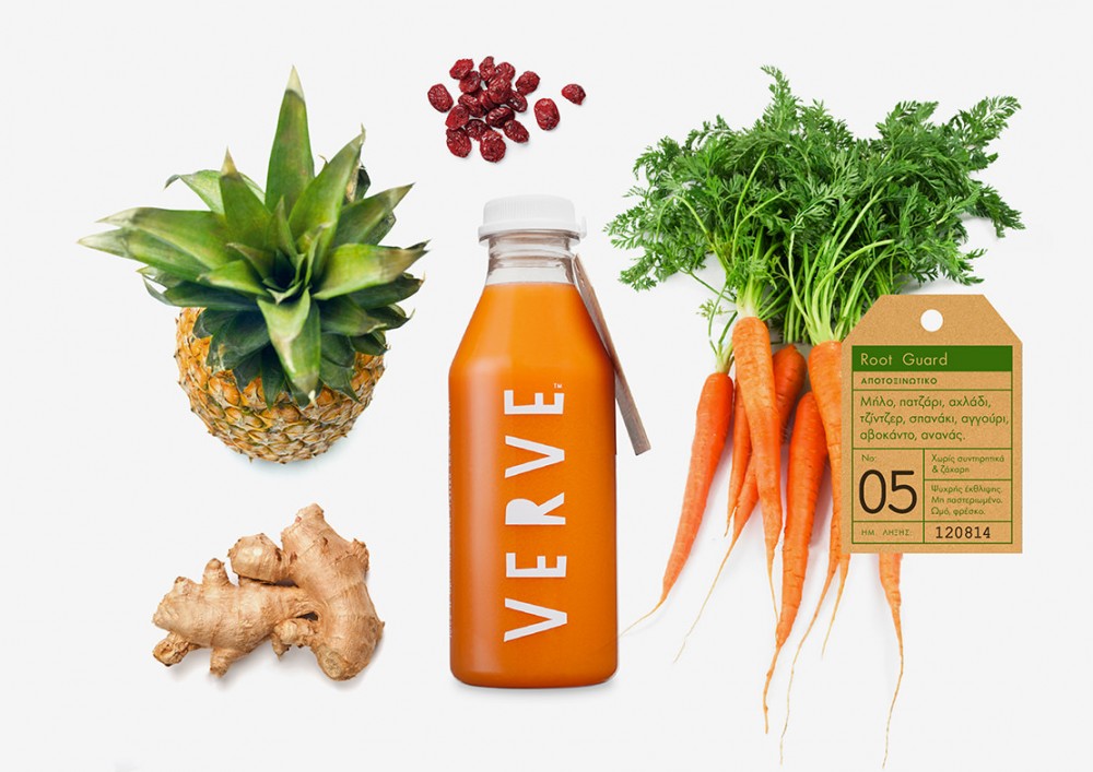
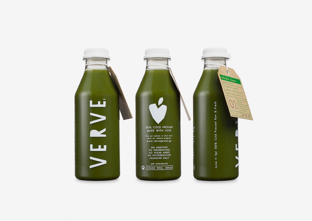
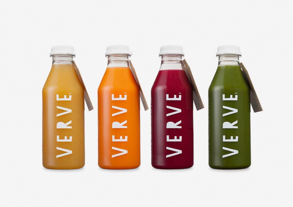
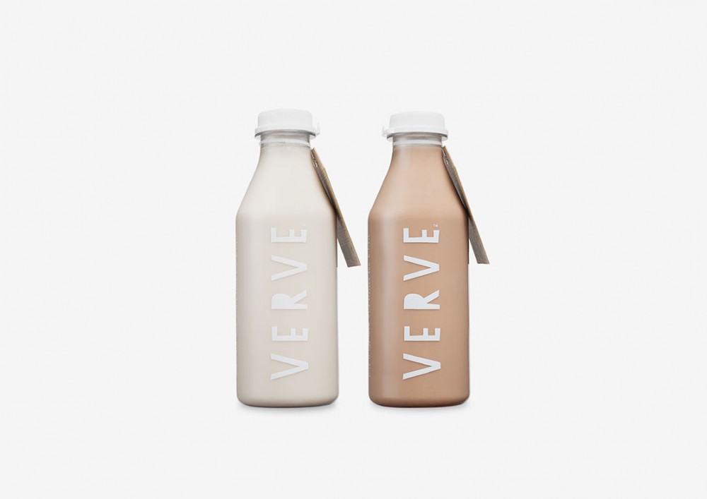
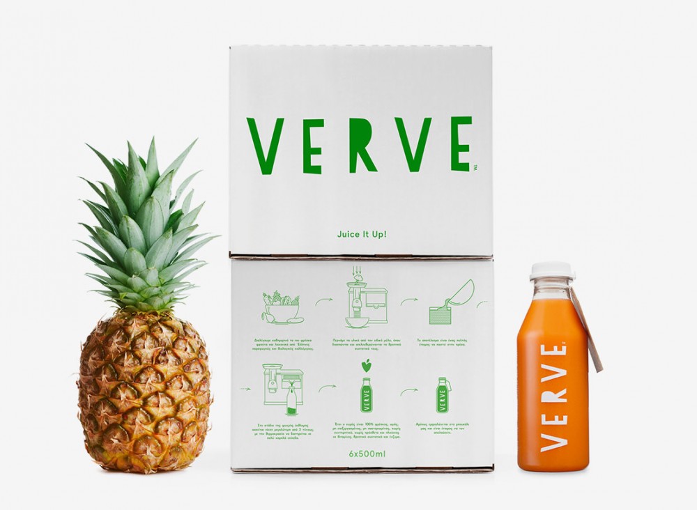
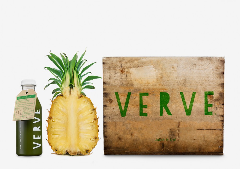
Bob Studio provided the naming, logo design, branding and packaging for Verve, the first cold-pressed juice and cleanse company in Greece, established in 2014. They offer a variety of 9 juices and 2 milks made with raw and fresh ingredients using only the cold pressed method. Their identity is simple and clean, using a strong logo and the vivid colors of the juices themselves, revealing the freshness and purity of the brand. Logo typography is simple and primitive made by strong cut letters, inspired in a way on how we cut fruits and vegetables everyday at home. Each juice is identified firstly by its color and secondly by a paper label on top, where you can find all information on the specific juice, like ingredients, nutrition facts, series number on a cleansing program etc. Having a generic bottle and different labels reduces bottle production costs a lot and eases the way of everyday hand bottling. All applications follow the same branding rules and the strong identity of Verve.
Verve Juices by Bob Studio
