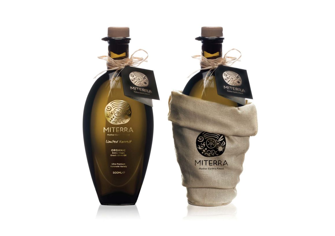
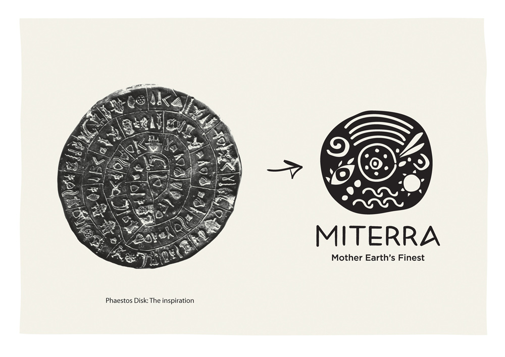
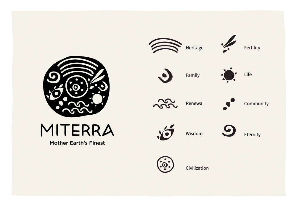
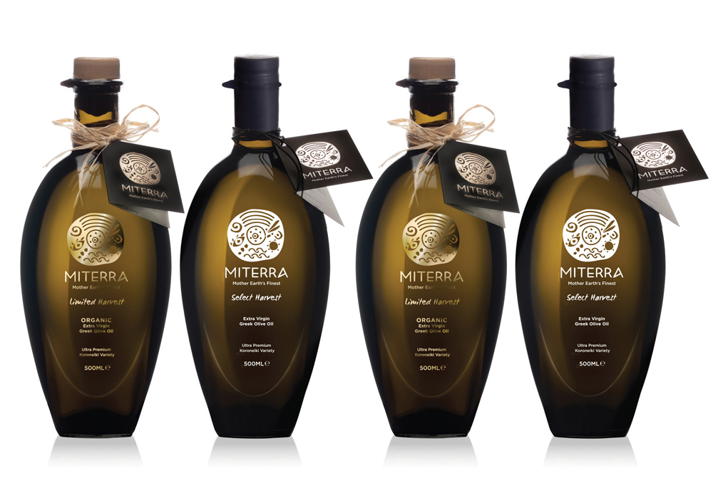
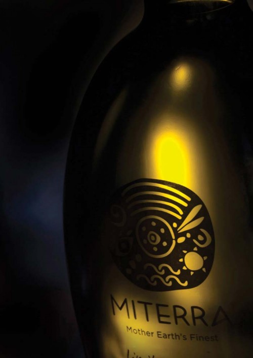
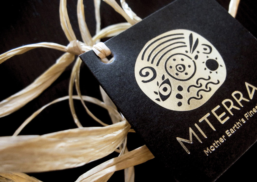
Sophia Georgopoulou designed this logo that expresses the values, history and culture of Greece for a company that addresses international consumers, offering high-quality goods from local producers across the country. Inspired by the well-known symbol of the Phaestos Disk and its signs, the logo is strong, sentimental, austere yet easily recognizable as Greek, without being cliché.
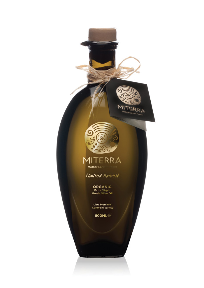
Regarding the olive oil packaging, the goal was to express the outstanding value of a traditional Greek product, through an elegant and premium design. Two olive oil variants were created, the gold ‘Limited Harvest’ and the white ‘Select Harvest’.
The unique-shaped bottle brings to mind the shape of an olive and highlights the premium identity of the product and the philosophy of the brand.
