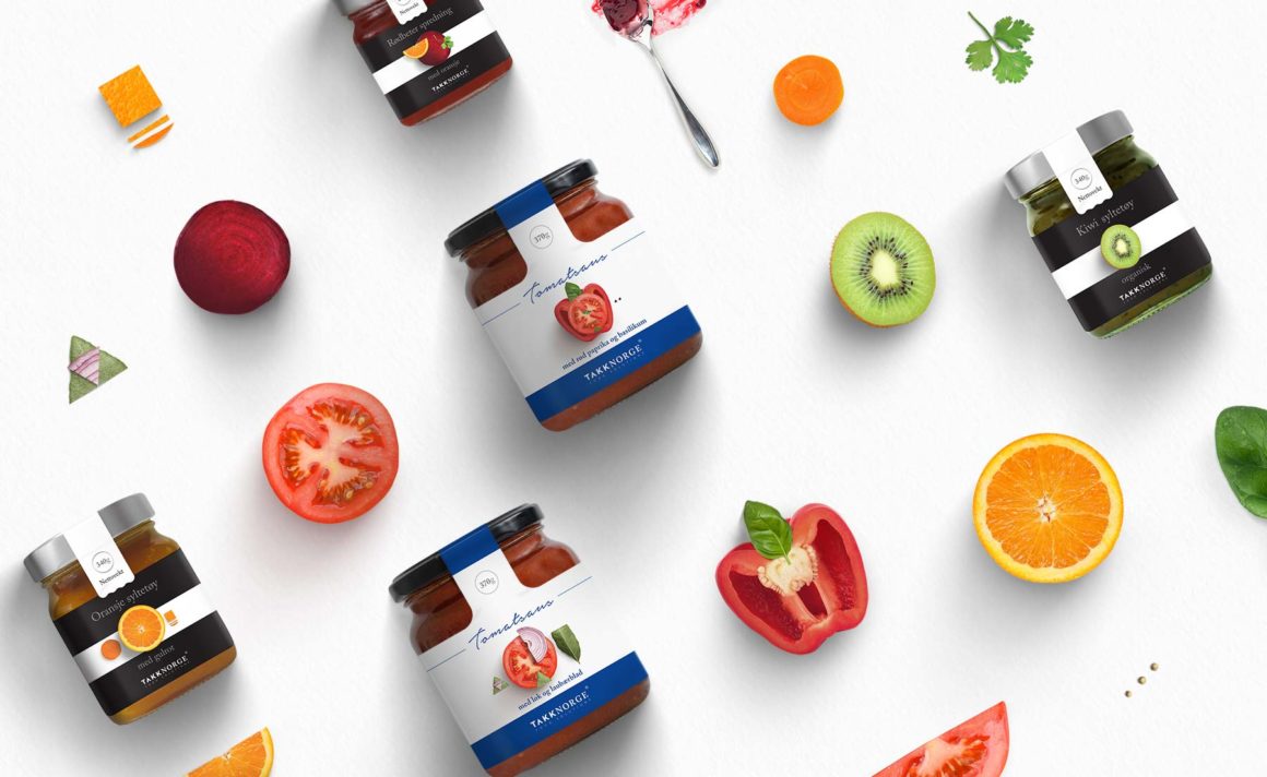
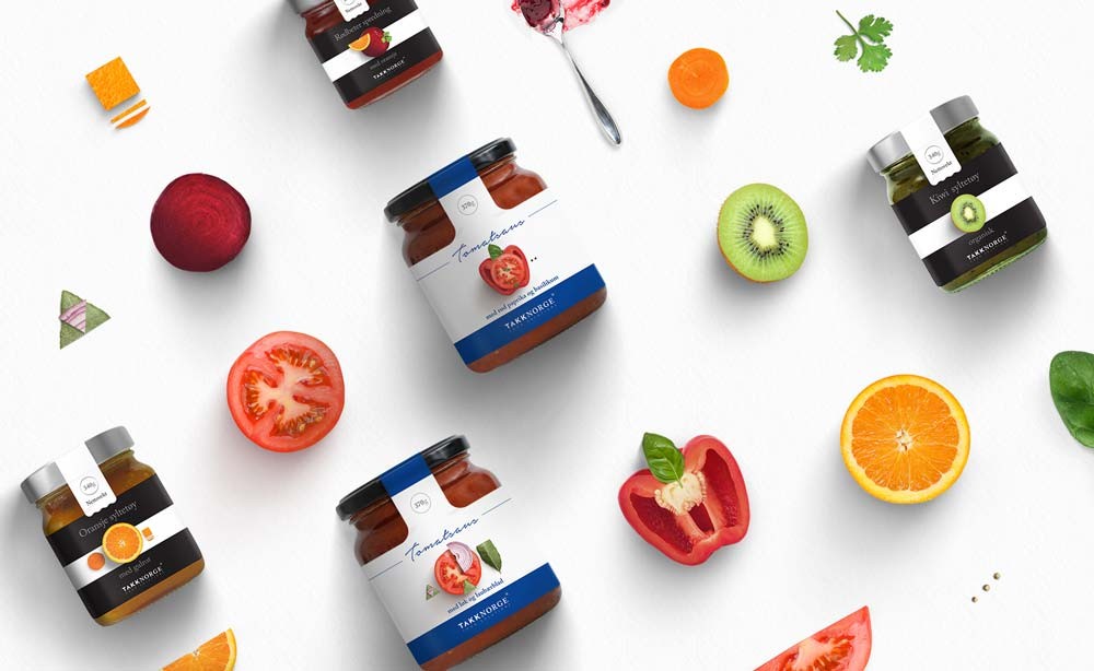
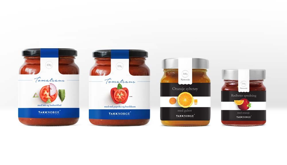
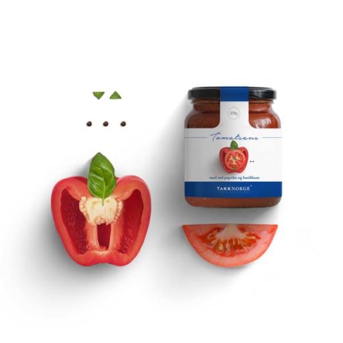
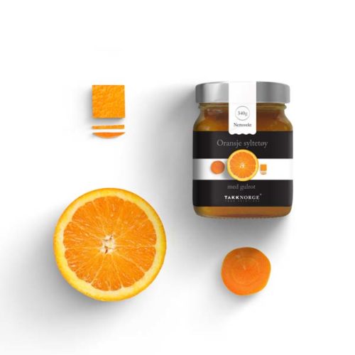
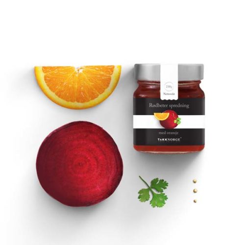
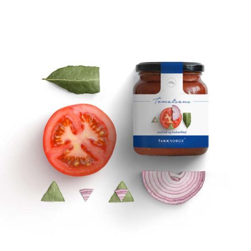
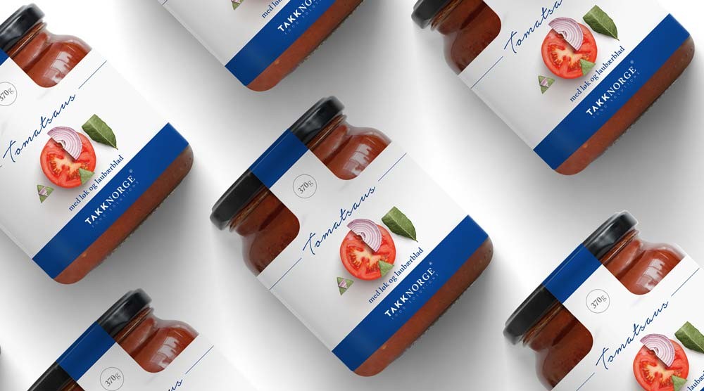
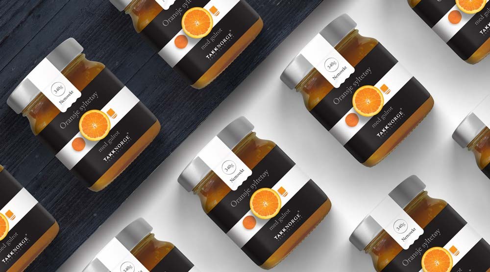
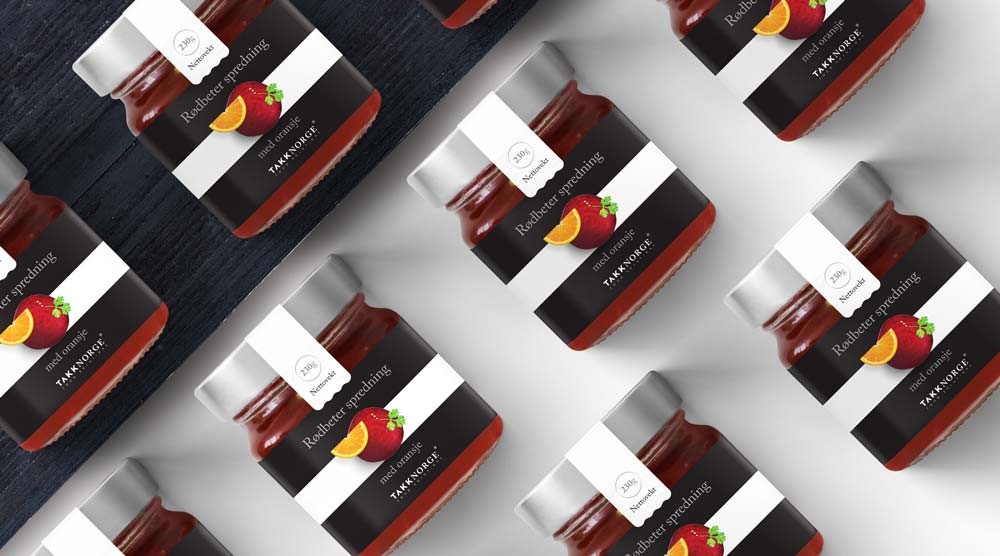
Kommigraphics designed the product line of food sauces and marmalades for Takk Norge, an import company of Greek products in Scandinavia, using minimal aesthetics, with clear typography forms. Based in Norway, the company’s name is translated as “Norway thank you” in English and its high quality products are provided exclusively by Greek producers. Every label surface was approached as a white canvas for small creations, and through this concept, Kommigraphics made small compositions depicting the main ingredients of each product; in away, the art of food meets the art of graphic design on small canvases. The design was based on combining two fonts, the one referring to the Greek origin of the products and the other to the Royal House of Norway. By conveying the expression “Takk Norge” as a single word the design expresses the “cooperation” of the two countries for a common goal, rendering at the same time the title more legible.
Takk Norge by Kommigraphics
