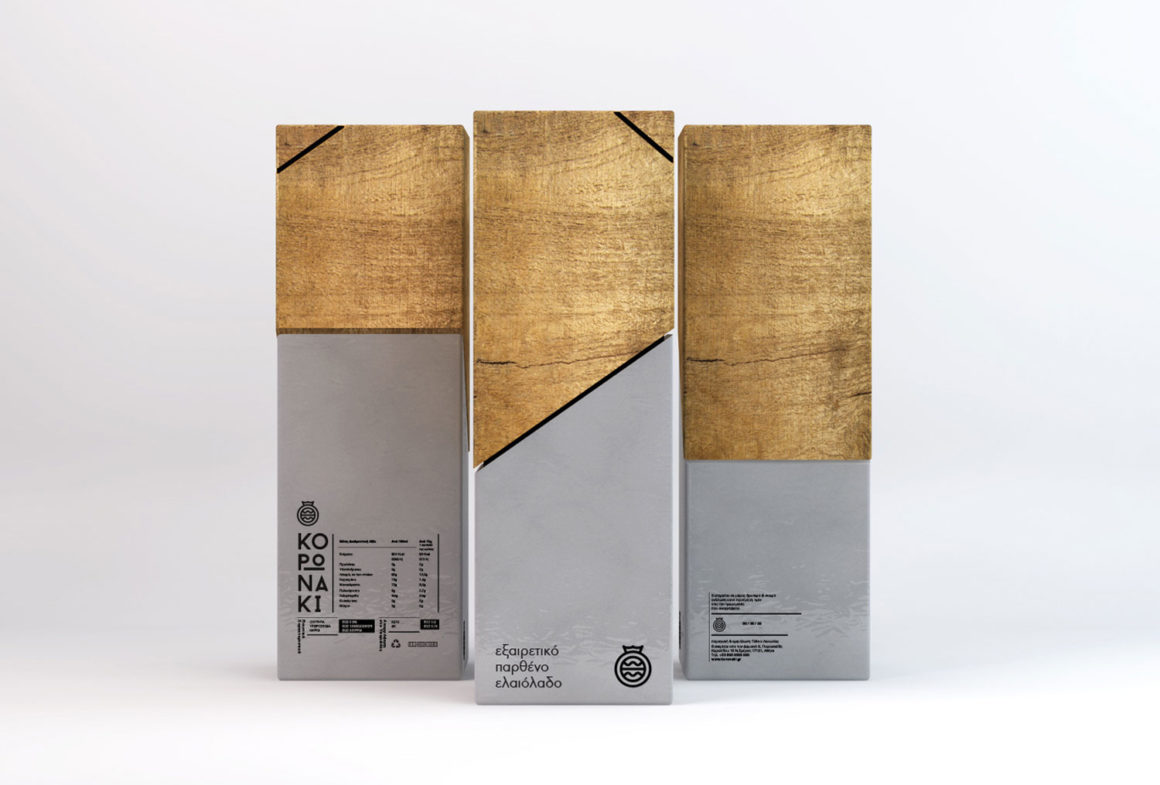
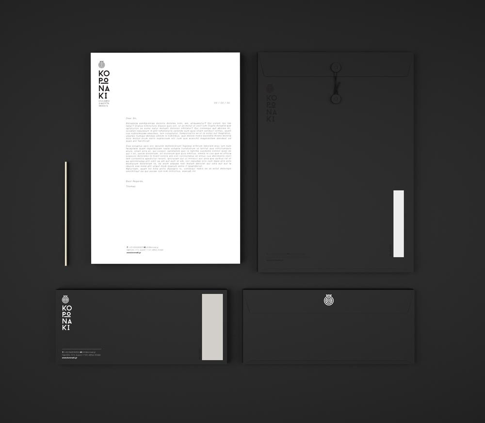
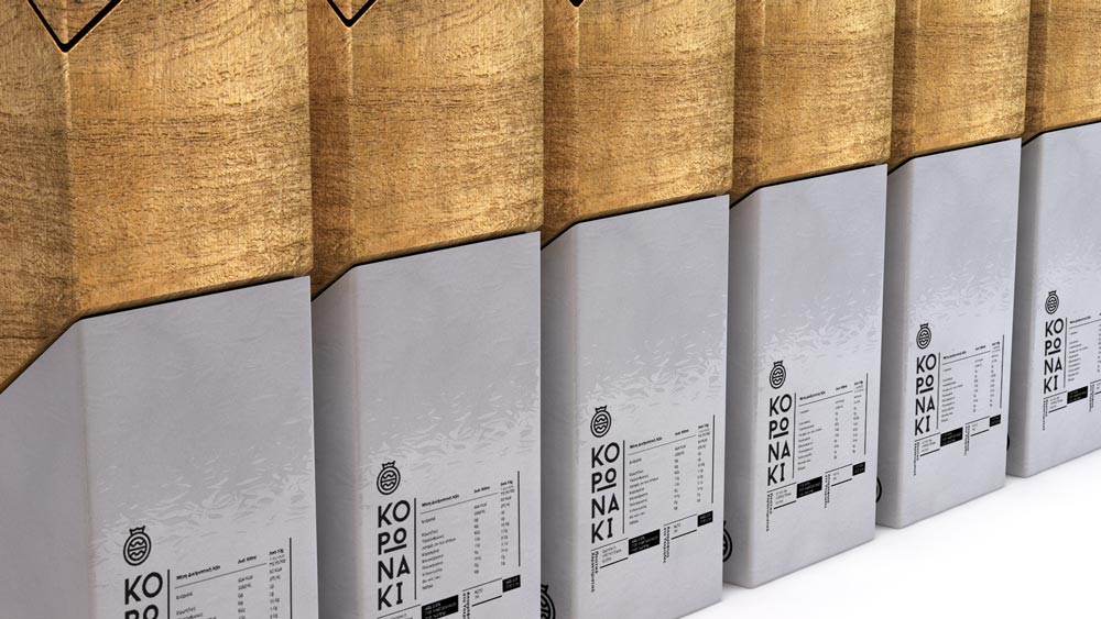
Thomas Kiourtsis created a simple, clean and sharp identity, along with a new packaging for Koronaki, a small Greek company that aims to offer customers both in Greece and abroad excellent quality virgin olive oil and high-value traditional Greek products.
The designer’s goal was to delineate the simplicity and purity of olive oil along with the range and complexity of its use in Mediterranean cuisine. Using simple symbols that refer to the natural resources that make this product so special, he designed a strong, simple and flexible logo that, combined with the use of black and white, gives an aesthetically rich corporate identity, comprising nevertheless simple design elements.
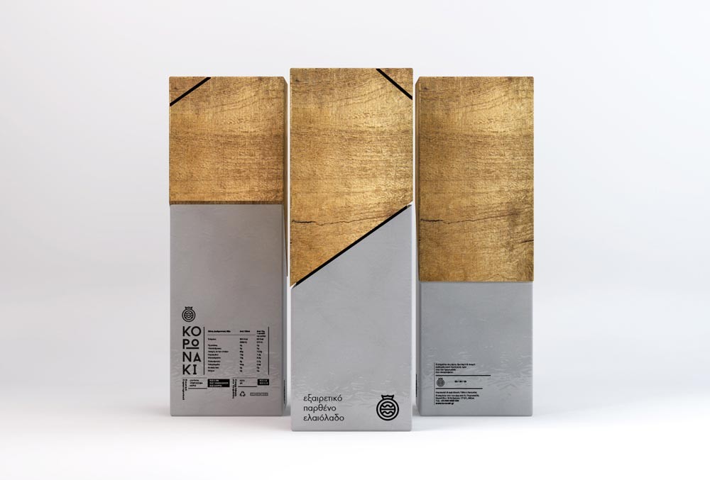
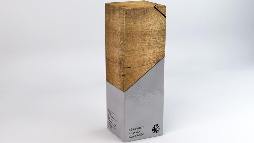
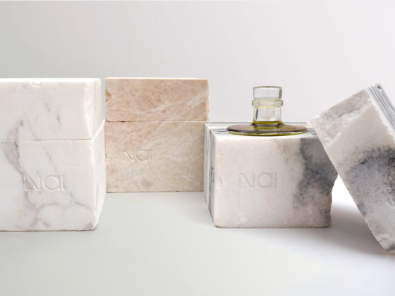
The design of the packaging was a great challenge right from the beginning, as olive oil is a very popular product in the Greek market, showcasing interesting and important design approaches by many graphic designers. For its creation, Thomas Kiourtsis tried to express a similar idea to the one that lead to the design of the symbol, this time through materials and textures. Balancing between timber and stone, the end product is a natural, timeless and beautiful combination of materials.
