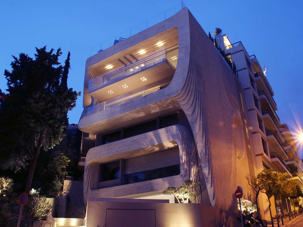
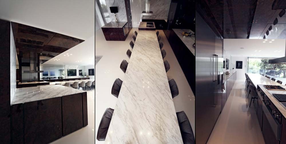
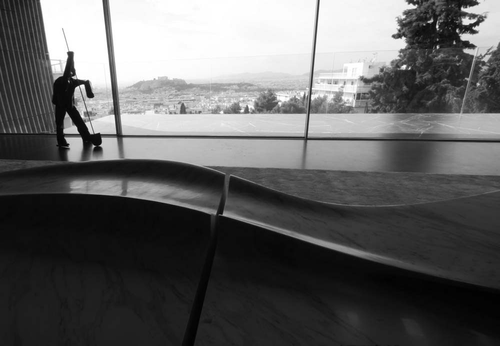
In designing the One Kleomenous building in Athens, Omniview Architects skillfully combined design language and material choices to create a paradigm when it comes to a building in harmony with its surroundings. Located at the city’s marginal territory between a heavily built urbanscape and a completely natural environment, the building is adequately contemporary, acknowledging the inherent modernity of contemporary materials and forms, but, most importantly, it blends harmoniously with the untouched surrounding land. The end result is a natural continuation of the city’s unified volume, ending up in a final frontier so strongly associated with the adjacent Lycabettus hill, that the transition almost goes unnoticed.
As far as the design language is concerned, the architects looked very carefully at the building positioning, orientation and functions to develop their strategy for the facade. They decided to continue upon the form of the existing adjacent building on the city end of the plot, using a simple planar surface. The vicinity to the city fabric was further honored by using plain stucco, one of the city’s most popular materials.
On the forest end of the plot, the harsh volumes of the cantilevering balconies, almost touched by the trees and plantation of the forest, needed to be geometrically manipulated in order to adapt to the fluid forms of the hill. Further more, the Southeastern side of the building’s volume needed a cladding system that would filter the direct sunlight and ensure the energy – efficient operation of the building.
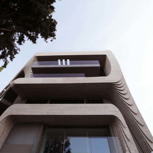
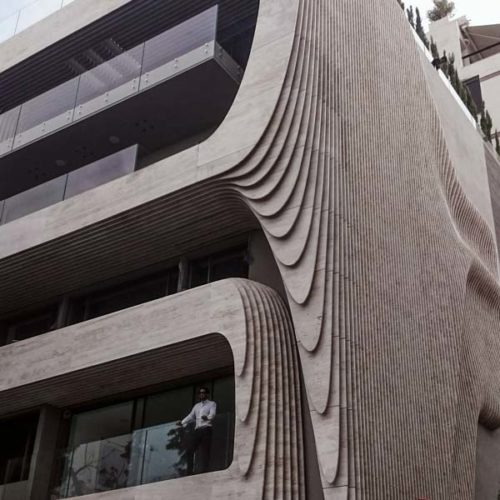
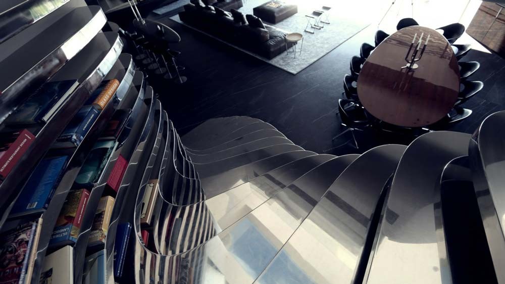
While seeking inspiration by researching Lycabettus-related items, an old topographic map became the source of an architectural metaphor; Omniview digitally created a facade landscape by assigning natural morphing transition volumes between the blocky balcony forms. They then sliced it up in multiple consequent sections, to create the elements of the cladding system. No extra volume was added to the building, but the existing ones were unified instead, creating a natural looking geometry.
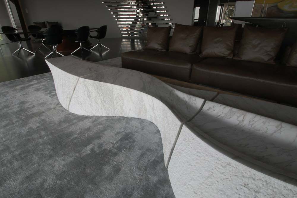
With regards to material choices, the architects needed a material that would match in color the characteristic beige stones used in all of the retaining walls of the Lycabettus hill. They chose Travertino, as it communicates very intensely its non-artificial status due to its porous nature, but is also a very popular material in the surrounding condo developments of a 1970’s modernist style.
The inner building skin’s color was carefully selected to match the color of soil. The glass balusters were selected to be extra reflective and thus carry the image of the sky and the trees around them. In general, the material pallet of the whole building was designed to refer to the architects’ innate aesthetic conception of Attica’s indigenous landscape: it’s made of soil, stone and sky.

